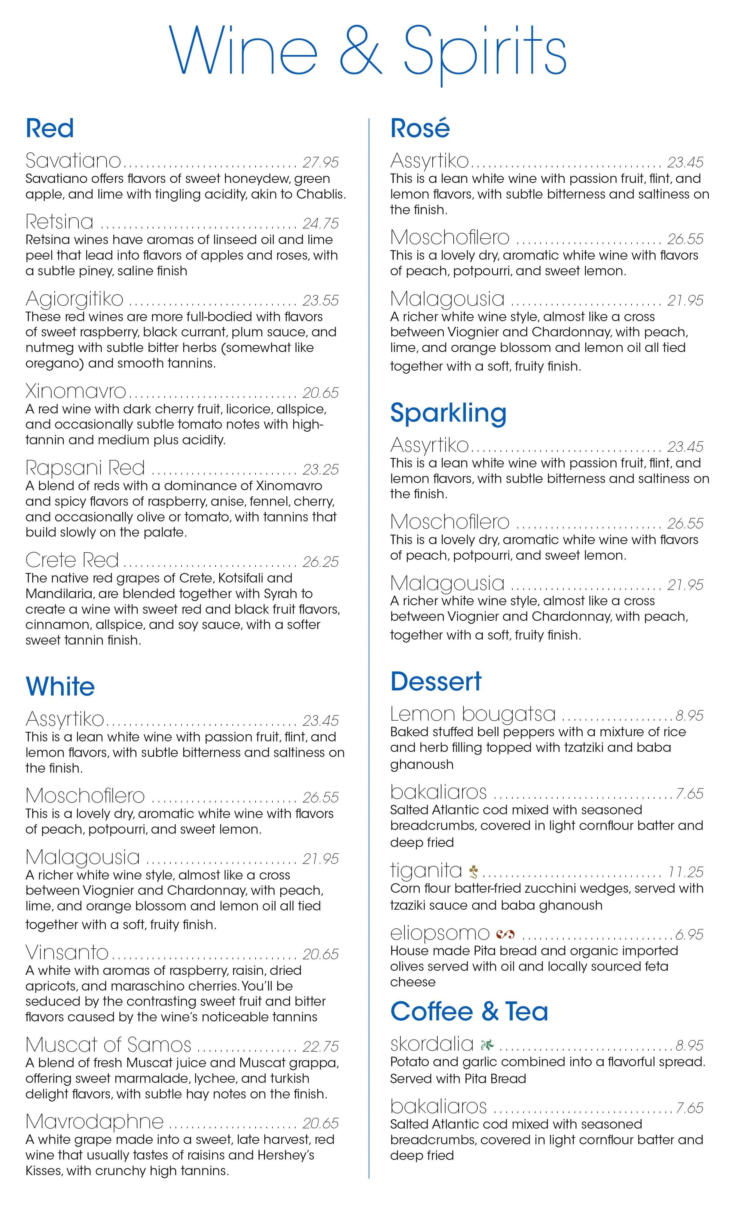
The wine list from Icarus Taverna
Typography
Typesetting is a craft that surrounds us daily. It has a long history, but it really hit the gas in the 1400s with the advent of moveable type. In the last five hundred years, we have gone from 5% global literacy to 95%. The printing press created the modern world more than any other single invention. That includes the Reformation AND Fascism, so its a mixed blessing at best.
All of us have dabbled in typography whether in a word processing program or simply sending an email. We all know a ‘wall of text’ is hard to read and an all-caps sentence feels threatening, but why? This question is at the core of typography.
Words can be expressive in so many ways, most of them very subtle. A casual observer can tell when a font is playful or serious or aggressive or timid, but often only in the extreme. The majority of typesets fall into the vast middle ground. Noticing and understanding the little intricacies of letterforms is where the art of typography begins. Some type matches and some does not. Some type is effective only when used correctly. Some type is amateur and expresses the exact opposite of the client’s intention.
The perfect font can still be misused when spaced incorrectly. It must fit into the entirety of the document with balance and cohesion. Even when type appears perfectly assembled, it may still be constructed using amateur techniques. For example, hitting spacebar or the enter key several times in a row to create space is always a mistake.
There are hundreds of tiny considerations that I make whenever I assemble a block of type. Adobe InDesign can be rather dense at first, but I can confidently say I know how to use 100% of that program to create professional documents that meet accessibility standards.


