Sea Ice Infographic
Background
Sea ice science is critical to understanding climate change. How is it done? What is the physical evidence that proves the theory? Who collects this evidence and with what tools? When did scientists start measuring climate change in this way? The aim of this infographic is to engage the viewer using a timeline approach which follows the scientific method as it is used to prove the theory of climate change.
Project Objectives
The focus of this infographic is to explain the hands-on work that scientists and engineers do to arrive at their conclusions. Demonstrating the step-by-step process will help validate the scientific method to the layperson.
Target Audience
Middle aged professionals and parents who live in communities where climate change is often disputed and voted on. The target audience is educated and works effectively at their trade but does not typically engage with intellectual pursuits. They might casually listen to right-wing media and may seriously consider climate change to be a hoax.
The infographic could also be targeted at middle school students in an effort to encourage imagination. Displaying scientific research as being adventurous as well as important could engage young minds and broaden perspectives.
Production Considerations
This project has a five-week production schedule with a final delivery on December 14th. There will be weekly critiques on every Friday. The final will be printed at 10” by 13” and mounted on 14” by 17” grey Neenah paper. It will need to feature all appropriate source and reference information.

Creative Considerations
The infographic will feature solid colours and shapes with no photographs or overly detailed graphics. Non-representational or iconic shapes will take precedent when displaying things. All the text should be rendered in an appropriate typeface for legibility at large and small scale.
Key Message
The scientific method works really well. Most people don’t think about all the various failures and misguided theories that are eventually proven wrong by the scientific method. The journey towards truth and understanding involves lots of hard work and specialized tools and machinery, which are themes that any average non-scientist can understand.
The infographic asks the viewer to invest in science because it is challenging and adventurous. That investment could be a donation to a non-profit with a science education mandate, or by simply voting in favor of a pro-education political candidate. Perhaps the infographic can be used in a school itself to encourage young minds to follow the science career path.
The study of sea ice and other climate-related topics is large-scale. Sea ice may be receding, but the polar environments are still vast and daunting. In order to get a clear picture of the situation, several science teams from numerous countries have had to coordinate their research efforts. Polar research is adventurous and challenging.
Design Solution
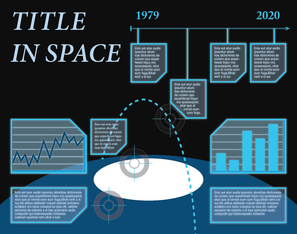
The resulting infographic is predominantly black with white writing. The bottom of the image is dominated by a simplified view of the Earth’s north pole as a wide horizon. The viewer is put in the perspective of a space craft or a satellite. Looking down on the Earth, the viewer is reminded of both how massive the planet is, but also how unique and tiny it is compared to the vastness of space.
The dominant timeline in the center of the infographic shows a brief overview of the past century’s polar exploration. The viewer is reminded how humanity has only been visiting the poles for a short part of our existence. We have come a long way, but the cutting-edge technology we use is still in its infancy.
The bright blues which highlight and surround all the elements is meant to reference a sci-fi style computer monitor. The use of a digital display commands a degree of believability. Scientific data collected by advanced measuring tools is seen as being brutally honest and logical.
The overall effect should be one of encouragement. This infographic identifies a problem and illustrates how we are working to find solutions. Humanity must remain optimistic and determined moving into the future.
