Illustrative Typesetting Project
A lesson in the history and practice of typography
Classical Fables
A private press is a small-scale book publisher which celebrates history by rejecting mass production and embracing tradition. In order to survive as a small company, they must always demonstrate their skill and quality by filling each page with dense, well-designed illustrations and thoughtful typography.
Strategic Brief
Background
The client is a small-scale private press. They produce books in limited runs on their collections of mid-century machinery. Every aspect of their production is done with a great reverence for history, employing manual methods wherever possible.
Objective
For this project, the company requires an example spread to demonstrate the look of a classic fables book entitled the little book of fables. Each book will be a collectible work of art sturdy enough to last a lifetime and more. With this in mind, each book must have the utmost attention to detail. The company expects to produce a limited run of 100 books, each perfect and handmade.
Audience
The immediate potential audience is collectors of fine books. Limited editions pique the interest of any dedicated fan of a medium. This part of the audience is already won over by the quality and exclusivity. The company’s goal should be to win over more new customers. With the proliferation of smartphones and animated billboards, there is a rising trend towards the authenticity offered by a handmade analog item. Young families in their early 30s have helped create a certain “etsy.com” style market for unique, one-of-a-kind artifacts. Books such as this help encourage respect and admiration for the old world, which young parents often wish to transmit to their young children. The young parents and collectors alike will be enticed by the timeless references to the old world throughout the book, in its construction and illumination.
Production Considerations
The client wishes to express a nostalgic timeless feel to every production by including unique illustrations and traditional print colours and paper. No excessively bright colours are to be used. The paper will be slightly yellow-brown.
Creative Considerations
The book design must make efforts to limit creative decisions to style influences from the 19th and 20th century. Illustrations styles from the late 19th century is preferred. The company prefers old style serif fonts but allows for modern serifs.
Key Message
Old world traditions have great value, as do ancient fables. Celebrate history by buying this book and reading it to your kids.
Schedule
To be completed on October 4th, 2018. Regular progress reports occur each Thursday until then.
Rationale
How the needs of the strategic brief have been met, and the design process that has led to this result.
Concept
The client’s needs required developing a style expressed through type and image which could easily be adapted to a whole series of pages. While there are only two pages represented, this spread stands as an exemplar for the possibility of many pages following a similar style throughout.
Design
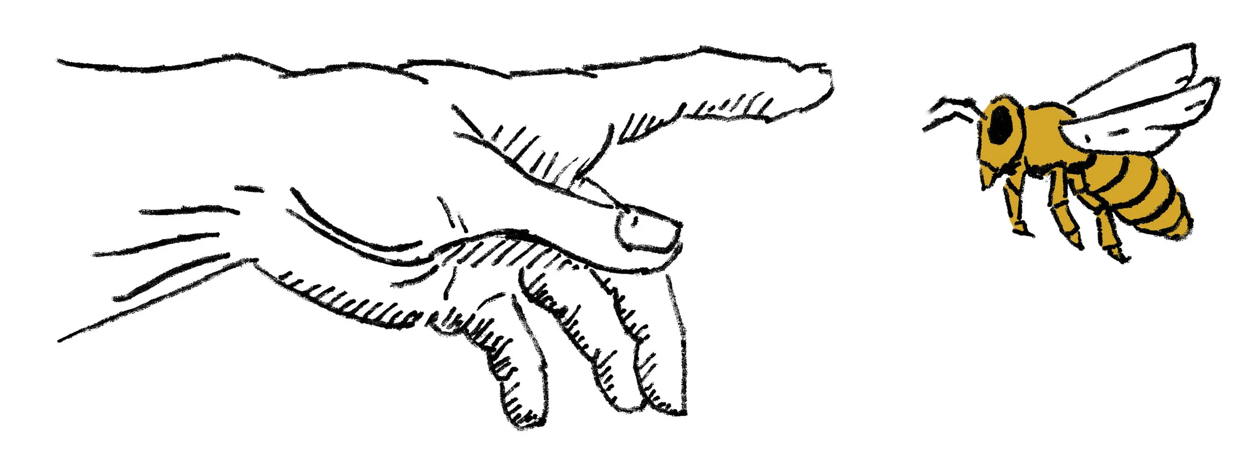
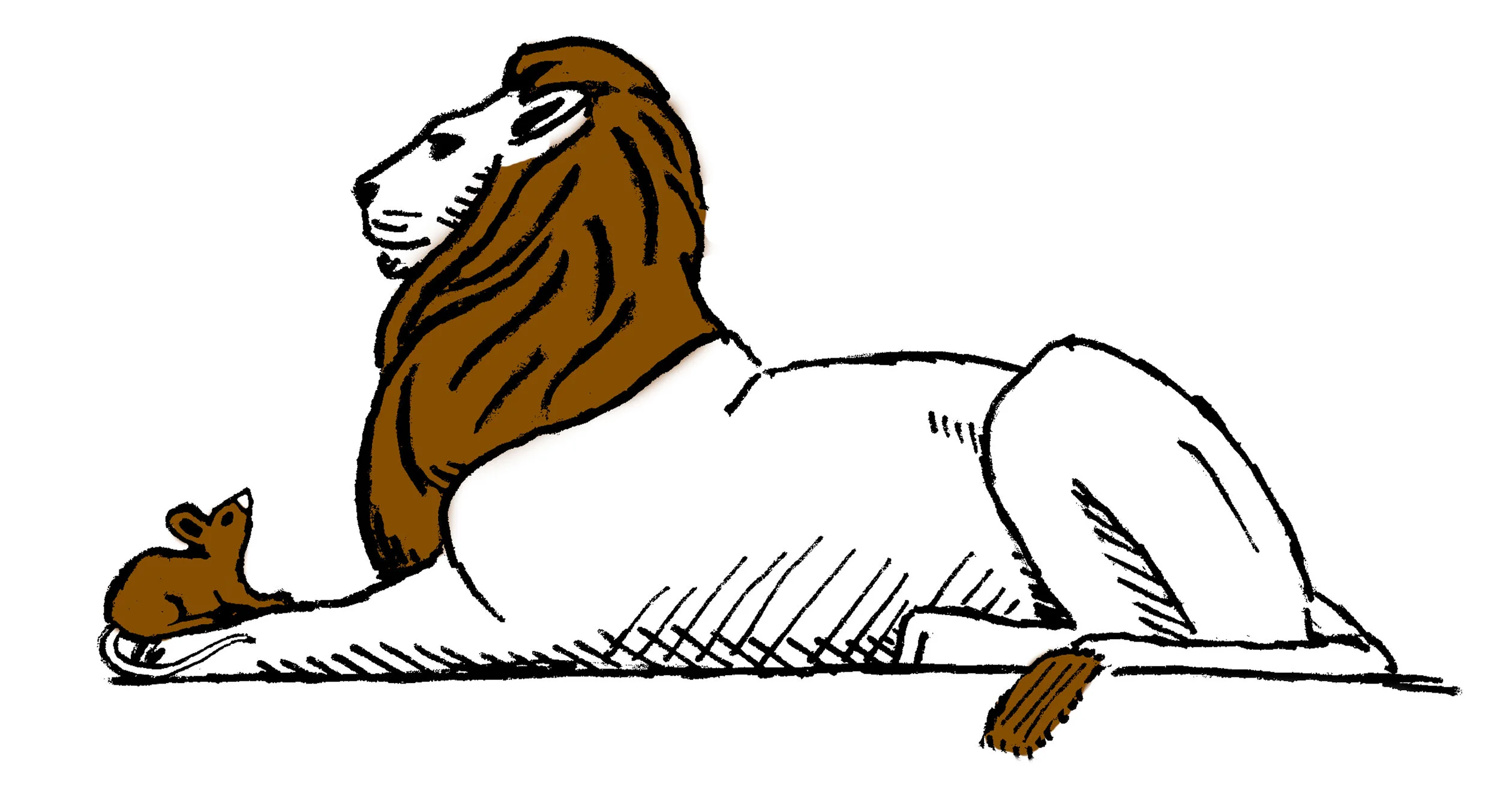
I began by choosing two fables to arrange. With the title “little book of fables” I chose fables which featured small animals, namely a mouse and a bee, contrasted with large things, a lion and the god Jupiter respectively.
I looked at several dozen pictures of bees, mice, lions, and Roman gods. The most challenging decision was how to display Jupiter. I decided to make a modern choice and display the god in part as the planet Jupiter. Additionally, I would draw a version of the hand of God from the famous Michelangelo work ‘Creation of Adam’. The animals all came together fairly easily especially when the style was deliberately rough and minimalistic.
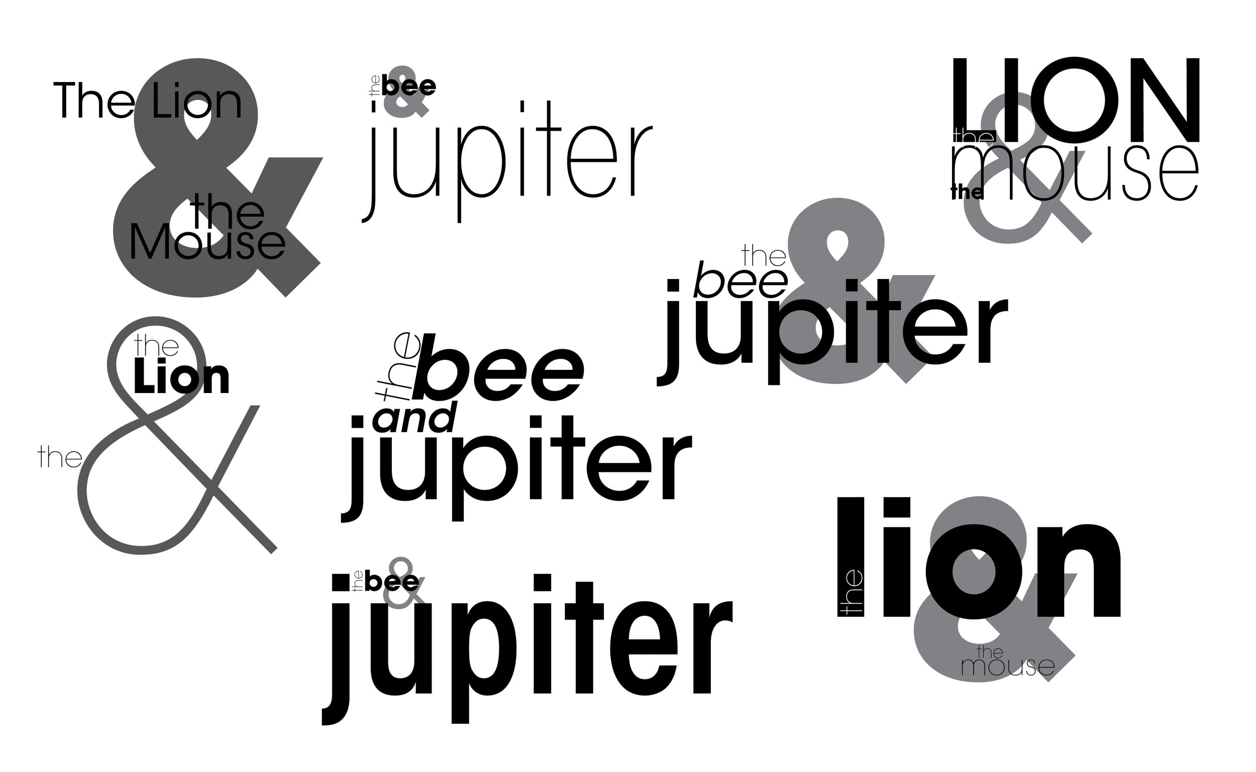
All of the text elements are using various styles of Galliard. This typeface has plenty of options to allow cohesive text clusters while adjusting weights and styles in various ways. The bilateral nature of the titles allows for frequent use of the dynamic ampersand, adding childish whimsy.
All of the colour choices are clear and bold, but reserved and traditional to match the overall theme. This collection would ideally feature only half a dozen colour choices highlighting each page in random combinations. All the colours would show a warm yellow hue preference.
Production
Each page displays a clear hierarchy. Primarily we have the title cluster. The largeness and weight of the titles commands initial attention. Each cluster is arranged in a whimsical and atypical manner.
The hand rendered illustrations take secondary attention. Each element is drawn with regard to the printing method, which will require custom pieces to be etched and inked before arriving on the page. Lines are simple and clear. Each illustration also features a single colour as an accent. Each page is limited to one spot color. Each page features one major illustration and one minor illustration.
The main body of the page is the classic fables themselves. Each is placed fully justified within the margins defined by antique printing methodology. The blocks of text conclude with a dominant moral conclusion to the fable. The size of the lettering encourages the viewer to read the brief maxim before returning to the fable text and reading the narrative itself.
Finally, each page contains the traditional indicators – page number, book title, and collection credits.
The cover is a simple traditional leather binding. It features gold coloured metallic type affixed to dark leather. A two-letter monogram private press brand indicator appears above the collection credit at the bottom. The main title appears at the top center and is accented with two abstract flourishes.
Expressive Fables
Create a cover and example spread for a new book of fables. The book has a specific size requirement, but otherwise there are no limitations. The aim is to be creative with unusual use of typography and imagery. Readability takes a back seat to expressiveness.
Background
The client is a publisher of avant-garde graphic novels and new approaches to classic works. They specialize in works that combine type and image to re-imagine them in new ways. For this project, they want to create a re-mix version of the classic Aesop’s Fables.
Objective
This book should be eye-catching. Although it contains traditional fables, its expressiveness creates an obvious juxtaposition between new and old. The stories will be familiar, but the provocative style will encourage readers to derive new meaning from the old tales.
The book will be sold as a coffee table type curiosity. It will be sold in stylish gift shops, modern cafes, and Urban Outfitters as well as the usual bookstores.
Audience
The target audience are young adults with disposable income. They appreciate cutting edge music, art, and cinema. They already have a collection of art books, photography collection books, and graphic novels. They appreciate mature remixes of traditionally childish works of fiction.
Production Considerations
The final product will be six by nine inches. There are no colour limitations as each page is printed with the highest quality paper and inks. The cover design and one example spread will be mounted together on a presentation board for approval.
Creative Considerations
The typeface must be Avant Garde Gothic. The illustrations must be based on the previous Classic Fables publication. Elaborate re-imaginations of traditional typesetting conventions are encouraged. Readability is not a priority.
Key Message
Atypical photographic elements are being mixed with hand-rendered drawings and type to communicate emotion in a modern expressive way through the medium of classic Aesop Fables.


