Graduate Show Poster Concept
Strategic Brief
The SLC Graphic Design Graduate Exhibition requires a poster to spread awareness. This show will display three years’ worth of work. The poster will feature a central message which summarizes the ethos of the exhibit. This phrase can take a variety of forms and may be manipulated to reinforce the message.
Data to be Presented
The poster will use typography to deliver a key message. The message should be attractive to viewers and draw them into the exhibition. The poster will pique the interest of viewers and make them consider the role of graphic design in the world.
The poster will also display specific details about the time, location, and contents of the exhibition.
Project Objectives
The poster should make the audience feel engaged and encouraged to welcomed to the show. It should demonstrate the talents and abilities essential to graphic design. It will show the graphic design department has learned to be creative hardworking problem solvers who are personable and ready to work in the field.
Target Audience
The poster is primarily aimed at the casual observer who may not typically think about graphic design at all. These viewers will be inspired to experience a mentally enriching exhibit. The audience may comprise family and friends, students in Graphic Design and other programs, alumni, employers, and potential students.
The secondary targets are the grad show stakeholders. The Program Advisory Committee, the Dean of Students, and the SLC President will appreciate a poster that reflects the values of the Graphic Design Department. The poster should reflect well on the faculty and demonstrate the professionalism of the students.
Production Considerations
The poster will be a 11x17 full-color print. It should be legible from a fair distance.
Creative Considerations
This poster will revolve around the central typographic message that is expressed with a clear conceptual approach. This message can be expressed in any number of ways, but it should not use tired clichés. A variety of these clichés should be identified before design work begins so they can be avoided.
Key Message
Graphic Design is Visual Communication
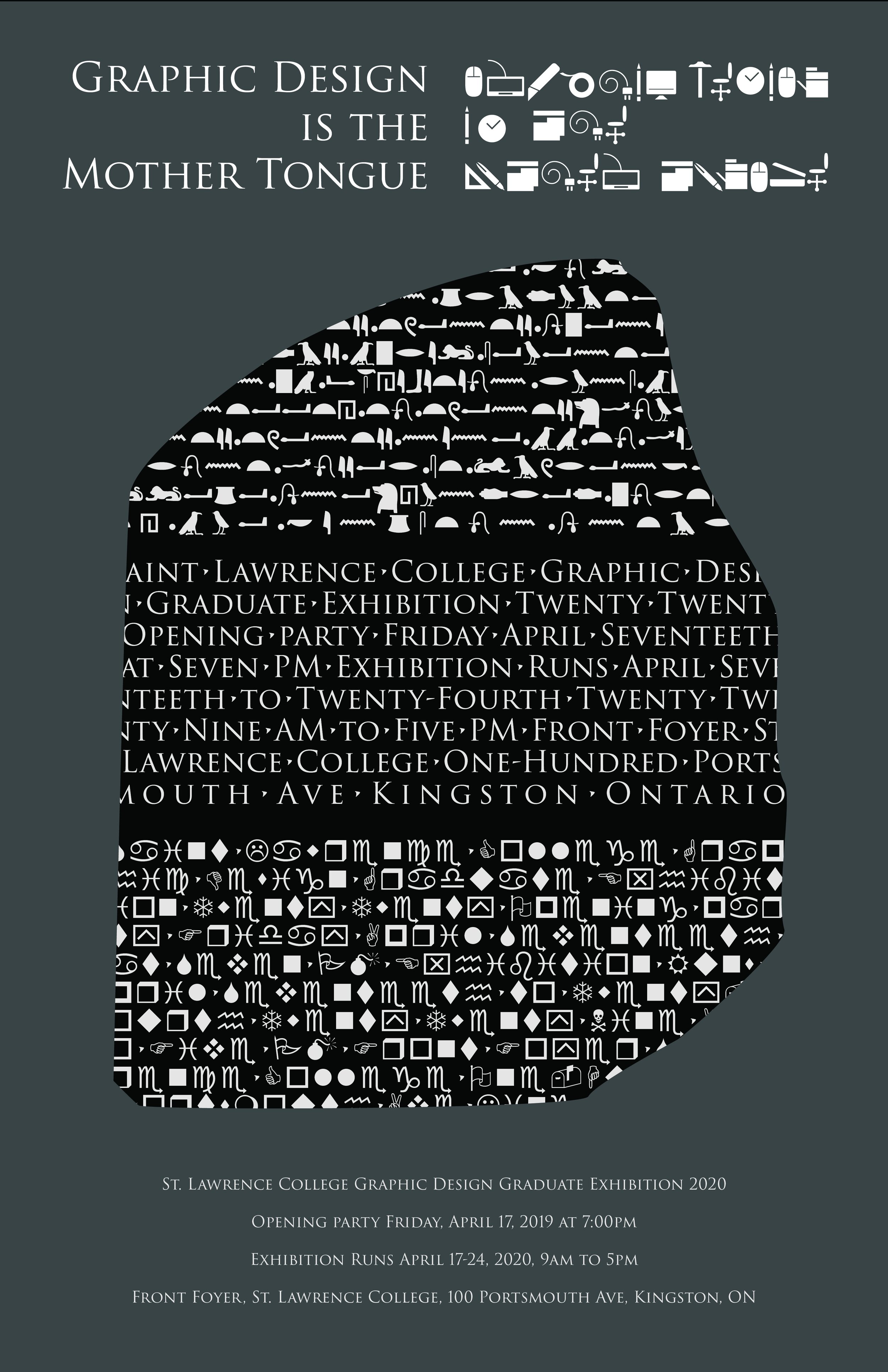
Graphic Design is the Mother Tongue
Lingua Franca – The Language of Mutual Understanding
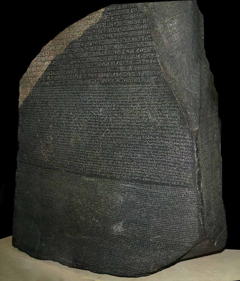
The Rosetta Stone as it exists today
Result
In an effort to emulate the Rosetta Stone, I set three blocks of text in a similar-shaped cluster stacked vertically. Each cluster uses a different set of characters, all drastically dissimilar. The center cluster is the largest and the only one set in normal Roman characters. The other two use pictographic characters that would be impossible to read. The similarity of the type clusters and their identical number of characters should lead the audience to realize they all say the same thing in different languages.
The top pictograph set is referencing classic Egyptian Hieroglyphics. The character set is a simple replacement for the 26 letters in our alphabet, so it does not truly say anything in real Ancient Egyptian.
The bottom pictograph set is a custom-made collection of characters meant to resemble the tools used in Graphic Design. This set is another direct replacement of the traditional characters.
All three clusters are placed on a dark granite texture background that is meant to further reference the actual Rosetta Stone.
Approach
A professor of graphic design mentioned how the field would be more accurately called Visual Communication. This re-wording has helped me explain the idea of graphic design to many individuals who are not familiar with the subject. This is where I began to develop the current poster design.
When considering how “Visual Communication” might be expressed purely through type, I began thinking about ancient Egyptian hieroglyphics and the Rosetta Stone which enables us to translate them. This artifact was discovered in the early 1800s by accident and it featured the same block of text written in three ancient languages. Two of those languages had been lost to the ages and no one knew how to read them. The last was a form of Greek which was still translatable.
These three languages, and all written words, are attempts at visual communication, but they require the viewer to know how to read. Perfect visual communication is hard, if not impossible. To speak the same idea to every viewer is the goal of graphic design. The preciousness of a translation key like the Rosetta Stone indicates how challenging pure universal communication can be.
A prototype design featuring an overt reference to the Rosetta Stone and three existing typefaces, Hieroglyphs, Roman Style All-Caps, and modern symbolic WingDings.
A series of pictograms used to establish a metaphoric “language of graphic design”
The final design solution reduces the illustrative elements and drives the message with typography only.


