Icarus Taverna
Restaurant Brand Identity
Brief
Icarus Taverna is a fine dining restaurant opening in downtown Kingston. The location needs a clear branding strategy that can be adapted to a number of applications both large and small. The main focus will be a logo design that is matched with appropriate type choices.
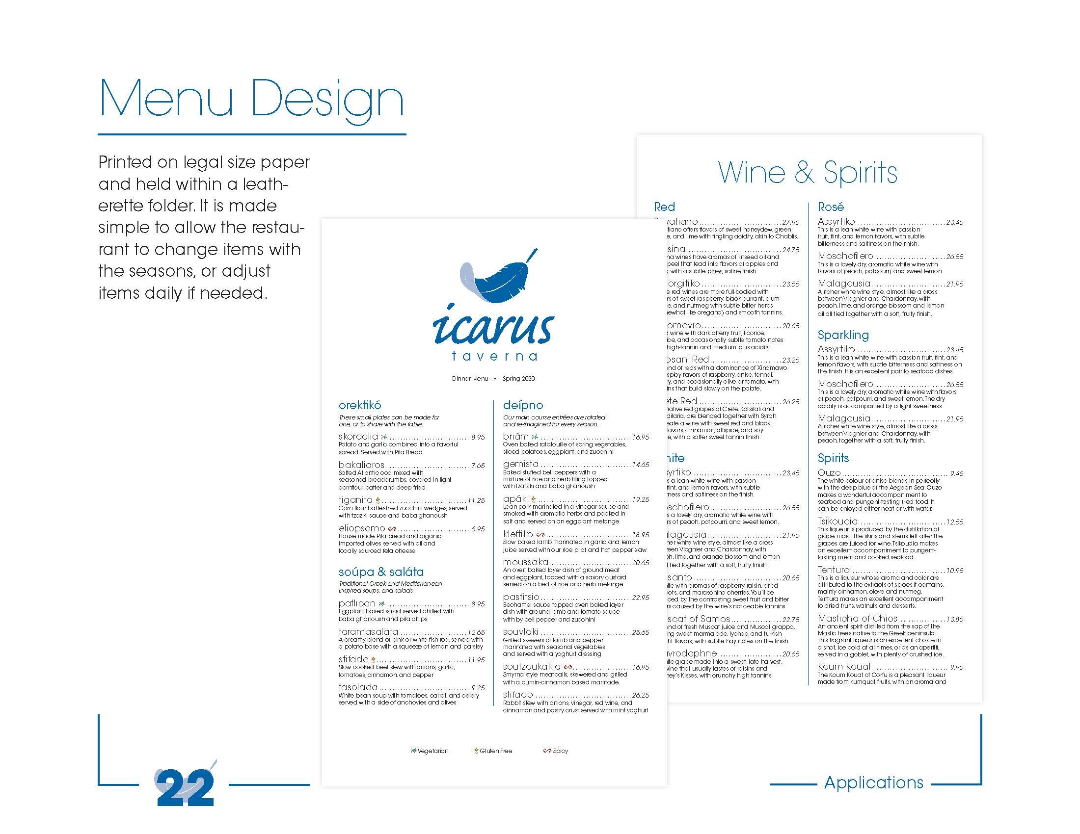
The brand identifier will be applied to a menu design. The menu will be arranged for readability, but also it will reflect the corporate ideals of Icarus Taverna. The restaurant is traditional and authentic, although it is also high-end and modern. The brand identity should match the accepted language of modern high-class food service, namely by using a stark and serious menu layout that is full of well-described semi-exotic dishes reimagined for local audiences.
The menu design must be set as a long vertical single page, printed on 7¼“ x 12” medium weight coated paper. The menu items will be switched out regularly, so the design must be flexible enough to accommodate some changes. The final menu designs should be printed on high quality paper with a slight yellow parchment hue. The menu will be printed and held within a rigid leatherette folder which features the main logo and restaurant name on the cover.
Icarus Taverna is a Greek restaurant. Borrowing from tradition, most Greek restaurants utilize the classical imagery of white columns and bright blue water. These colours reflect the national flag of Greece well. Alternative clichés of Greek restaurants include silhouetted pottery, ruins of temples, and the weapons and armour favoured by Greek soldiers. This project should attempt to avoid as many of these overused images as possible.
Concept
Icarus Taverna shares a name with one of the most well-known characters from Greek mythology. Icarus was the son of Daedalus, a great inventor. Both were held captive on an island by an evil ruler. They managed to escape by collecting feathers and wax and building wings with which to fly home. Icarus was warned not to fly very high because the sun’s heat would melt the wax and he’d fall and drown. Icarus was too excited and ignored his father’s advice which led to his tragic death. The story is a moral tale about obeying your elders, but also about keeping a level head when you’re confronted with excitement or danger.
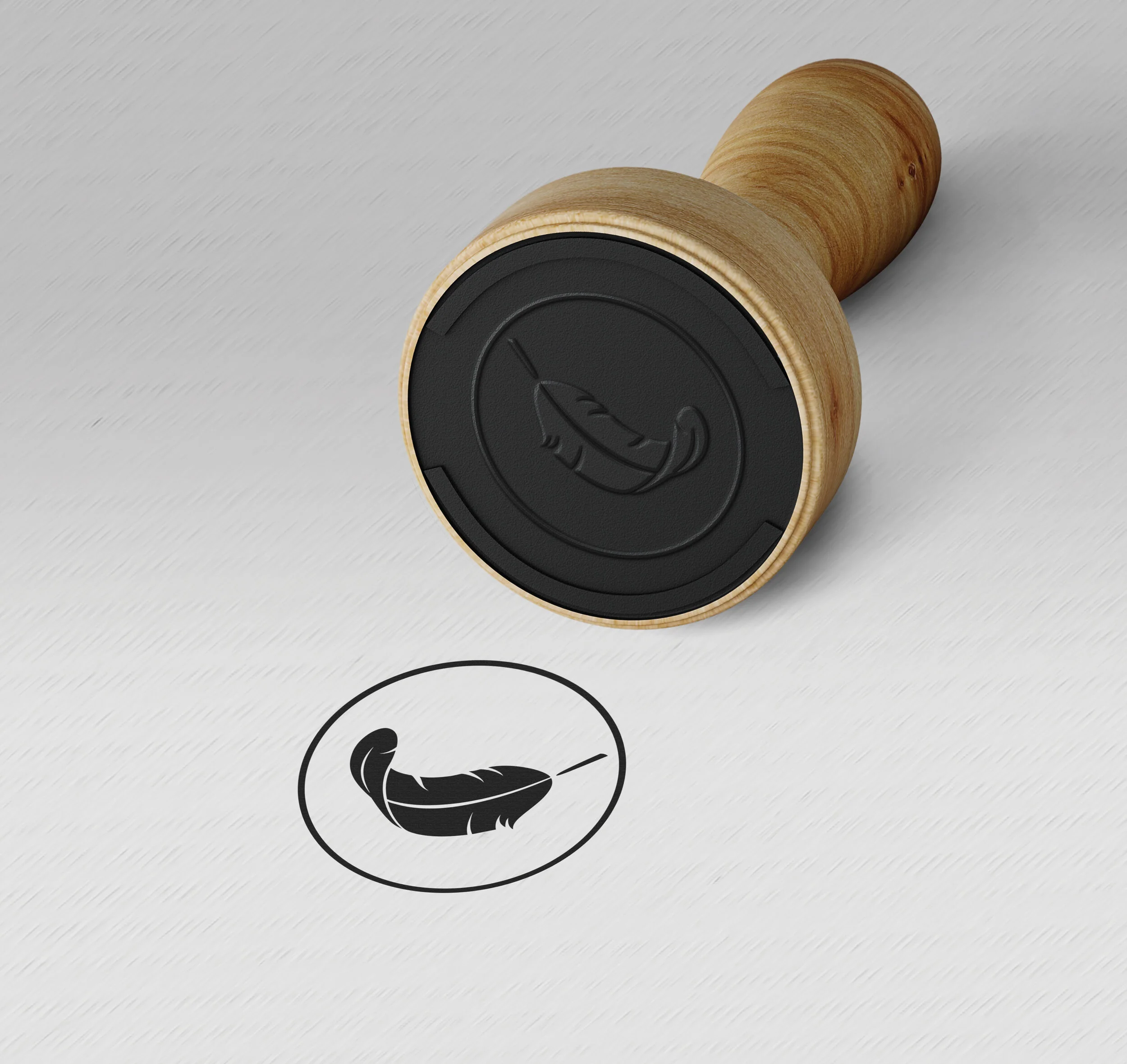
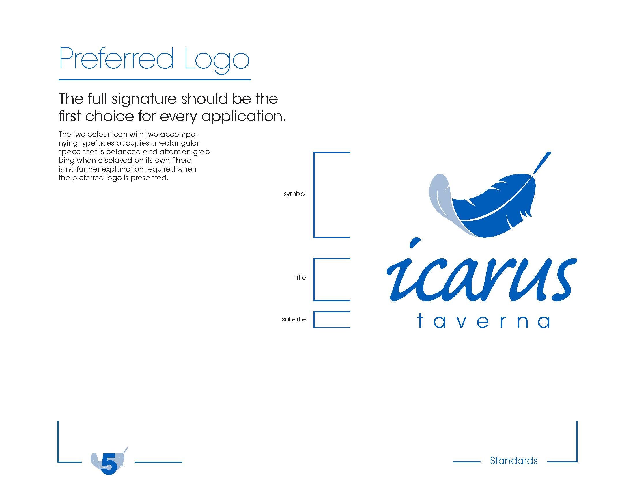
Using this narrative as a springboard, the design exists as a graphic visual representation of the name, Icarus. A single feather represents the key moment in the life of Icarus. The style in which the feather is rendered is reminiscent of the style seen on Greek pottery. Large solid black areas are broken up with thick deliberate white flowing lines. The feather is also a symbol of delicate lightness. A feather is fragile and yet it does not have to be temporary. With attention, a single feather can be preserved and displayed or adapted into a multitude of applications. A feather represents care and attention, not unlike the care and attention a dedicated waiter or chef might use to serve patrons in a fine dining restaurant. A feather is also a single part of a larger group of feathers. As a team, they work together to create the miracle of flight. Again, the notion of teamwork is appropriate for a restaurant whose chaotic work is made to appear seamless and easy to the customer.
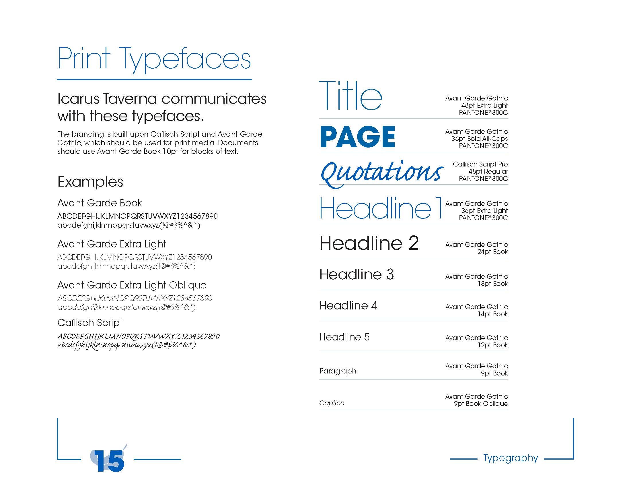
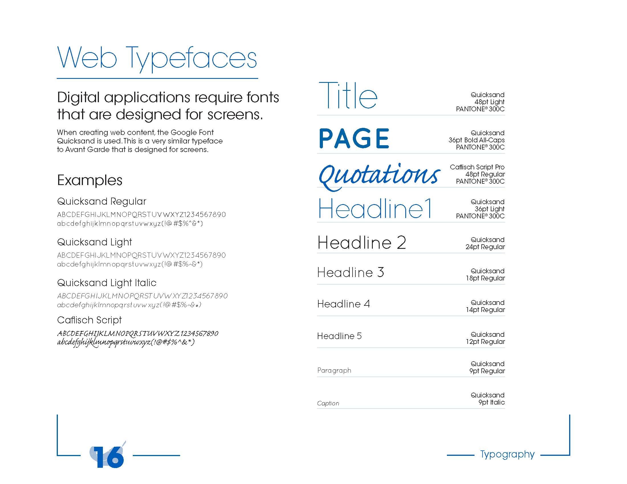
The typeface used for the majority of the menu design is Avant Garde Gothic. This is a geometric style sans-serif font. It is highly legible and functional at large and small sizes. It also exudes modernity through its use of delicate low-contrast light forms. The bold style is dominant and solid and serves to break up the sections simply by being a heavier weight.
The main title Icarus is rendered in a variation on a typeface called Swansong. It is clear that the letters evoke a clean classy feeling, not unlike an elegant white swan. The original letters have many divots and imperfections meant to resemble brush strokes. In this application, the letters have been smoothed and made to flow into each other more clearly. The result is a light and flowy handwriting typeface. The angled letters reflect the angle of the feather as well.
The brand identity uses two colours of blue. Depending on the application, it can be displayed in the darker or the lighter colour. In the perfect arrangement, the feather features both colours while the main title is written in black with a dark blue line underneath. The shades of blue are reminiscent of the classic blue and white colours familiar to Greek restaurants and the culture as a whole. While it would be sensible to completely eschew the traditional colours, it is advisable to keep some classic clichés in place to reinforce the ethnic style of the restaurant. There are probably a large number of people who do not know the connection between the mythological Icarus and the image of a feather. The blue and white contrast subtly restates the notion of Greek culture.
Brand Identity Guidebook


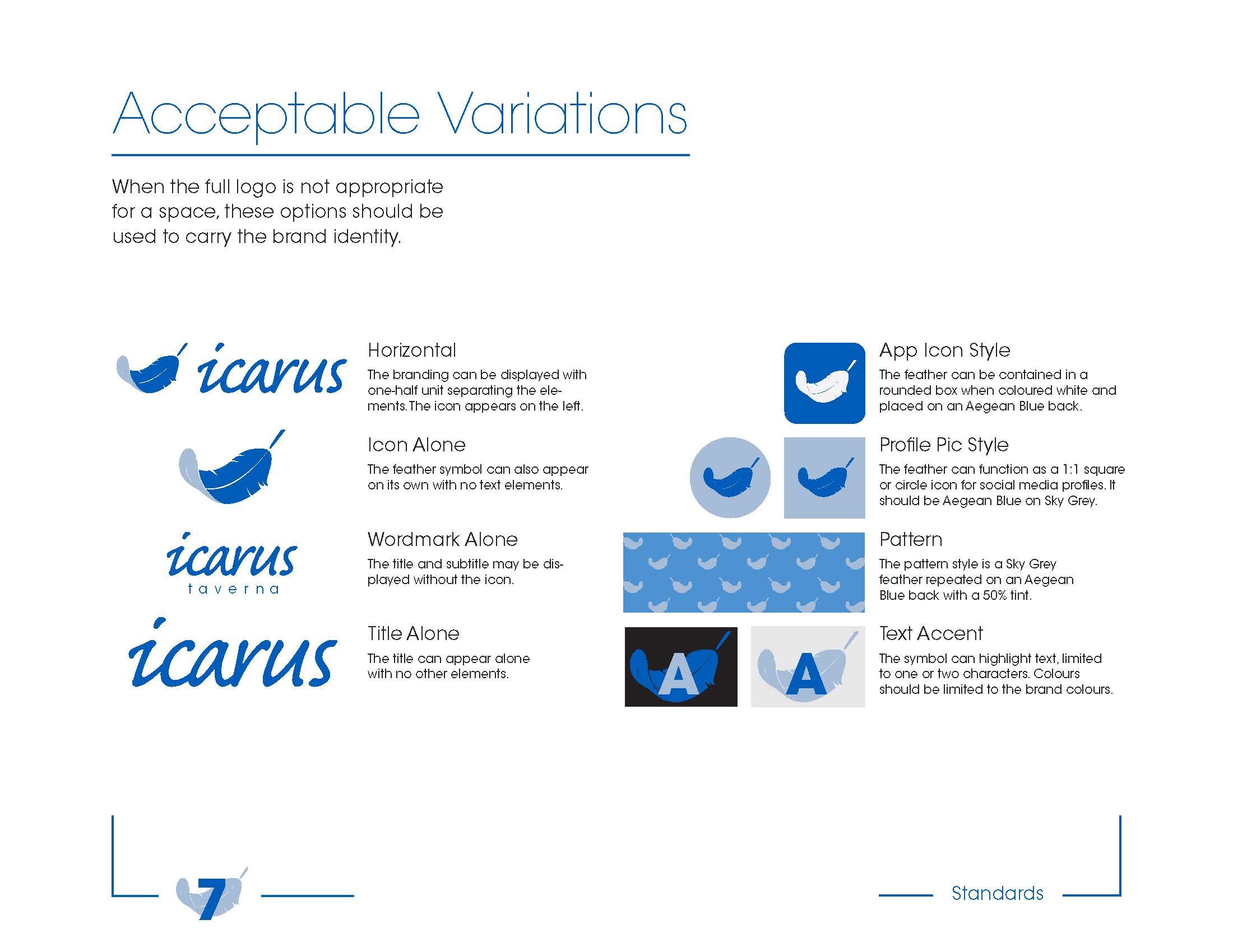
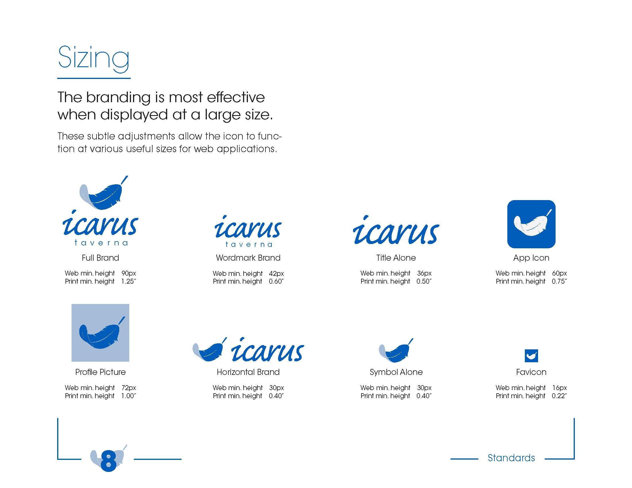

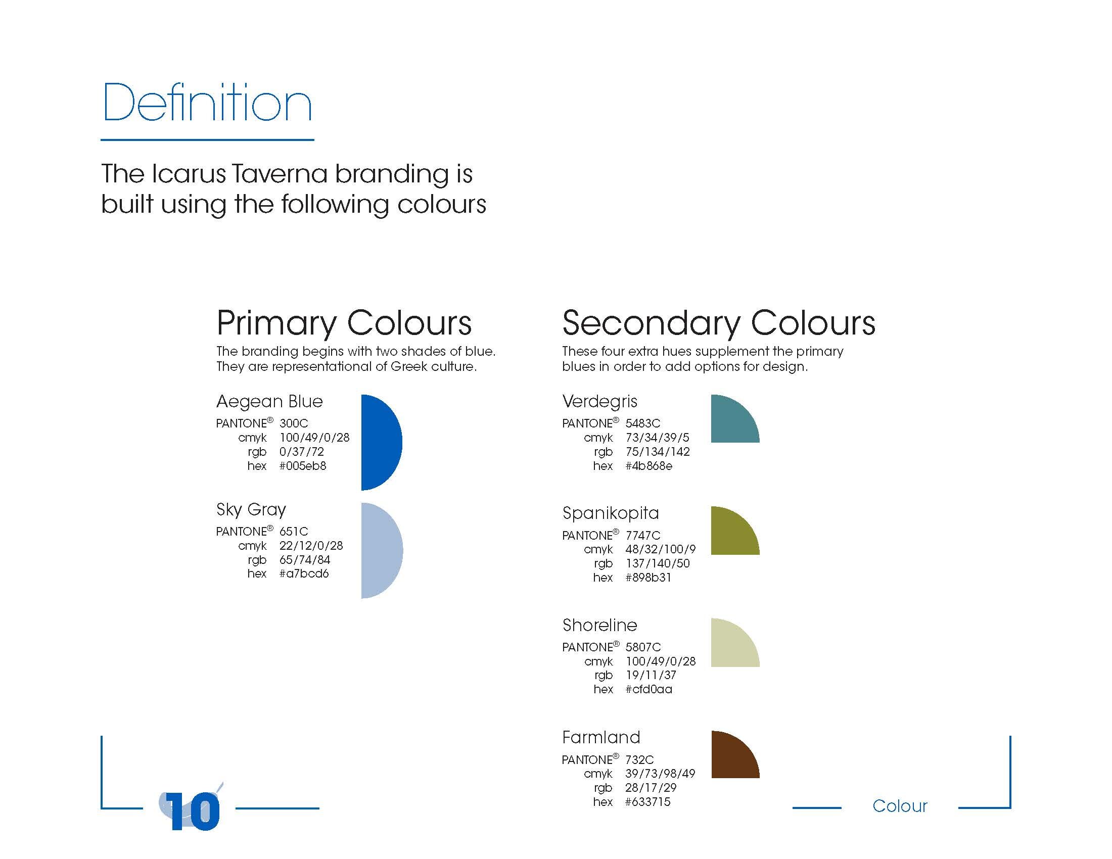
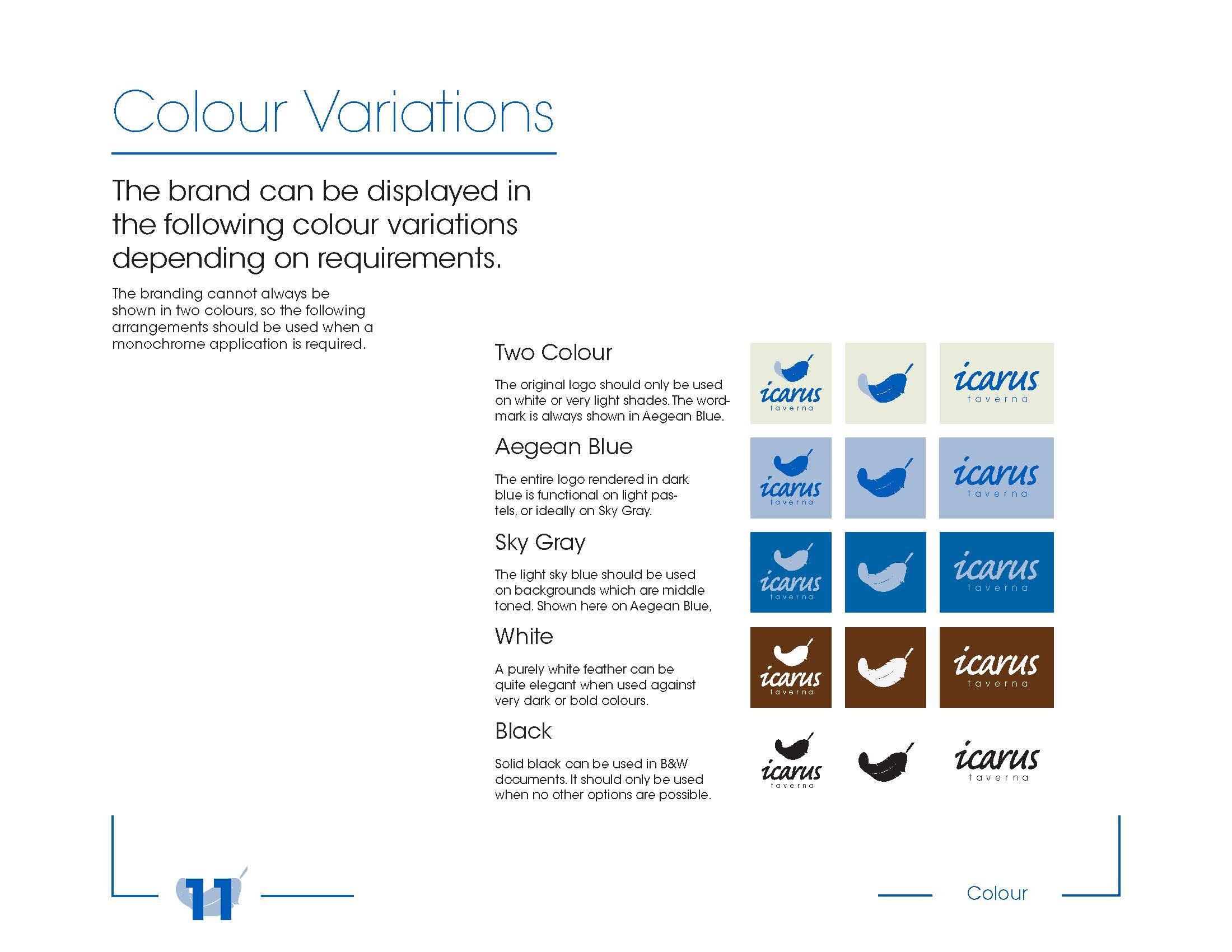



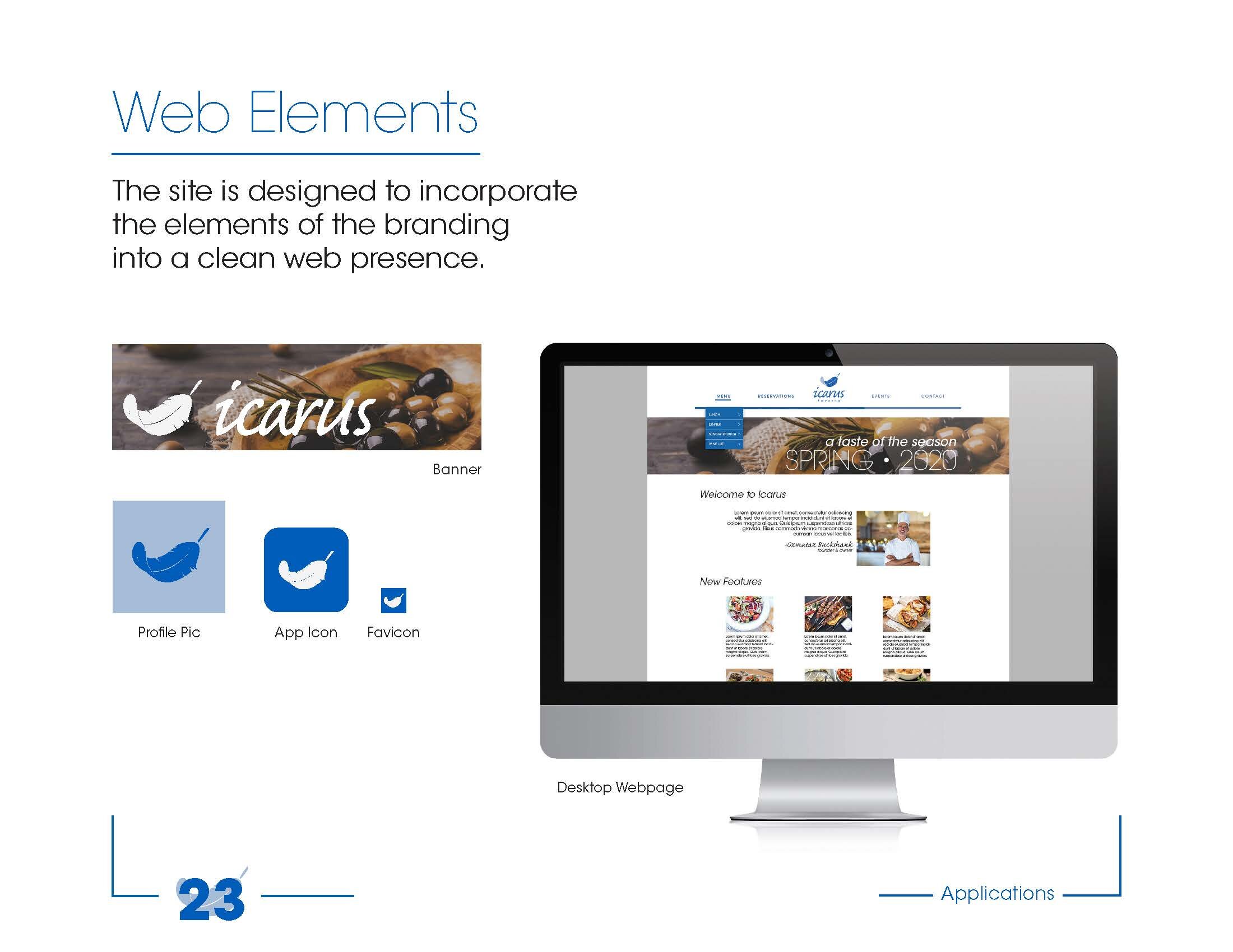
Strategic Brief
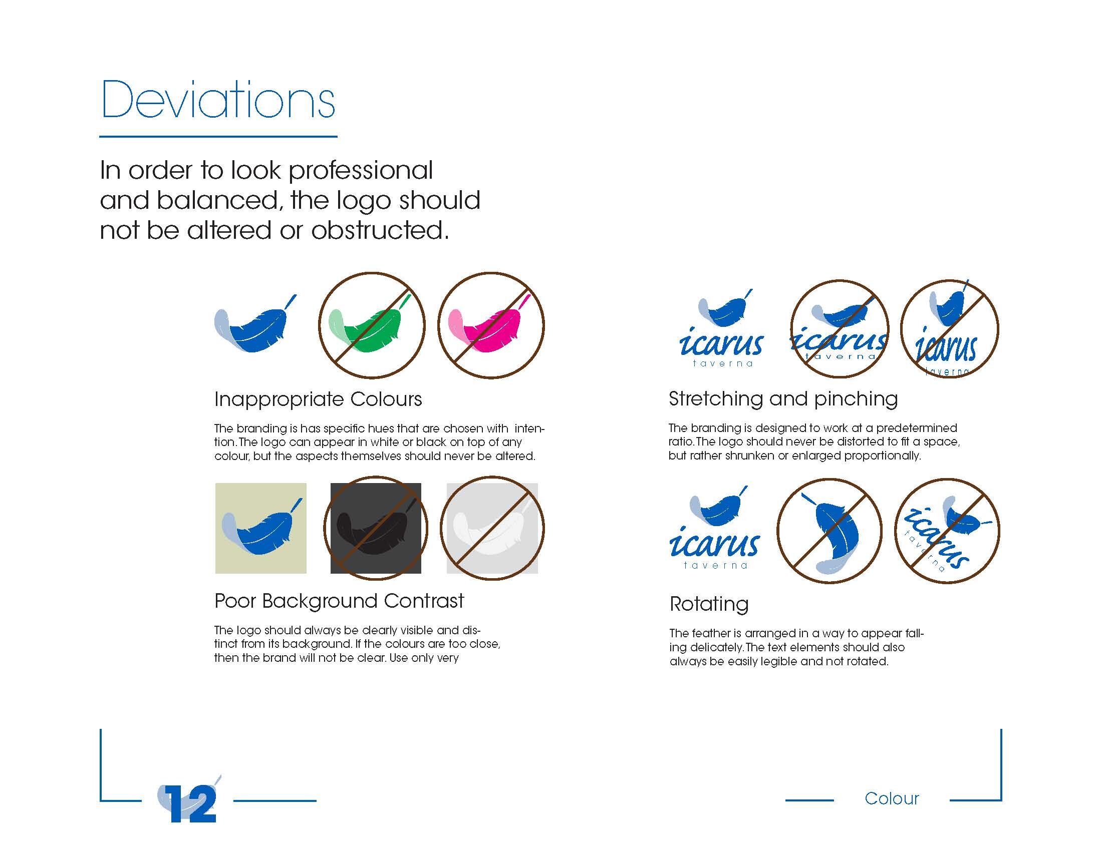
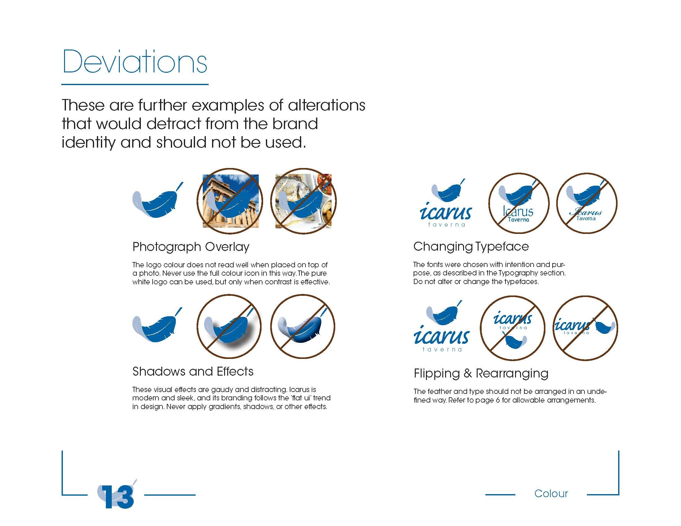
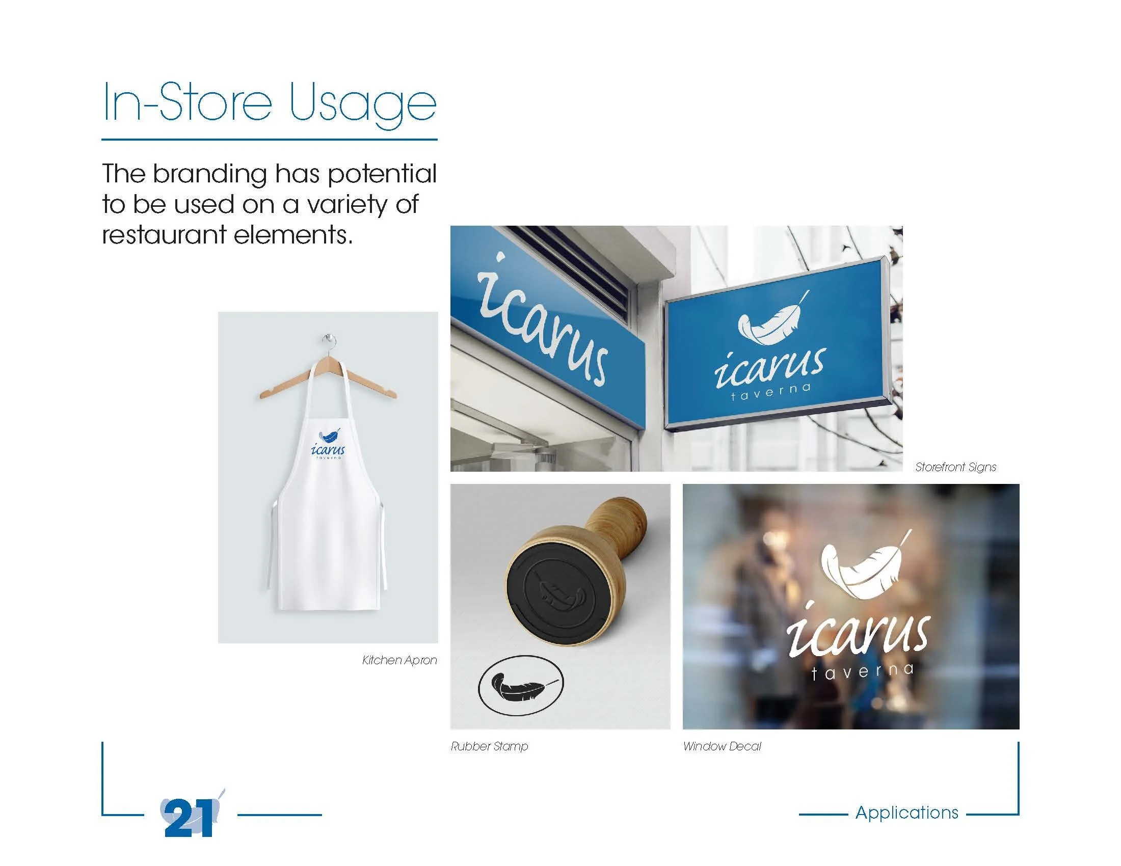
The guide must dictate every conceivable appropriate way to use the established brand. The symbol and title can be applied to several things that have been defined, but also many more will be created. The design cannot account for every conceivable application, so it must have rules defined for the client to use.
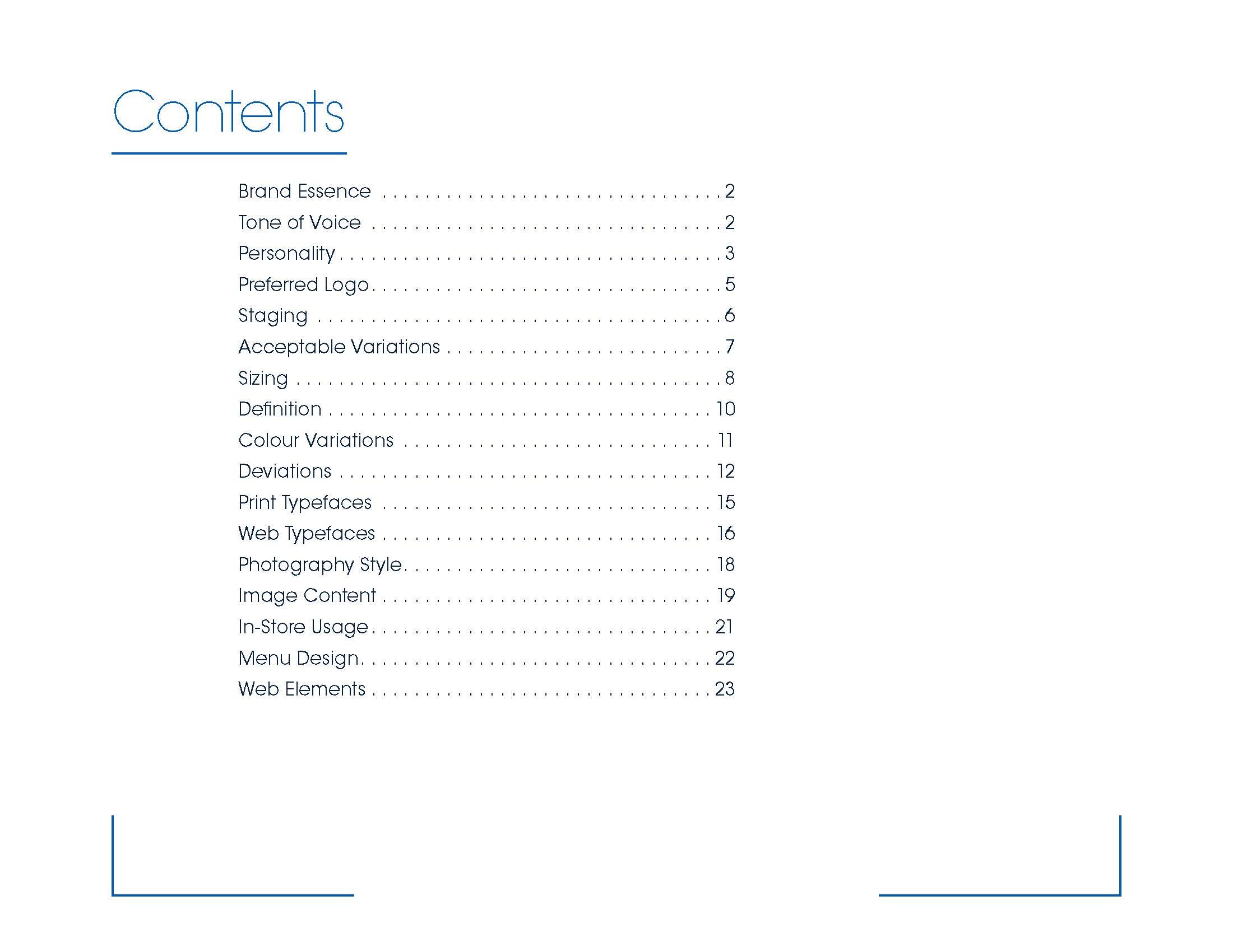
The guide must be easily usable and direct in its messaging. This document will be used by the business owners, who are unlikely to be versed in design language. A table of contents and obvious headlines are essential. The guide should be broken into sections that facilitate understanding.
The guide must be attractive. Clients will want to see something worthy of their investment. They will be proud to refer back to it and to demonstrate it to their employees and other clients.
The design should be understated as well. Excessive use of visual decorations and language added for flavor should be minimized. Clients will encounter this text many times, and clever jokes and quirky language becomes stale quickly.
Guide Rationale
The brand identity guide was assembled following these existing style choices. The background is white and most visual decorations are shown in Pantone 600C, the main brand colour. These angular blue lines and letters against the white backdrop further mimics the Greek cultural aesthetic, especially in their exotic tourist destinations.
The guide is arranged on a letter-sized document in a horizontal layout. This is meant to make it easier to read on a screen, which is the intended application. Blocks of text are arranged along the left column wherever possible. A large top margin serves as a legible headline starting point in the top-left corner of each page. The page margins are displayed on each page in a subtle way using lines that highlight the page number and section title in each lower corner.
Section dividers were created to make the transitions more overt. A pattern of feathers on a dark background was created to fill this space, which entered the guide as an additional application of the brand. It is hoped this pattern bears a slight resemblance to the Luis Vuitton pattern or other high-end repeating patterns with flat designs. The section dividers required titles, which were placed on a white bar. This bar was made to fit the same location as the title on the cover.
A page numbering system was applied. The numbers were set in a very bold version of the main typeface and arranged on top of a pale version of the feather symbol. This was a new approach to the existing logo, which was then defined within the guide. The logo should only be an underlay when contrast is exactly correct.
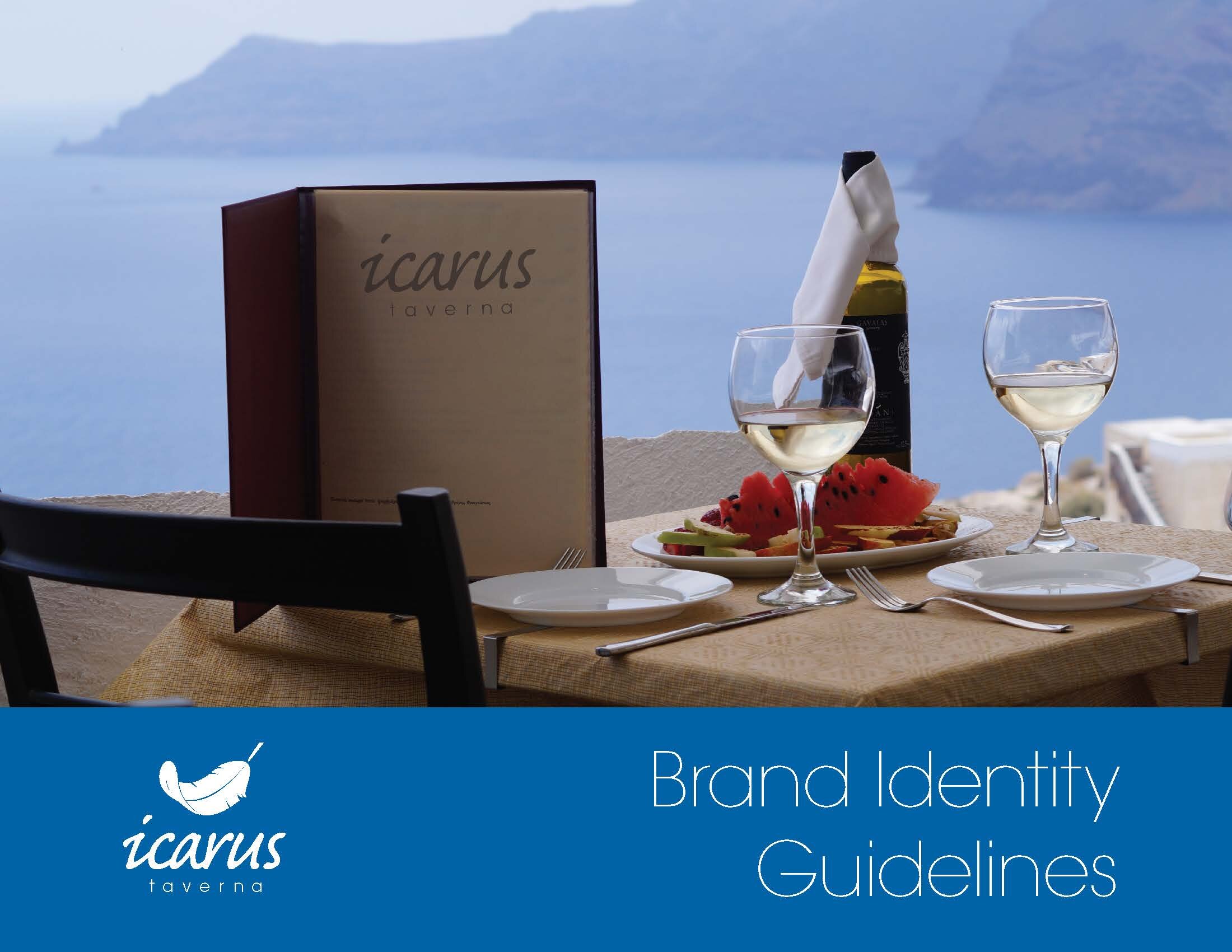
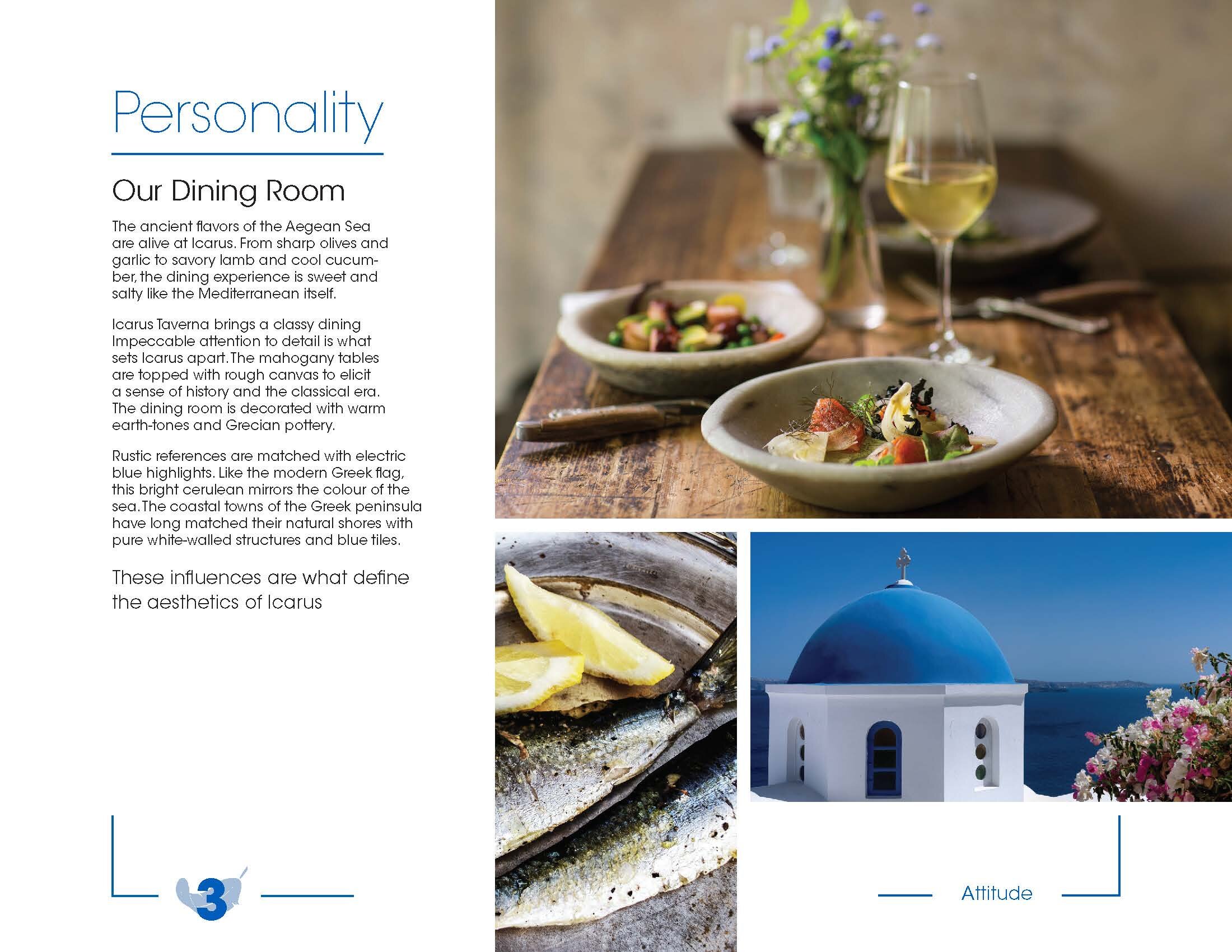
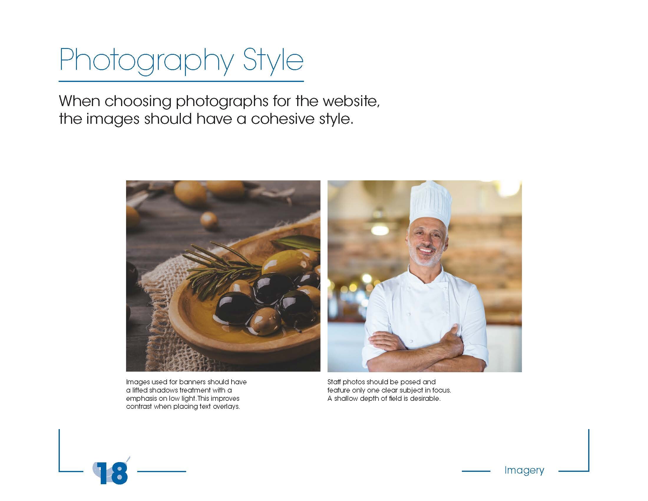
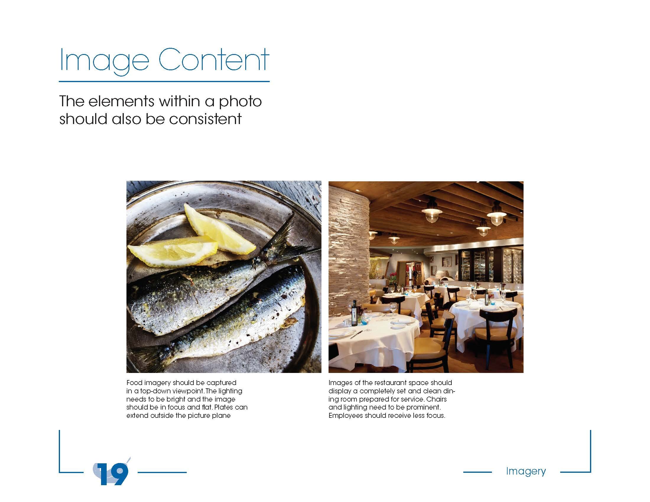
Photography was collected from creative commons licensed for reuse images on flickr.com. When the restaurant is fully furnished, new photos of the actual space can be inserted. These choices reflect the intended aesthetic and development treatment all photos should take.
The style guide is meant to be a mature, sober document that is useful for its purpose. This is not a public-facing creation - it is designed for restaurant managers and owners. It should be clean and direct and fast, just like a commercial kitchen.

