Interaction Design
Creating an interface is somewhat akin to creating a webpage. Web design is a relatively new field, being only around thirty years old at this point. Interaction design has been in development a bit longer, although its relevance has skyrocketed in the last ten years with the smartphone revolution. Anywhere a person controls a machine through an interface is subject to interaction design, and that is not limited to touchscreens.
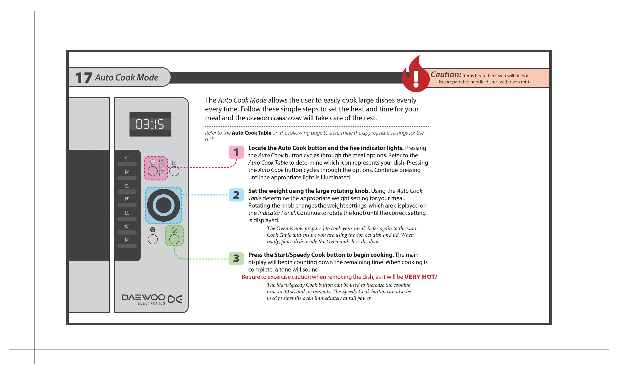
Some interactions are designed by engineers with little sense of balance or aesthetics. Some are designed to be beautiful but fail when used daily. Many interactions require an extensive user manual to explain the functions. The perfect interaction requires no explanation, and is both functional and attractive.
The majority of interaction design comes in the form of a mobile device application. These can be created rather easily nowadays with little knowledge of coding. The trick is to always maintain focus on the goal and remember why the app exists at all. Any business that features an app should already have an extensive website. The app exists to do things that cannot be done on the website. If the app is just a vacuous billboard, the the brand is cheapened.
The interactions I have designed here focus primarily on the function and ease of use. Every decision is made with the utmost restraint. While this field of design was never particularly inspiring to me, I have found it to be an interesting design puzzle to be solved. I liken it to a “choose your own adventure” book, where every option must be considered. What if you were at point 7 and wanted to go to point 3? What if you enter the wrong information and need to correct it? What if your phone lost power and you had to restart the process? No-matter how simple the idea, the result is always surprisingly complicated.


