A Better Credit Transfer System
Applying design research to improve an interaction
Strategic Brief
Research
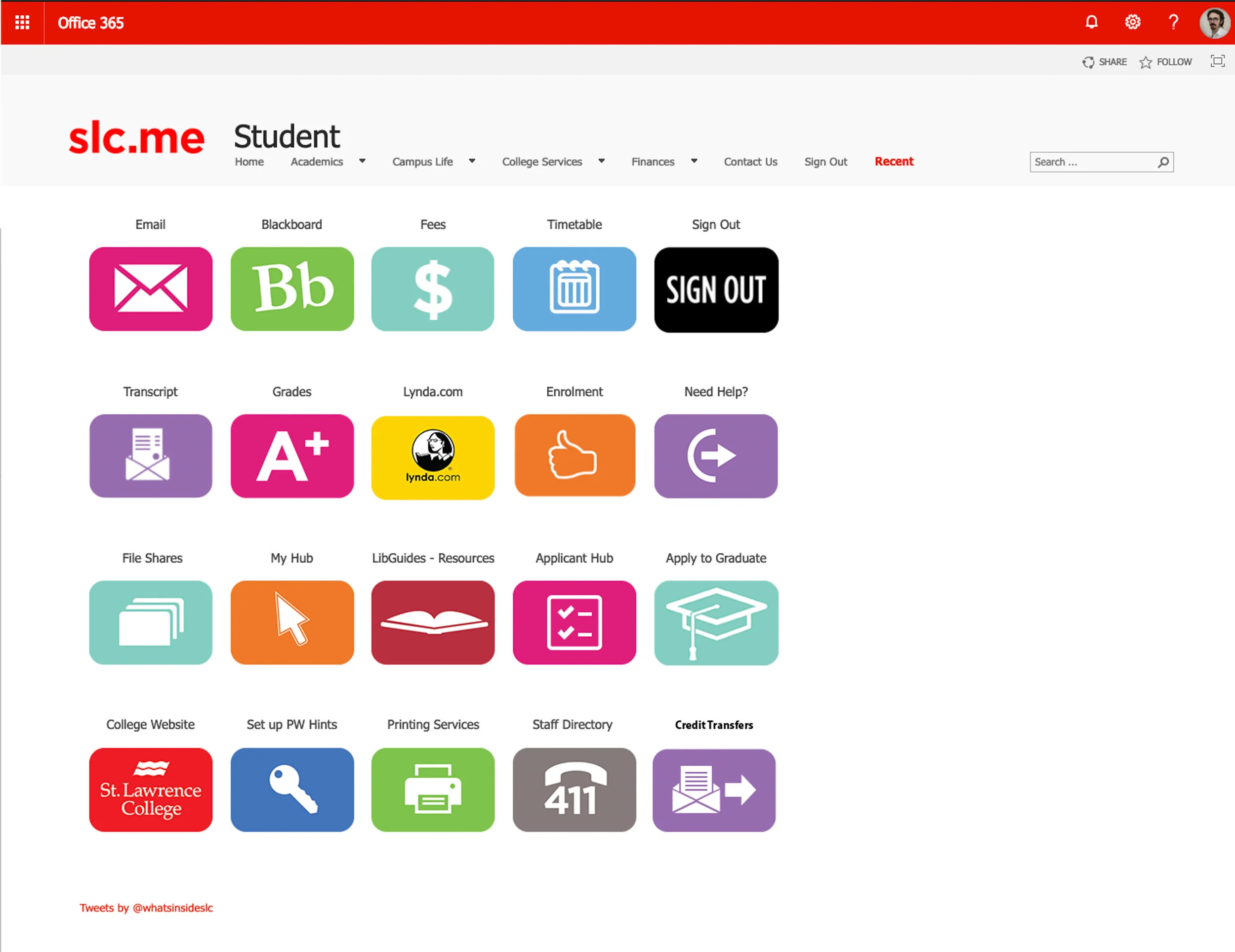
The Student Portal features many tools, but it would benefit from having a Credit Transfer interface, as seen in the bottom right corner.
The established system of transferring credits from outside SLC is clumsy. Whenever separate organizations such as Ontario Colleges need to collaborate, there is bound to be disagreement over methodology which creates fundamentally unnecessary obstacles. In extreme cases some students are required to obtain a sealed envelope to deliver to SLC in order to validate their credits.
While it would be ideal to make sweeping changes to the legal requirements of all schools within Ontario, this may not be immediately feasible. In reality, there will always be some amount of seemingly meaningless paperwork or time-wasting task that is required of an adult. A better approach to this problem would begin from the bottom and create an information design system. Students primarily need a concise and obvious way to understand their credit transfer options and the timeline/status of their transfers in progress.
From a middle-out perspective, the faculty and student advisors at high schools and all colleges in Ontario ought to have a well-designed FAQ document regarding the most up-to-date information about credit transfers. Having an accurate sense of the timeline is crucial for the various types and conditions of transfer credits.
Design Solution
A singular website which contains a database of classes and their course codes as well as instructions for obtaining credit validation. Simple Q&A pages help users determine what they need to search for. Timeline and due dates are emphasized as much as reasonably possible. FAQ and area for faculty interaction is made obvious. Calendar, SMS, or email updates available.
Design Mandates
The basic concept outline
The Student Perspective
Must-haves
Make available options more apparent
Put the link in a more prominent location on the student slc.me landing page
Create links from relevant areas to the credit transfer information page.
Reliable status updates available 24/7.
Calendar integration, email reminders, overt timelines
Searchable database of classes
Could-haves
Encourage all schools to standardize their communication methods, thus solving the need for sealed paper envelopes and transit at the student’s expense
The Administration Perspective
Must-haves
Established FAQ set of instructions to explain options to students
Memorable, simple infographic style “quick-start” guide to explaining credit transfer system to students.
Should-haves
Database/spreadsheet of students who apply for more complicated transfers (international, etc.) to facilitate communication and availability for updates and
re-explanation.Awareness campaign for student success facilitators and the department of student services in order to make them more aware of the options available to students.
Talk aloud testing
Recruitment script
Students at SLC will be approached by the researcher in the Graphic Design studio during the free time between class sessions. Alternatively, student volunteers might also be approached in the SA or the Cafeteria if more participants are needed. The researcher will begin with the following recruitment speech.
This is a test of a typical user’s experience when attempting to perform a task on the SLC.ME website. Would you care to contribute your opinion in order to improve the design solution? This should take only 10 minutes at most.
We require the participant to explain aloud the sequence of choices they make to accomplish a task. In this situation, the task is to apply for a transfer credit through the SLC.ME student portal, then check the status of the application. Please view these pages as if they were webpages on a desktop screen. Tell the researcher exactly what steps you would take to accomplish this task and be as specific as possible when describing WHY you are making these choices.
Informed consent letter
See attached letter containing full disclosure of the nature of the research and the participant's involvement, adequate comprehension on the part of the potential participant, and the participant's voluntary choice to participate. The volunteer is invited to retain a copy if they desire.
Purpose
This activity will document the typical approach a user applies when searching for the credit transfer information they require. Currently, some of the relevant information is displayed on a moderately obscure page whereas the remaining details are found deep within a massive document with the very broad title ‘Academic Policy Manual’. This redesign attempts to make the information and status of credit transfers more obvious and findable. The testing will determine if the design is successful by analyzing how quickly people choose the best link to follow. The test will also determine what other elements are competing for user attention and may be distracting or misleading and could lead to a colour change or re-wording of the design.
Scope
The design test covers layout, wording, and colour. It also tests the logic of the sequence and how well a user can follow that sequence. The test seeks to identify missing information or poorly sequenced tasks.
Method
At least three participants will be presented with printouts of browser screens and asked to indicate how they might navigate to the credit transfer information area. They will talk aloud about their thought process as they indicate how they would fill out the forms. They will be encouraged to say exactly why they make their decisions no-matter how basic and obvious those choices might seem.
Task
The user is asked to apply for a transfer credit through the SLC.ME student portal. The proposed sequence should be accomplished by following a sequence of basic forms spread out among three screens. If successful, the user will correctly understand how to fill out the forms on the first try, and they will be able to easily check the status of their application once the forms are complete.
Interview questions
Are there any other adjectives you would use to describe the interface?
Are there any concerns you can think of that have not been addressed?
What were your first thoughts upon seeing the design?
Did this interface remind you of any other interface experiences?
Do you use your telephone’s calendar app?
Do you have any other comments or observations?
Was any language unclear?
Analysis
Users will show a preference for some design features over others. It is hoped that a consensus will arise. The goal of the design is to make the transfer credit system more overtly accessible, and the amount of time spent searching for the correct area is a clear indicator of success or failure. The key piece of information to be gained is the time it takes to find the information and how many failed attempts are witnessed.
Rationale
Interview questions Results
Are there any other adjectives you would use to describe the interface?
Plain, Straightforward, Simple
Are there any concerns you can think of that have not been addressed?
Better progress trail
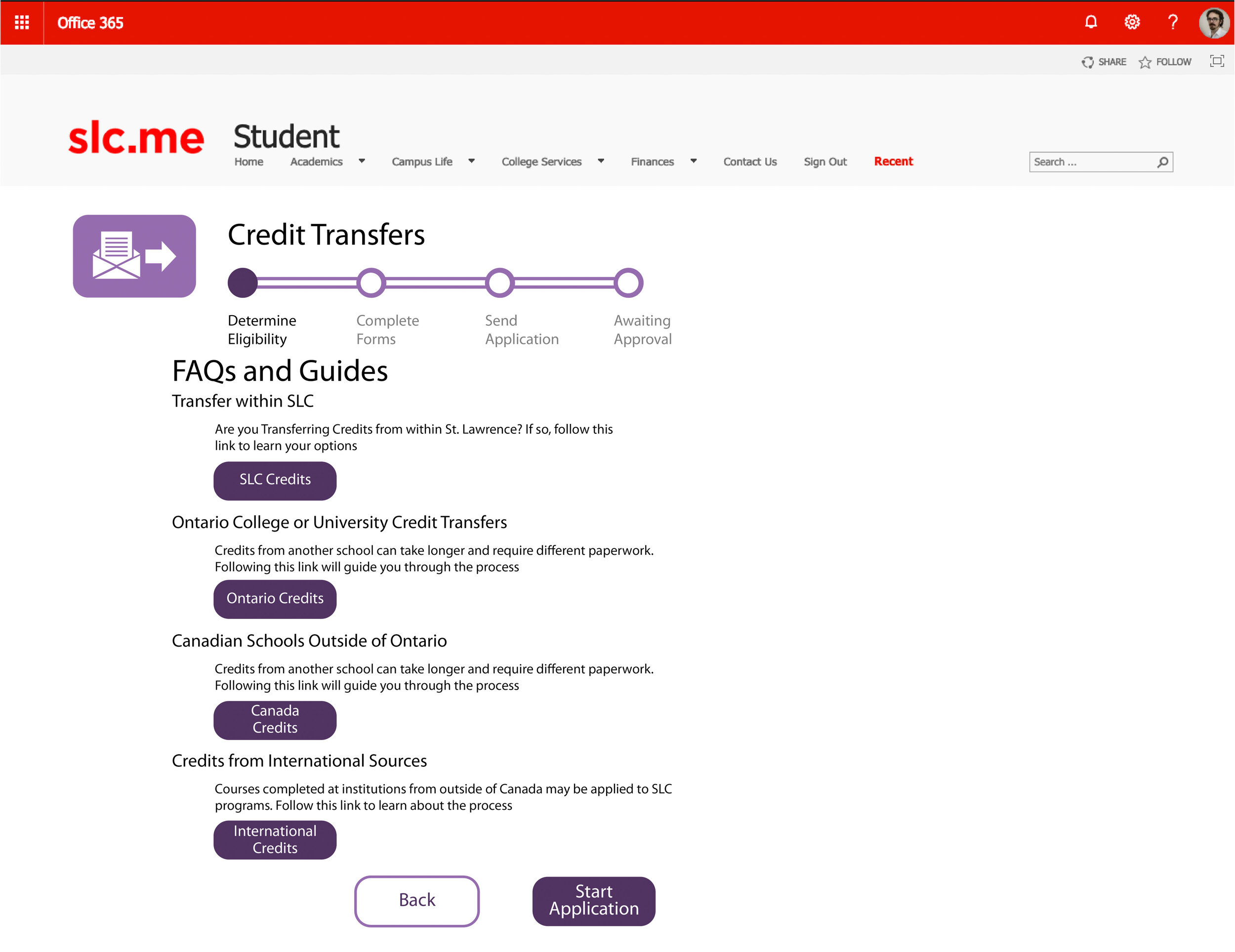
Buttons on FAQ page are strange
What were your first thoughts upon seeing the design?
It looks like a real SLC.me extension
Highlights the SLC.me arrangement of buttons
Did this interface remind you of any other interface experiences?
Job Application sites, survey sites
Do you use your telephone’s calendar app?
Fewer than half use a specific calendar app and most prefer email notifications
Do you have any other comments or observations?
Seems crowded to the left.
More steps in progress bar
Was any language unclear?
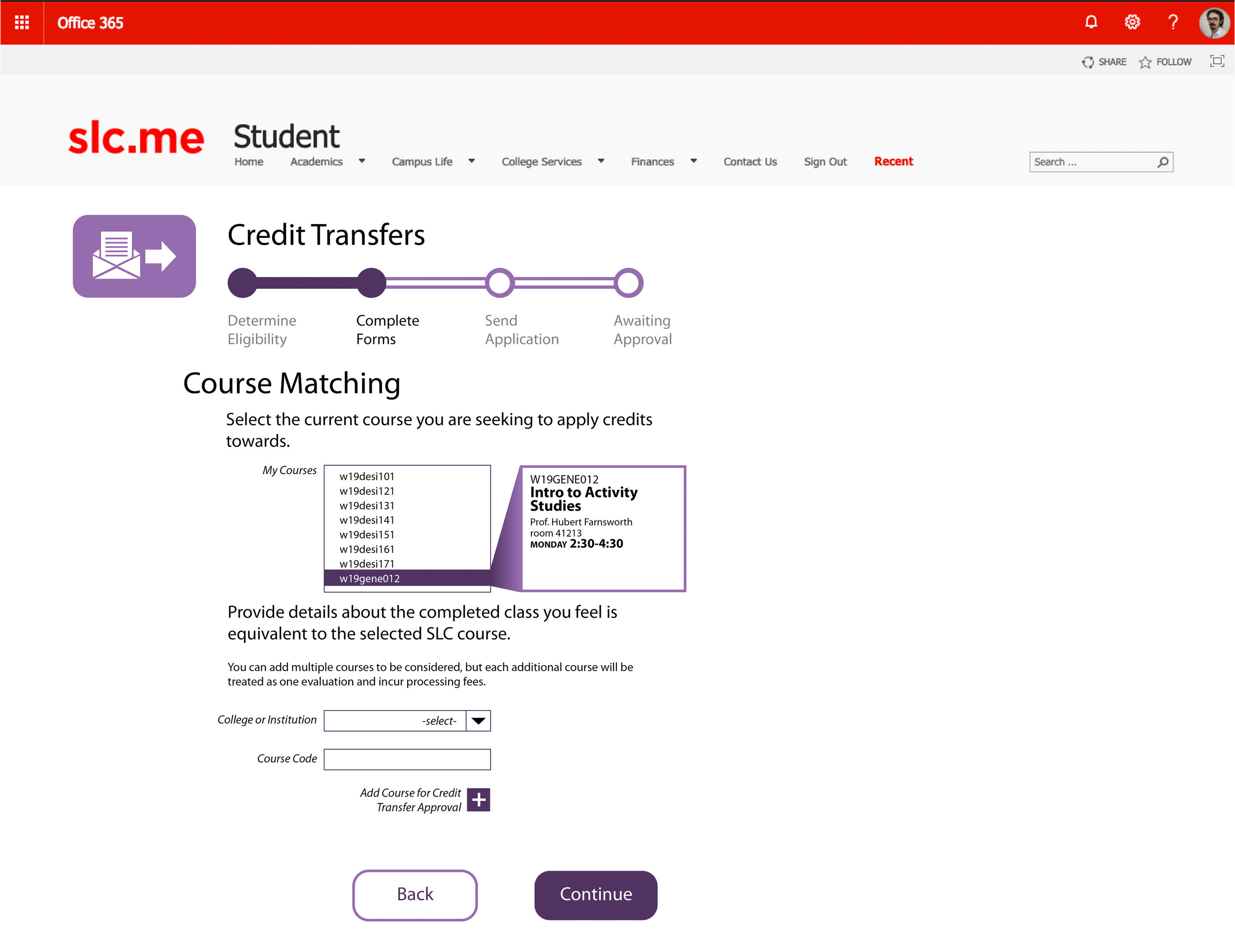
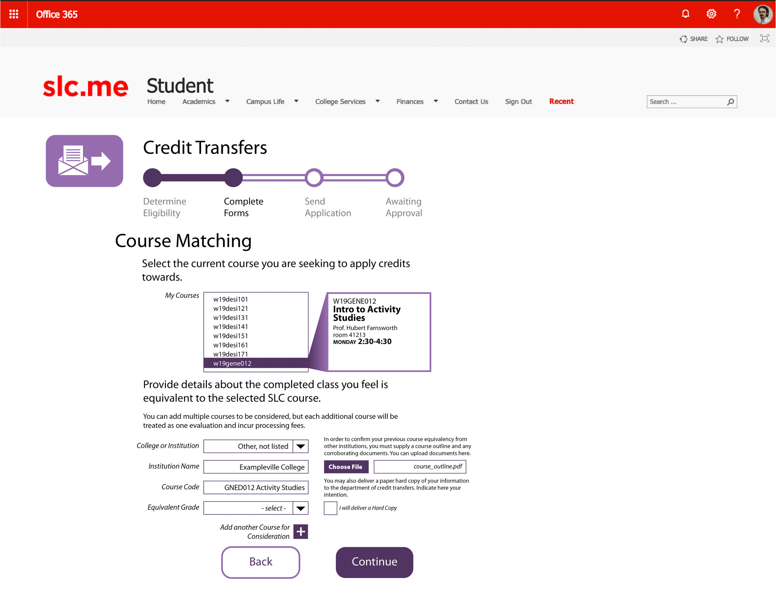
Course Matching page has a lot of info to digest
Progress bar could be better.
A large format poster summary of the project
Addressing the Mandates
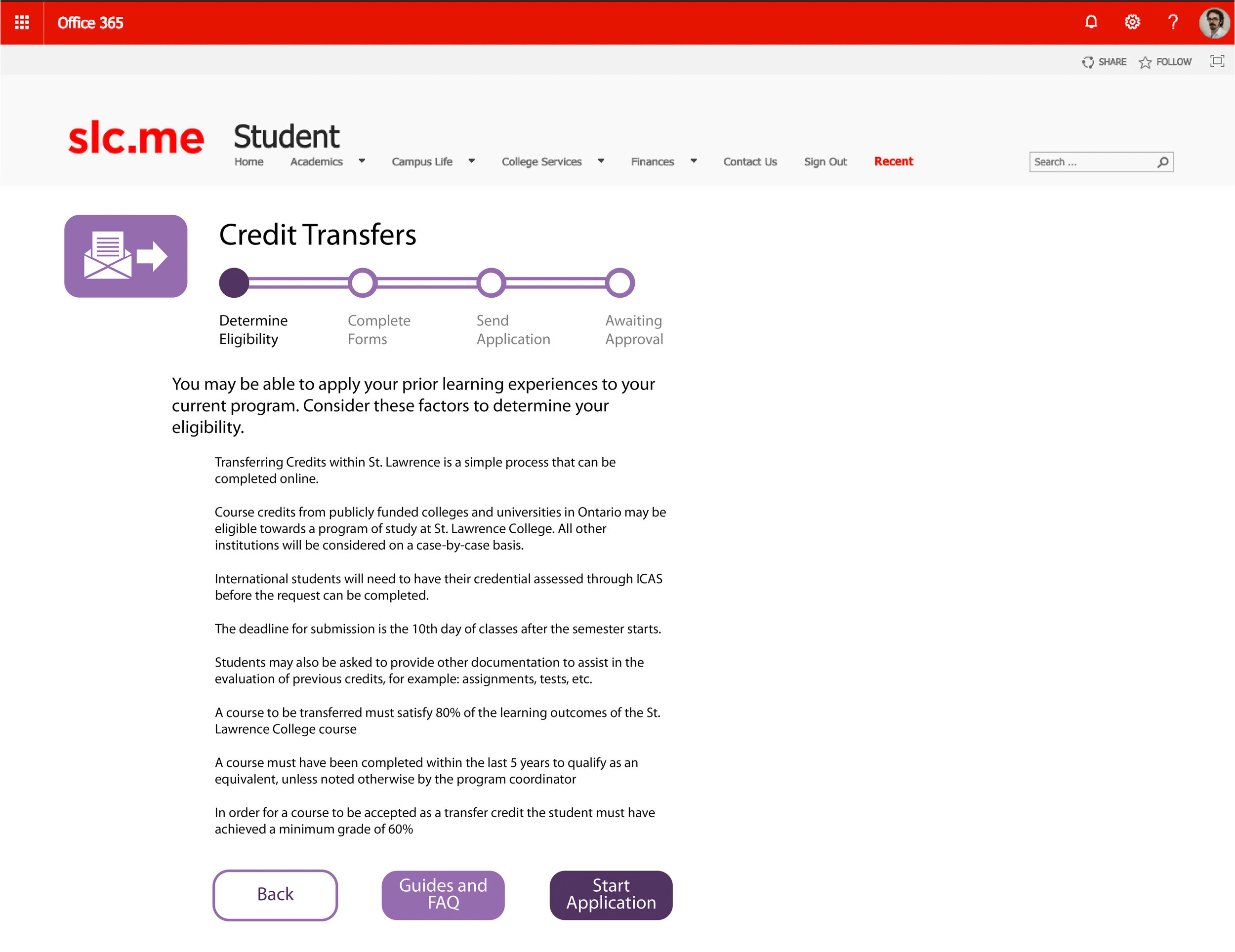
The first goal was to make the options available to students more overt. The prototype addresses this by first putting an icon on the main SLC.ME page the students are confronted with regularly. The first page a student arrives at upon clicking the Transfer Credits link is a very basic overview of the options. This page features a noticeable link to where the student can find further explanation of these options.
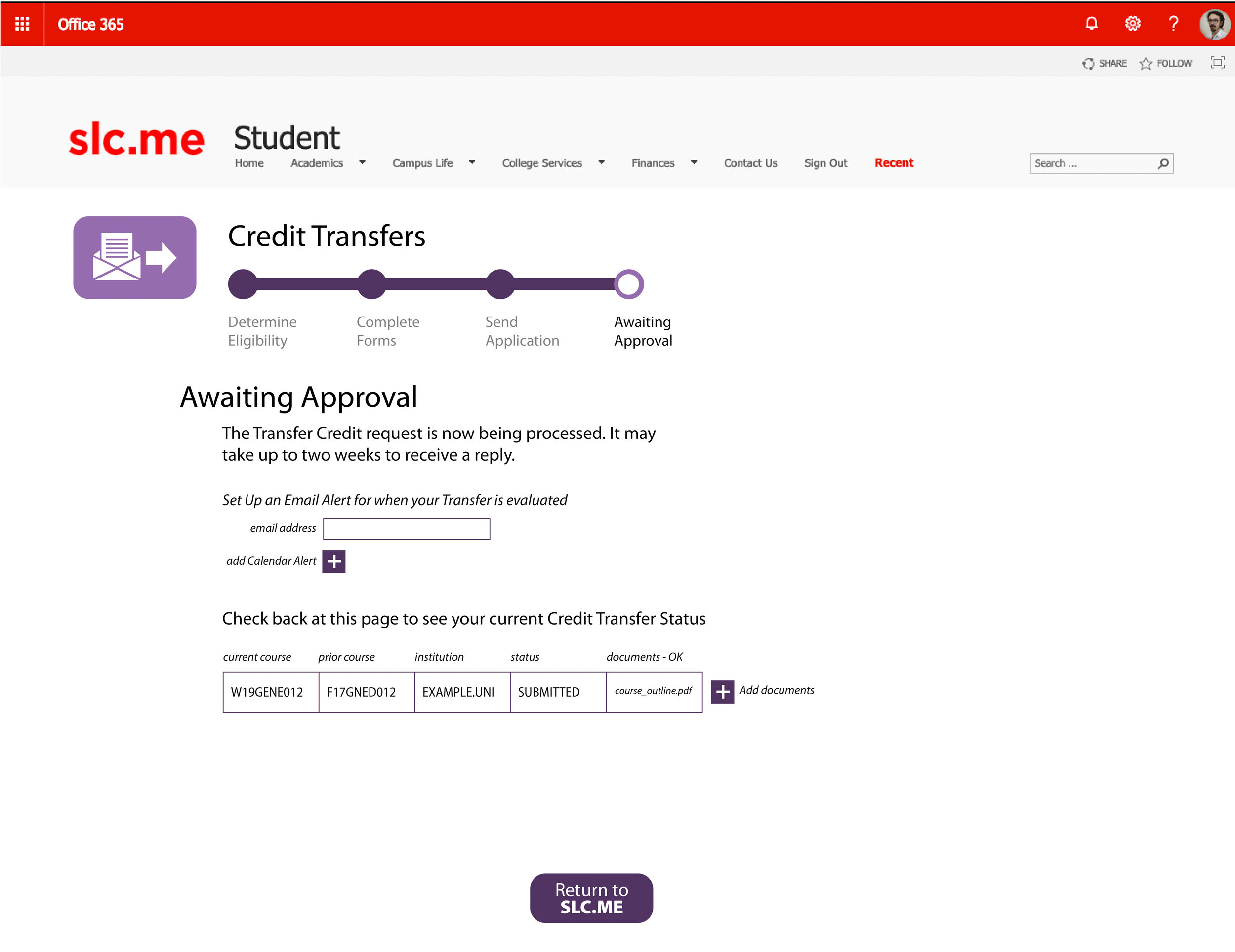
The second most essential goal was to offer reliable updates on the status of a student’s credit transfer approval. This prototype offers a no-nonsense single-row chart of a student’s pertinent information. Once an application for transfer credit has been submitted, a student can arrive at this update page simply by clicking the link on their SLC.ME page. The student will also be able to include their email address if they would prefer to be updated directly when a decision is made. There will also be an option to add a calendar alert should a student prefer to be updated this way.
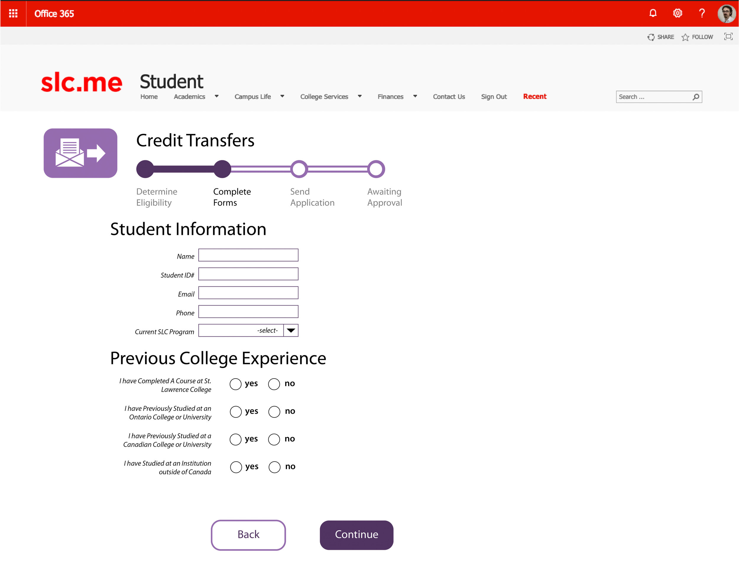
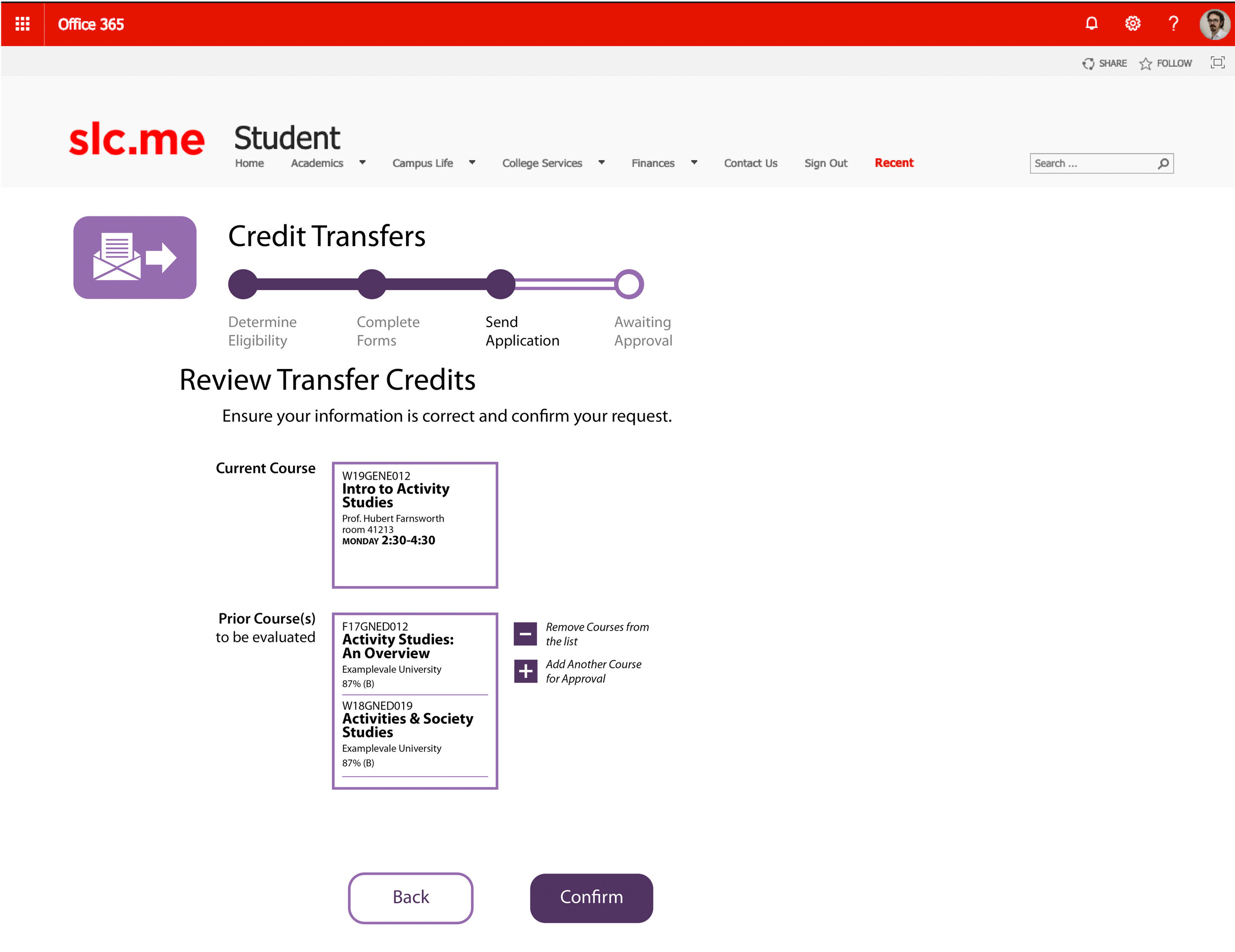
The third most common issue with the process was the cumbersome application process. Students are likely familiar with the annoyance of printing a form, filling it out in pen, then scanning it back in to complete an application. This process is easily solved by making the document a straightforward multipage questionnaire style series of webpages. While a persons’ signature offers a traditional sense of veracity, there much better ways of proving ones’ identity. This prototype re-arranges the PDF application for transfer credits into the series of pages demonstrated here.
Addressing the administration perspective has been de-prioritized, although they clearly benefit from the new system as well. Having the ability to direct students to this new simple process will alleviate many hours of explanation over time.
This interface is made accessible by following much of the established approaches to forms on the web. There is a clear hierarchy of text directing the users’ reading order. Colours are high contrast. Buttons have test that is descriptive of their actions. The form has large margins and does not take up much screen real estate, which is helpful when considering responsive design. Limitations of the SLC.ME site and Sharepoint may make true responsive design unfeasible when incorporating with the existing architecture. This slim design would still be usable on any size screen. Action buttons are made large and they demonstrate their activity by their colour. Active buttons are dark purple, while reverse action buttons are white with a dark purple stroke. Light purple denotes choices that have been made which can be changed.
Key findings from user testing
The progression bar needs more steps and should link back to parts of the form when it is clicked. The layout is oddly scrunched into one side. There is too much info on the student info page and the course info pages shouldn’t be duplicated/separated the way they are. The course matching page is hard to understand. ‘Confirm’ should be ‘Submit’ or something similar. Starburst on the SLC.ME page is dumb. Things could be aligned more spaciously.
Revisions made as a result of user testing.
A new guide grid was made to align all elements better. There was an effort to spread out towards the right side of the screen without becoming too stretched or centered. A fifth dot was placed on the main progress bar which helped spread the design out further and added clarity to the sequence. A number of slight adjustments to the type hierarchy were made to enhance accessibility by clarifying reading order. The two course matching pages were consolidated into one, and the single student information page was divided into two.

