• Photo
  • Design
    • Graphic Design Overview
    • Branding
    • Illustration
    • Typography
    • Web Design
    • Interaction
  • Side Projects
    • writing
    • drawing
    • video
    • leathercraft
  • about
  • contact
  • blog
RBAphoto
  • Photo
  • Design
    • Graphic Design Overview
    • Branding
    • Illustration
    • Typography
    • Web Design
    • Interaction
  • Side Projects
    • writing
    • drawing
    • video
    • leathercraft
  • about
  • contact
  • blog

Jean Michel Basquiat & the Art world

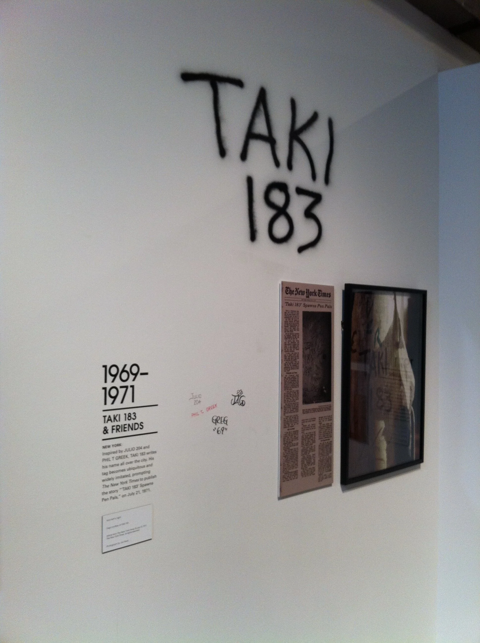
Writing your name on public property does not make you an artist. The act of tagging has many significant effects on society, but the impact is 100% dependent on the location.

The rise of bubble lettering and evolution of street art meant inevitably graffiti tags would migrate into the realm of fine art. Many creative types rose up making a name in this new urban folk-art style, but few became as well-known as Jean Michel Basquiat.

He began like many others in the early ‘70s spreading his tag across New York City. His personal tag was SAMO, a slang version of the phrase “same old __”. SAMO began as a shared effort between Basquiat and a friend, Al Diaz, while in high school. The tag was also part of a comic book style publication the pair was working on.

Unlike TAKI 183 and others, the pair's SAMO tag quickly evolved beyond simply repeating the moniker. The tag was often paired with provocative anti-consumerist phrases.

SAMO was always a sophomoric effort, as described by Basquiat and Diaz. The pair continued posting edgy phrases around lower Manhattan until the late '70s. Continued devotion to the bohemian lifestyle in NYC meant the pair were soon connected with other culture creators in the music and art world. Basquiat and Diaz had a falling out in 1980, and Jean-Michel held a melodramatic party announcing the "death of SAMO".

Basquiat transitioned easily to the art world, adapting his style to the canvas instead of the public wall. His work evolved past straightforward statements to incorporate more and more drawings. He had a tendency to focus on craniums and other rough abstractions of medial diagrams. He continued to use type in a less sensical way. The work has a clear connection to Dadaism and futurist nonsense of the 1920s. It could be said that his work, and others like him, were now making art that was a commentary derived from graffiti. The urban folk-art style could only exist in a world covered in graffiti, such as New York City in the 1970s.

categories: Graphic Design
Thursday 12.06.18
Posted by Robert Bruce Anderson
 

Bubble Letters

21829037426_914b4a1deb_o.jpg

Phase2 began his career in the late 1970s as one of many juvenile delinquents in NYC.  The emerging hip-hop culture was becoming more established as a true artistic movement. Graffiti tags evolved beyond simply writing one’s handle. The letters themselves became provocative and esoteric at the same time. Legibility took a backseat to enticing curves and shocking colors. This new technique became known as 'Wild Style'.

Subsequently the trend of bubble letters took hold in a big way. Also known as 'softies', Phase 2 helped usher in a trend of increasing obfuscation in letterforms. The style has roots in psychedelic poster art from the late '60s. Viewers had to be somewhat hip and in-the-know to decipher the words.

Bubble letters remain popular today. The technique has been repeated so much over the past decades that their appearance is commonplace around the world. Artists have to become increasingly creative to rise above the herd.

The basic approach is to make the letters so thick and stretched out that they crash together creating random organic shapes. Similar techniques are used by logo designers when they make text-based logotypes.

Crashing letters creates a sense of motion, action, and character. The graffiti tags in bubble letters may not say anything to the casual observer, but they have a clear emotion to convey nonetheless. Colour takes a more prominent role, and the corners of letters can have a wide variety ranging from soft to sharp.

The 'softies' have remained a touchstone for hip-hop culture. In the '70s they were cutting edge, and by the '90s, they had become retro. Modern advancements of the style have re-energized the bubble letter style, and now it is solidified as an element of typography. Softies speak to an anti-establishment hip-hop mentality before they are even read by a viewer.

categories: Graphic Design
Wednesday 11.28.18
Posted by Robert Bruce Anderson
 

Monogram Tagging

5782626270_d9225de639_o.jpg

TAKI 183 is a Greek immigrant who rose to prominence by repeating his personal monogram all over NYC. Dimitraki, who never revealed his full name, was a messenger whose work sent him all over the city. He sprayed his tag wherever he went, and soon gained recognition mostly due to the sheer number of locations he hit.

In 1971, the New York Times wrote an article about him before his identity was known, which may have served as a cultural tipping point for graffiti tags in NYC. Hundreds of competitors joined the monogram tagging game. Whoever gets the most tags wins, and bonus points for tagging something on another tagger’s turf.

Package delivery was the perfect cover. Not only are delivery boys a normal site all over the city, but also a package can make the perfect visual shield when writing your name on private property. The type style is clearly defined by necessity. Taki needed to be able to write his name without looking at what he was doing, so a simple consistent style was necessary: all caps, sans-serif, and as few strokes as possible.

The competitive graffiti game exploded, and soon evolved in style. Taki had little interest in the wild colourful evolution that would come in the mid to late ‘70s. He continued to make his mark on the city and maintained his fame until he grew up, left the city, and started a family. He gave an interview in 1989, but never revealed his full name, and he has been out of the game ever since.

categories: Graphic Design
Wednesday 11.21.18
Posted by Robert Bruce Anderson
 

Cornbread

2790356085_690ff7651f_o.jpg

Darryl McCray, the graffiti artist known as Cornbread, is widely considered the first of the modern graffiti artists. He was born in North Philadelphia in 1953. During the late 1960s, he and a group of friends started ‘tagging’ Philadelphia, by writing their nicknames on walls across the city.

Favoring an all-caps style, his style was highly dependent on the limitations of the spray can. Curvaceous letterforms take precedent, and most letters are formed with single flowing strokes. The typography reflects the fast pace of city life.

His work is noticeably easy to read when compared to modern graffiti tags. The trend towards complexity and illegible letterforms had not taken hold yet. Illegibility has its own benefit and meaning, mainly used to reinforce dividing lines between the hip and the uninitiated.

In his day, Cornbread’s name was provocative enough on its own when written large on a public wall. The artist himself is the first to affirm that he began ‘tagging’ just to impress women. His message may not have been profound, but his work did have a significant impact by helping to create a new social game: who can write their name in the most places.

This wasn’t exactly a new concept. Writing your own name on a thing is often the only thought a vandalizer has. Especially when you turn the clock back a few hundred years to when most of the world was illiterate. Consider this collection of scratches on a marble slab in Constantinople. Halvdan the Viking wrote his name around the year 800AD. Perhaps this was simple defiance of authority, but Halvdan did accomplish one thing – notoriety beyond his years. We know two things about Halvdan: his name and the fact that he visited Turkey.

Shakespeare famously questions the real significance of names. A rose would still smell like a rose by any name, of course. Names become all the more significant when they are the only use you have for the written word. Cornbread was obviously quite literate, but his moniker is probably the most important word in his repertoire. When you are confronted with a fifty storey building or the worlds’ biggest cathedral, how can you not attempt to shout back at the power that made such a thing? If you have no other words at your command, then maybe it is enough to say “I exist, and I am here now.”

categories: Graphic Design
Wednesday 11.14.18
Posted by Robert Bruce Anderson
 

Graffiti as Protest

9710188248_1b434096f5_o.jpg

Graffiti is most often characterized as an act of defiance and defacement. Money can buy space on a billboard to display a safe message honed to perfection by sterile board members. The largeness and imposing nature of giant advertising is often overlooked and forgotten by those desensitised to modern life.

In truth, there are infinite locations for supergraphic text. Any wall is a canvas to spread a provocative statement to reach the masses if you're willing to commit a felony.

Typographically interesting graffiti with a message is a rather fine line to follow. Amateur lettering to communicate a civic message quickly devolves into picket signage. True stylish thoughtful graffiti has potential for so much more.

What is the best font choice for raging against the status quo? Well, unlike with bubble letters and monogram graffiti, protest tagging demands legibility first and foremost.

Aggressive protest graffiti is just as vulgar as the bawdy Latin inscribed on bathhouse walls, although it carries an honesty with it. Pure traditional serifs demand respect even when peppered with randomly sized characters. Another tried and true approach to provocation is to remix lighthearted design trends. The example here is reminiscent of 19th century advertising. Bold black on white text has an implied three-dimensionality that commands attention.

categories: Graphic Design
Thursday 11.01.18
Posted by Robert Bruce Anderson
 

Ancient Graffiti

171893763_3264f7184b_o.jpg

Roman “graffiti” is famously bawdy, but many of the surviving examples are essentially just advertisements. The eruption that encased Pompeii in volcanic ash essentially froze time for this medium-sized city. Inscriptions such as this one was only meant to be temporary, which gives us an interesting glimpse into how and why the typical Roman actually made letters.

There were actually two Latin languages which evolved side-by-side. As early as the 200s BCE, evidence of a non-traditional writing was emerging in Italy. The highly technical and official Latin spoken by scholars and the upper class was growing into something new in the streets and alleys of

the city, as well as the distant countryside. Classical Latin culture rejected anything Greek due to deep animosity between the people dating back centuries. Linguists and poets rejected any co-mingling with other languages, but the diverse cultural mishmash that made up the lower classes had no such hang-ups. The living language that was Vulgar Latin was free to experiment.

If you consider these three examples, it is clear that the top and bottom examples are rough and unconfined by structure, only by the limitations of the wall. Classic Latin had no lowercase type, obviously. It also has no punctuation and often no spaces between the words. Classic Latin almost seems decorative and needlessly esoteric, where the vulgar graffiti perhaps follows actual speech patterns.

Etchings such as these highlight one of the biggest factors affecting the practice and advancement of graffiti. Writing illicitly is difficult and time-sensitive. The graffito-tagger must work quickly, thus simply. Noble, stoic, evenly spaced high-Latin letters become erratic and random as they meander across the wall. The amateur has no concern for leading, line length, x-height, or any of the conventions we take for granted. This tendency for random roughness will become the stylistic highlight of all graffiti moving forward, however truly memorable works will always have a well arranged balance and evenness despite breaking convention.

categories: Graphic Design
Wednesday 10.31.18
Posted by Robert Bruce Anderson
 
Newer / Older