Zeero.com
E-Commerce Web Suite
Background
Zeero – a digital storefront which specializes in sustainable, plastic free products for homes and businesses. The company sells minimal waste products and offers well-researched information on eco-friendly lifestyle choices. Currently the trend towards eco-responsibility has led to a rising interest in the waste-free lifestyle. Potential customers are overwhelmingly in favor of these products, although any difficulty or confusion is likely to dissuade them from committing to changing their habits. Zeero is aiming to put information and strategies at the forefront to ensure customers that changes in their usual habits do not have to be difficult.
Competition
The Ideal Target Audience Persona
There are a number of places customers can buy plastic-free products, but they are usually a small part of a larger store. High-end grocery stores, such as Whole Foods and others, carry these products but they are not at the forefront of their business. Customers who are not interested in organic products or hemp clothing are unlikely to encounter the plastic-free products. Zeero should differentiate itself by focussing only on these household products and not engage with any divisive expensive items.
Objective
The e-commerce site for Zeero will allow customers to compare and shop and keep track of previous purchases. The site will make it easy to re-supply your home or office. The site will feature simple answers and strategies written by actual users of the products to ensure the customer that changing your habits is not difficult. The design should engage the attention not only of customers who are already living eco-friendly lifestyles, but also new customers who are generally uninterested in most “hippie” type values.
Audience
The primary audience is already interested in cutting down waste. They are adults (as young as 25 and up to 55) who have already tried a few ways to cut down on their waste. They generally will not have children until after age 30, and often only have one child. They have a high level of technical ability and will eagerly search and price match before committing to buying anything online. They read articles about eco-lifestyles once every two weeks at least. They are not especially wealthy, but they do save money by choosing mass transit over owning cars and renting small apartments and condos instead of buying homes. They tend to live in medium-large cities. They are open to trying new things, and almost never forget to bring reusable shopping bags. These people are already in the market for zero waste products and will value this site for its convenience and helpful information.
The secondary audience are less tech-savvy. They may be as young as 25, but they tend to be over 50. They live in the suburbs, drive large vehicles, and have 2.5 children. They are not interested in exotic foods and think maybe ‘organic’ food prices are a scam. They resent being told what to do by health-nut types. They resented smartphones at first, but after using one for a year they were able to learn and adapt to its advantages easily. They prefer traditional lifestyle choices and they eat the same way their parents and grandparents did. Despite not being particularly interested in eco-concerns, they do enjoy the outdoors and readily admit that there is a problem with the wasteful use of plastic. They will begrudgingly change their habits if a purely scientific and logical reason to do so. These people will appreciate being able to shop from their devices without having to go into a health food store. They will likely be introduced to a product from a friend, relative, or co-worker. They may also be turned on to the Zeero store out of necessity when plastic bags become prohibited at stores or schools.
Sitemap
Technical Considerations
The site will function on a full browser window, but also tablet and smartphone. The site will be designed for mobile first, and the larger sizes will be adapted from there. Each format will follow the same basic structure. The site will have a simple, no nonsense approach to shopping. Each item will have links to relevant articles and information written by actual users with advice about how to adjust your life to avoid waste.
Creative Considerations
Zeero uses a soothing pale teal as its primary corporate colour. Their logo is reminiscent of the classic recycling triangle. The typeface is all sans-serif humanist style with an all lower-case headline. The pages are white, and all products are photographed in a very clean and clear manner. This emphasizes the clean purity of the products. The brand aims to show the products free of packaging entirely.
Key Message
Plastic was a great innovation of the 20th century, but it has become a blight on our ecosystem. Most plastic is just wasteful packaging can be avoided with a couple simple steps. Zeero is here to make the transition easier with well researched products and easily available tips, strategies, and customer testimonials.
Zeero – the extra E is for environmentalism.
Schedule
The project began on January 7th and will be completed on February 4th. There will be benchmark meetings every Monday. On January 21st, a refined demonstration model with accurate colour, typeface, and layout will be presented for critique. At this point, the major visual design will be either approved or be sent back for immediate redesign. The remaining two weeks will be dedicated to technical details and troubleshooting the inevitable known unknowns. The project will involve a large amount of body copy in the product descriptions, forms, and articles. These text-heavy elements will require great attention to detail to catch any errors. The visual design needs to be settled before the coding begins.
Rationale
Concept
The zero-waste, plastic-free lifestyle products are represented best with earth-tone colours that reflect the natural world itself. Additionally, the idea of “zero waste” can be visualized as a circle representing the number ‘zero’. Efforts to reduce waste are also traditionally represented as a triangle or circle which indicates a cycle of re-use. These elements come together to direct the design solution.
Application
The choice of colours was made to match natural hues, but more specifically the beige and dark green match the colour of bamboo. This is a sustainable material which is cheap and durable, and it is used in many of the products offered by zero waste companies. These colours will match the packaging and branding of many products.
The typefaces chosen are all geometric sans. Each one has overt circular shapes to most of their letters. The main display type is Comfortaa, which has curved ends to its lines. These aspects combine to reinforce the circular imagery tied to waste reduction and also the image of a number ‘zero’. The lack of harsh angles also expresses a friendly attitude. Wasteful packaging made from cardboard or plastic is often angular with many flat sharp edges. Re-usable products tend to be rounded, soft, and irregular. The circular typeface aspects reinforce the feeling of the products themselves.
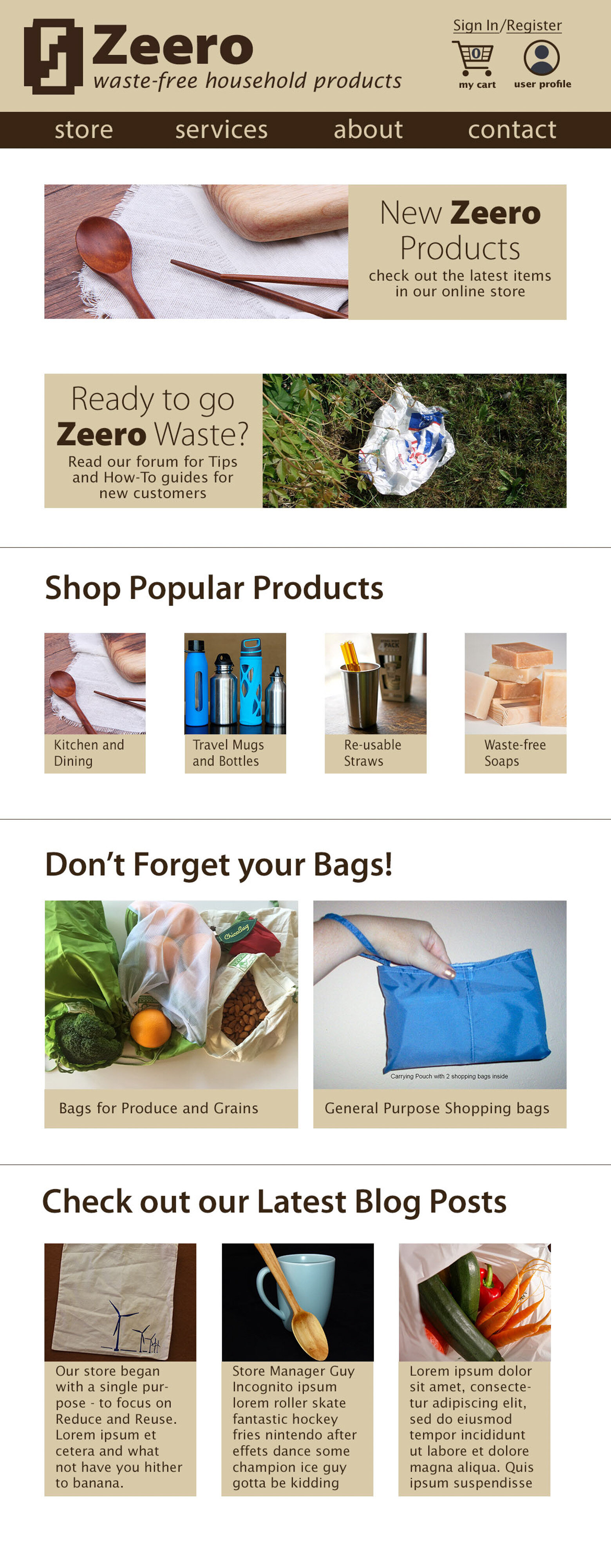
The layout of the site borrows from the ubiquitous Shopify storefronts, as well as other successful ecommerce sites such as Zappos. There are sales and discounts, but the site includes several routes towards FAQs and starter guides. The articles will help illustrate how to slowly adjust habits without upsetting your daily life. One of the biggest roadblocks is the feeling of being overwhelmed by new eco-friendly options. A consumer cannot be expected to completely re-adjust to the zero-waste lifestyle in one weekend. The reassuring articles and blog posts help narrate the process others have gone through and encourage users to use Zeero.com as an information resource as well as a storefront.
App Development
The Zeero.com branding was later used again in the development of a habit tracking mobile app. The Zeero App project revolved around an extensive research program aimed at better understanding the target audience. A full accounting of that project can be seen on the Zeero App page here.


