Lantic Sugar
Packaging Redesign
Overview & Problem Statement
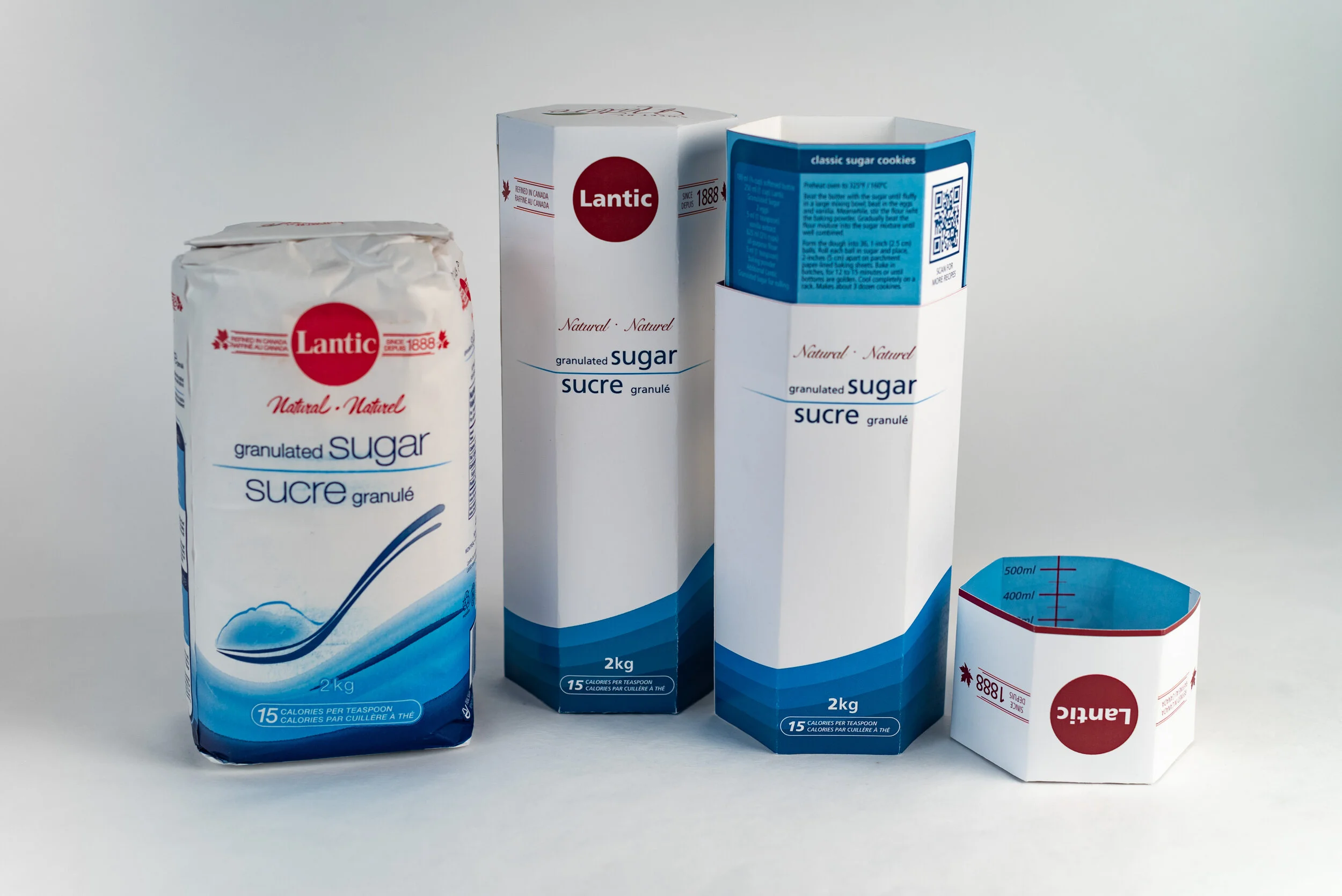
Rogers & Lantic brand granulated sugar is packaged in a standard unremarkable paper bag. The product has great potential to grab attention and inform the consumer while also offering improvements to the standard packaging approach.
The current package is a simple paper bag. This is a basic package that has remained largely unchanged for a century. Dry goods such as sugar and flour are often sold in this format, which is effective enough, but it has a number of limitations. A paper bag is prone to ripping. The corners are predictable weak points which become tiny holes that allow sugar to escape. When the product is all consumed, the bag tends to trap a final teaspoon of sugar among the folds at the base, which comes falling out causing minor messes.
How might an update to the packaging improve the sales of this product and the public brand awareness of this product?
How might the packaging offer more features and intrigue while also remaining familiar and un-confusing to the audience?
Information Strategies
In order to fully satisfy the needs of the brand, there are a number of facts that need to be gathered.
What are the materials comprising this package and are they necessary?
Can we reduce packaging in any way?
What is the typical use situation?
Who purchases this product and how often?
How does this product appear on a shelf among multiple instances of itself?
How do competitors typically design their packaging?
Where is this product stored in a home?
Why would a consumer choose one option over another?
These are the essential questions which need consideration before design work begins. How might we gather this information?
Ask friends and family directly about their relationship to sugar
How do you use sugar in the home?
Do you bake?
How much sugar do you buy at a time?
Do you have any brand loyalty or awareness when it comes to sugar?
Observe shoppers in grocery stores
Search the internet for existing research on sugar consumption in north America
Find people who do not buy sugar and consider how they might be convinced to buy some
Target Audience
Once we know how typical users engage with the product we can begin to design with purpose. The current audience skews older than the median grocery shopper. Sugar is a cooking and baking ingredient, which are activities enjoyed by stay-at-home parents, empty nesters, and senior citizens. Young adults make up a portion of the audience, though they are not the target demographic. Any young adults buying sugar in a 2kg package are likely more mature and understand baking to be an activity mostly enjoyed by their seniors.
The target audience is, without a doubt, perceptive to change and interested in trying new things. An item so commonplace as plain sugar will be striking and noticeable when given a new package. Senior citizens and others will readily choose a new approach to a classic necessity. The package will be noteworthy and different, but also completely direct and clear in its messaging.
Product Considerations
Physical
The container must adequately hold 2kg of granulated sugar without falling apart. It must fit on the same size shelf that the product currently inhabits. It must be easily manipulatable by a consumer no-matter their dexterity. Users may have physical limitations that should be considered, including general aging issues such as arthritis. It must be sealable for freshness and to resist vermin invasion.
Creative
The packaging must contain all the same information and the branding must remain consistent with the current identity. The colors and typefaces must remain the same. The package is mostly white, reflecting the contents. Pale blues and reds swirl in ribbons around a stylized image of a spoon. This feature imagery will appear in familiar fashion on the new packaging. The product must look appealing when on its own, or when arranged on a shelf with multiple iterations of itself.
Solution Rationale
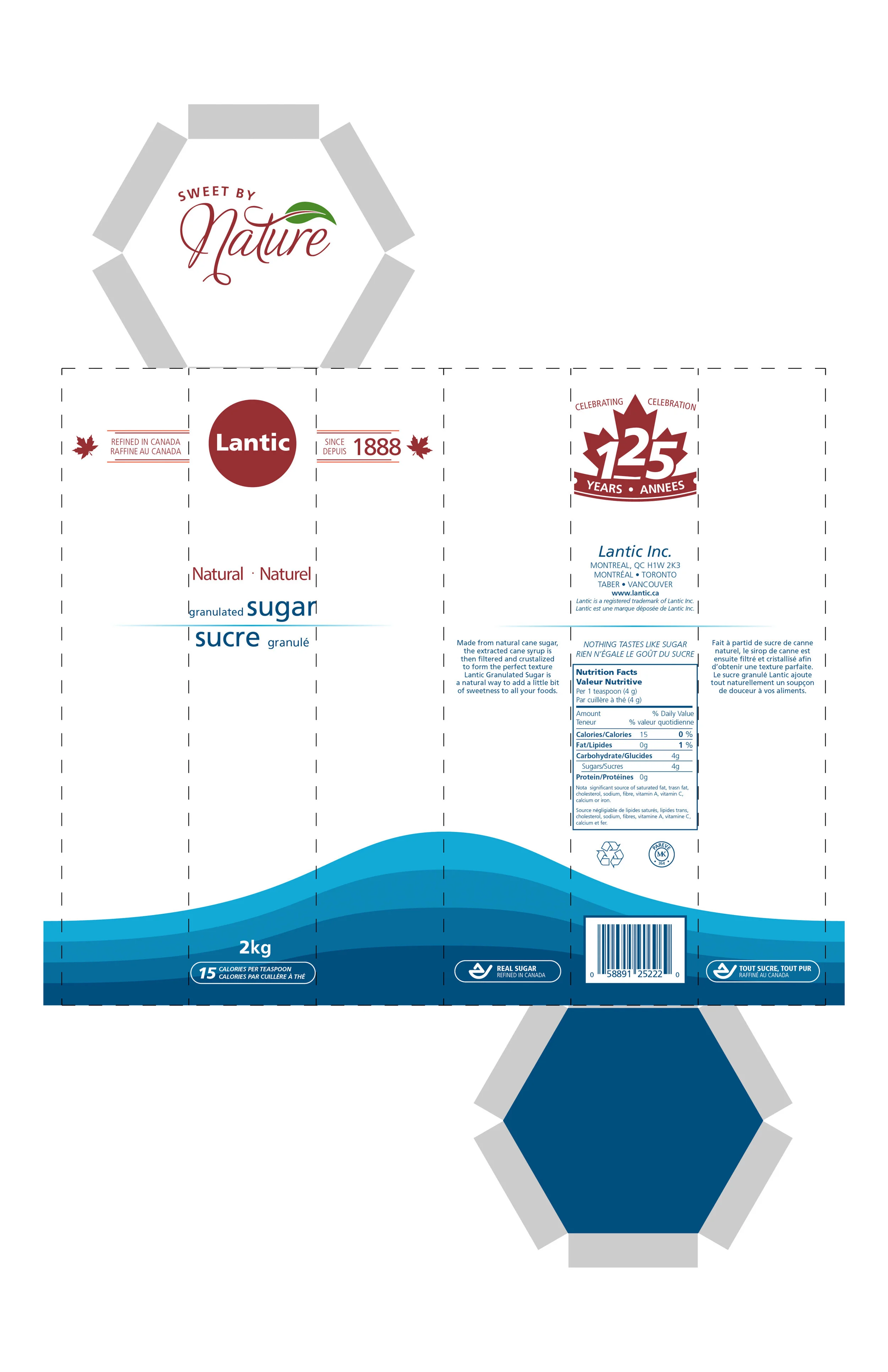
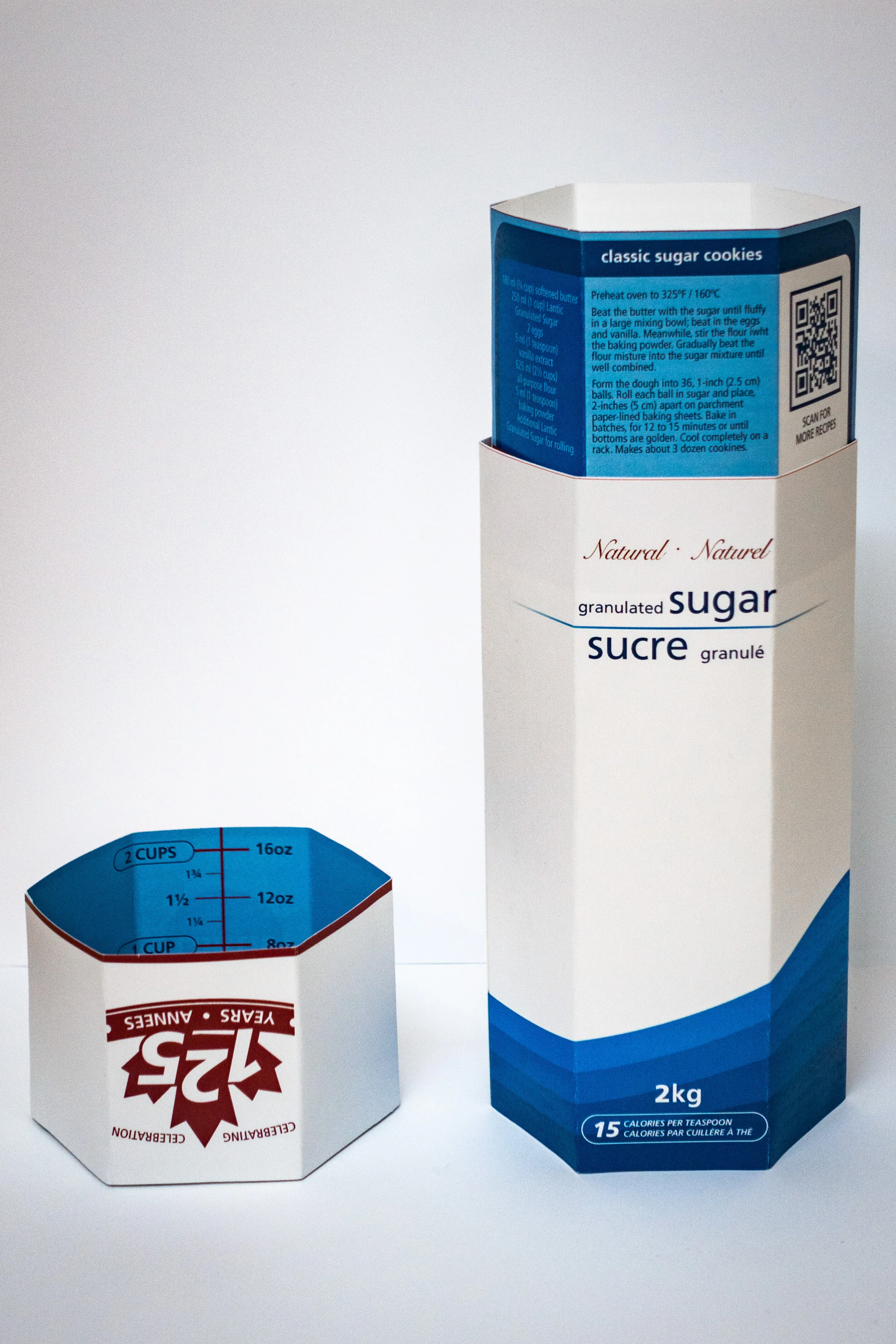
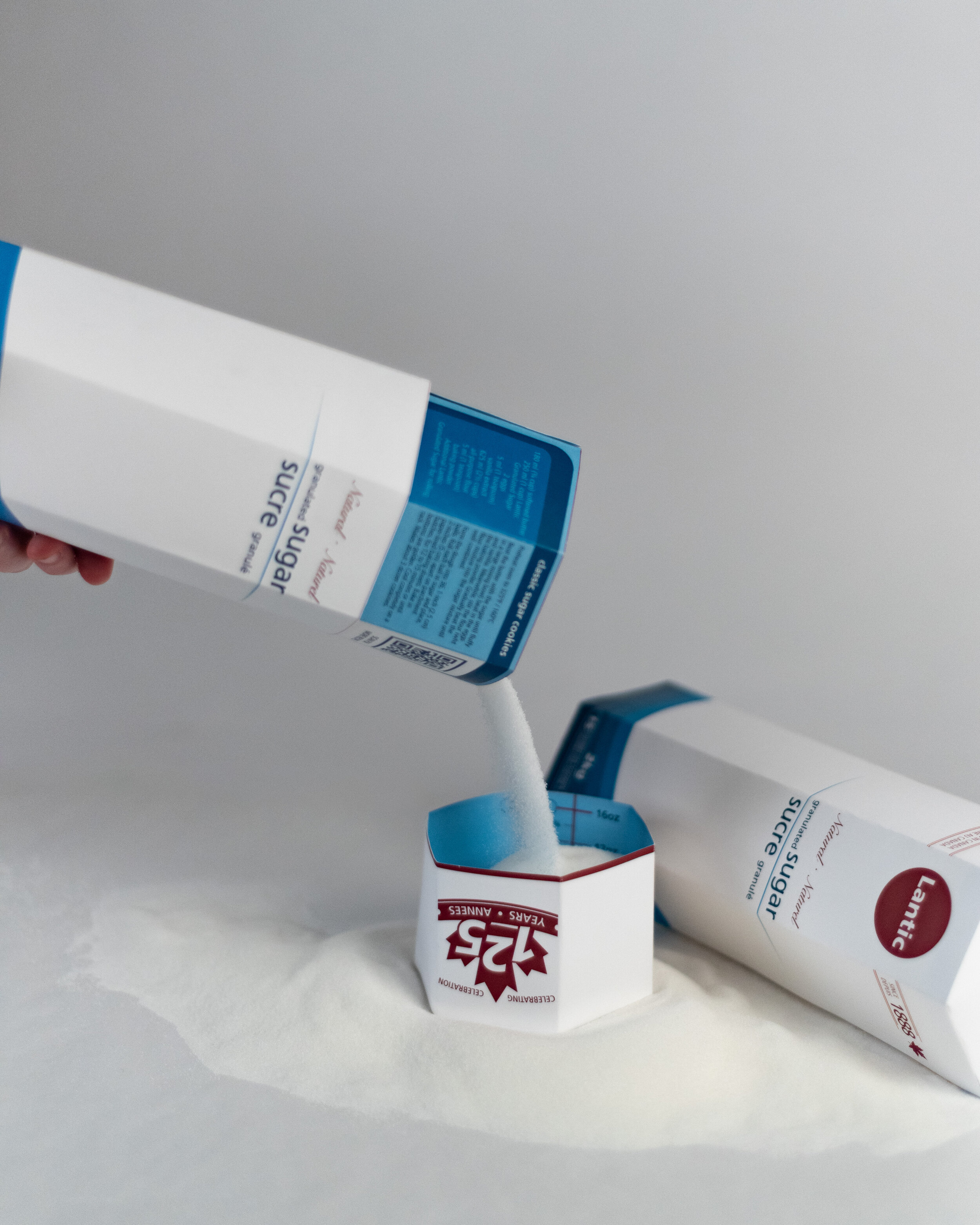
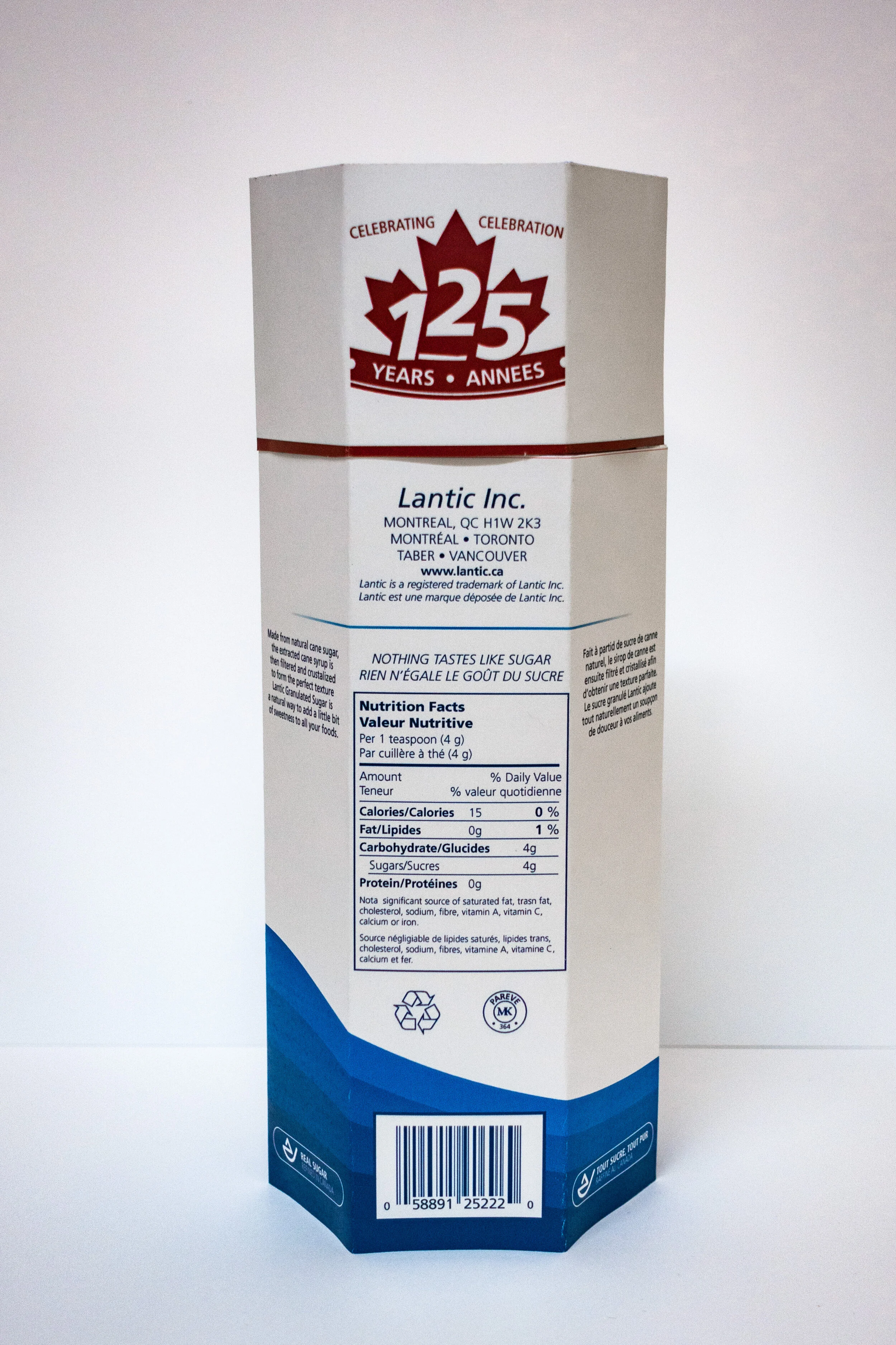
The sugar bag is flimsy. The primary update to the design is the shape of the container itself. Instead of a paper bag, the sugar is contained in a hexagonal prism that is twelve inches tall. The container has more rigidity simply due to its angular form.
The sugar bag is also a mundane commodity. A paper bag in this shape has been the agreed upon format for a dry good such as granulated sugar. This new format is eye-catching by virtue of its unusual six-sided shape.
The graphics on the bag are passé. The original features wavy elements with distinct gradients, which creates a sense of depth. Organic stripes such as these were quite popular in the early 2000s. Currently, the trend is swinging the other direction towards flatter and more single-coloured graphics. This new sugar bag replaces these dated graphics with a flat series of stipes. The new striped follow a wave form direction similar to the original.
The facets of the sugar container offer a new method to divide up information. The facets are narrower than the faces of the original bag. All the text elements had to be adjusted to fit inside the bounds of the planes. A change in the typeface to Frutiger LT offers the ability to use a variety of condensed formats that are quite legible. This helps save space and also reinforces the clean angular design aesthetic.


