Sherwin Williams Project
Redesigning a classic logo
This project seeks to improve the current Brand Identity of the Sherwin Williams Paint Company. When approaching a historic and iconic company worth billions, it can be easy to rest on the appeal of nostalgia and familiarity to sell your product. It is my intention to demonstrate how a change in the visual communication can boost sales and futureproof the company for the next hundred years.
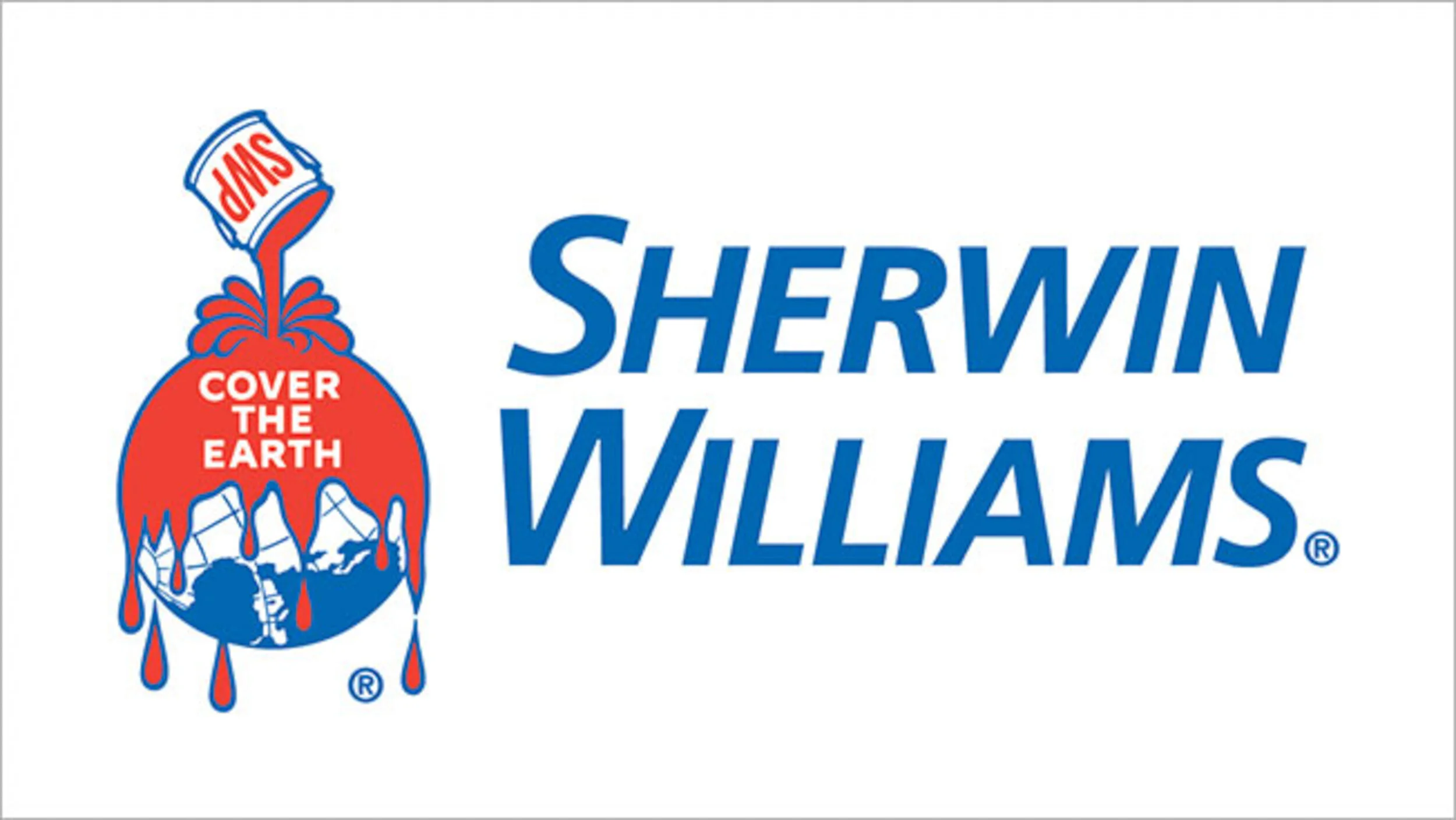
The current Sherwin Williams logo has remained unchanged for over a century
The Company
Sherwin Williams is a paint company founded in Cleveland Ohio in 1866 by businessmen Henry Sherwin and Edward Williams. The basic original paint products sold well, and the company grew steadily. Sherwin Williams built its first factory capable of meeting nationwide demand in Cleveland in the 1890s. The corporate headquarters remains situated in Downtown Cleveland today. The company is recognized as a proud success story from this all-American city.
Over two-thirds of the company’s sales are business-facing industrial applications. In addition to paint, the company manufactures a variety of coatings whose primary purpose is to resist corrosion from weather or chemicals.
While the majority of business is not directed at individual consumers, Sherwin Williams does maintain over 4500 retail stores worldwide, mostly located in North America. The patrons of these stores are both individual home improvement consumers as well as contractors and decorators. Sherwin Williams retail locations are familiar to anyone in North America, and they help advertise the company.
The Competition
Pittsburg Plate Glass, Republic Powdered Metals, and BASF
These companies are largely unknown to the public. They are solely focused on business-facing industrial sales. Their branding is simple and legible initials in safe shades of blue. companies have no reason to expand into retail spaces and therefore will likely remain cold and corporate in their branding. Their sales are driven by cost and performance and not advertising.
PPG and RPM are both American businesses, founded in Pennsylvania and Ohio respectively. BASF is a German company that is the worldwide leader in chemical manufacturing. Paints and coatings are just a part of what BASF does. BASF also sold consumer electronics in the 1980s but abandoned this avenue when it was no longer profitable. There is a chance BASF could choose to return to consumer-focused sales in the future. This company could be unencumbered by preexisting brand identity, as they are likely unfamiliar to the average consumer.
Benjamin Moore
American paint supplier founded in 1883. The company has earned a number of recognitions for their environmental efforts. This company uses a similar Red/Blue colour scheme. Their logo references a house roof, which also forms a letter ‘M’. When tilted 90º, the logo could be read as a ‘B’. The name itself also has a similarity to Sherwin Williams, as it is a combination of two very common Eurocentric names. They do not have their own retail locations.
This brand could easily be confused with Sherwin Williams.
Dulux Paints
A British paint company with a famous ad campaign featuring a sheepdog. This company’s branding is quite different. They utilize a series of coloured rhombuses to imply a variety of options. Their first ad campaign featured the tagline “say Dulux to your decorator”. Dulux currently uses a very modern brand, but they have had multiple re-designs over the years. The company had a memorable Sheepdog mascot in their early advertisements. The dog was iconic for British viewers, who sometimes referred to the breed as “Dulux dogs”.
This brand shows how a compelling mascot can be memorable for decades.
Behr
Sold exclusively at Home Depot, this company is aimed specifically at do-it-yourself consumers. Behr was founded in 1947 in California as a wood stain manufacturer. Since then, it has diversified into all sorts of paints and coatings. It has grown into one of the most recognized paint companies in the USA. The bear logo is a clear reference to the founder’s name, Otho Behr. Having a familiar silhouette tells viewers how to pronounce this name. The grizzly bear is also a reference to California. This animal has been featured on the State Flag since the 1850s.
Behr has a very tight unmistakable logo that has remained unchanged since its inception. The notches taken out of the letters seem to reference bear claws or teeth, which could be slightly aggressive. Conversely, perhaps the viewer is meant to feel the strength of a bear as they attack a project. In this sense, the Behr logo is empowering to the DIY user.
Audience Changes since 1860
Sherwin Williams has made efforts to remain relevant in their advertising. Their ads feature women and men of all ages and ethnicities engaging with the products and stores. Employees of all demographics are shown to be knowledgeable, friendly, and engaging. It is clear the company hopes to attract customers who do not fall into the dated stereotype of ‘white male handyman’.
The internet has given consumers a new way to become a do-it-yourselfer. In the past, a potential buyer might see painting a house as a daunting task that isn’t worth the effort. The user may pay someone to do it for them or elect to just live with peeling paint. Today, users can research products and projects without leaving home. They can overcome the initial fear of ignorance and see how they might accomplish this task. Once completed, the user will have increased satisfaction from the job knowing they did it themselves and saved money.
In this environment, Sherwin Williams is holding steady, although they are in danger of being overtaken by a competitor’s modern ad campaign. The company may be present in the minds of anyone who is considering a painting project, but there is room for further growth. An engaging new look can draw new eyes to this centuries-old company.
History
The current brand identity has clean modern elements, but the key imagery is confusing. Sherwin Williams has used a similar logo since the 19th century, which has nostalgic appeal in theory.
From a design perspective, the logo has several flaws. It does not reduce in scale well, as the detail on the continents and the lettering would become obscured. The tagline ‘cover the earth’ is rendered in a geometric sans-serif font with very little contrast, if any. This makes the words appear very blocky, horizontal, and flat, which is in direct opposition to the round globe and flowing paint on which it they sit. The paint can itself features the initials ‘SWP’, presumably for Sherwin Williams Paint. This is an unnecessary extra decoration which represents an unrefined design aesthetic. It is a logo within a logo.
From a metaphorical perspective, this logo is disturbing. The red paint has prominent drops that resemble blood. The way the paint envelopes the earth is ominous to consider as it seems to reference pollution or an advancing wave of danger. There is a feeling that Sherwin Williams wishes to dominate the earth. Lastly, the paint is being applied in a sloppy and unprofessional manner.
Approach
The first option is a safe and direct approach. A two-coloured paintbrush rendered in simple lines takes the place of the letters ‘W’ and ‘I’ in the company name. This icon can exist on its own or as part of the title. The icon can also be expressive by leaving a trail of contrasting paint. This represents the fundamental action of the company that users find familiar.
Colour & Typeface
The two colours utilized are new versions of the originals. While the old design used extremely bright red and blue outlined by white, these colours are much more subdued. The new blue is much closer to a classic denim blue, whereas the red has been replaced by a modern coral pink. These colours take a step back from the patriotic Red White and Blue and aim more towards colours an individual might actually use to paint.
The typeface is Optima which is a hybrid between sans and serif. The flares at the ends of the letters are very subtle, and the curves of the uprights are almost imperceptible at first glance. The result is friendly but professional.
The original typeface was an oblique sans-serif in smallcaps. This was a cutting-edge choice when it was first adopted, but it is completely forgettable to modern eyes.
Application
This logo is quite easy to scale. It shares characteristics with the Optima typeface, meaning it could be adapted into various words or phrases as needed. Adding the trail of paint increases visual interest, plus it allows the viewer to be guided towards relevant information. The logo can function from virtually any angle.
The primary application would be on a paint can. The trail of paint could be coloured to indicate the paint, or the coating style. Further applications are numerous, from retail signage to business cards.
Key Message
The paintbrush asks you to reach out and take hold of your project with your own hands. The paint stroke indicates you have committed to bring new life to your walls, and new energy to your daily life.
Approach
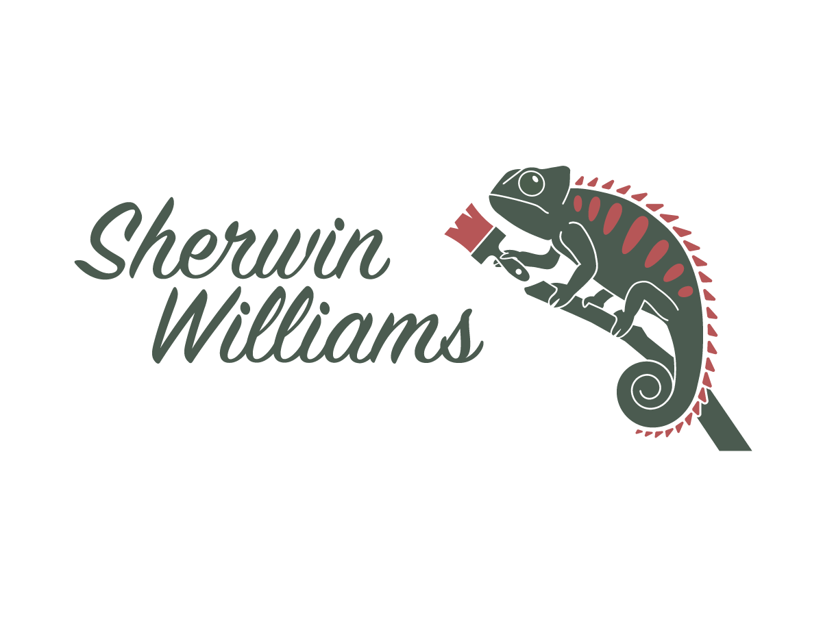
The next option is much more extreme and riskier but has much greater potential to broaden the audience. This is a character mascot which will represent the company and create new revenue through merchandising.
What we have is a Chameleon. This species is known for its ability to change the colour of its skin. Originally assumed this was done for camouflage purposes, new research indicates they more often use their colour changes to communicate. The Chameleon is a quirky and unusual creature whose very nature is enticing to humans.
A cute yet professional mascot has been proven effective when advertising seemingly unrelated products. GEICO the car insurance company and AFLAC the life insurance company both have had enormous success with this idea.
The Chameleon was also the original logo of the Sherwin Williams company in the years 1860-1890. The animal was a new discovery to most Americans in that time, and the founders of the company were enthralled by its abilities. The original expression of the lizard was highly detailed and realistic, which was likely confusing and off-putting to many uninformed viewers.
This new approach is much more friendly and stylistic, but efforts have been made to remain accurate to the creature. The animal holds a paintbrush in his hand, which creates a simple narrative that he has just painted the object or type next to which he appears. The animal is personified as a knowledgeable adult and not a childish cartoon.
Information
Sherwin Williams has featured the tagline “cover the earth” in their logo since it was created. This branding redesign suggests omitting this tagline entirely from the company. As stated, it creates undesirable reactions.
More recently, the company has included the line “what is worth doing is worth doing well” in their advertisements and website. This is not a terrible slogan, but it also rather meaningless and a bland appeal to history.
For this approach, the Chameleon has the potential to deliver a memorable tagline. Here we see him having written “Any colour you like”. This is clearly meant to signify that Sherwin Williams has a wide variety of options. It could also be an offer from the Chameleon as if to say he can change into any colour and he asks you to test his skill. This reinforces the notion that Sherwin Williams employees are knowledgeable and ready to undertake a challenge.
The Chameleon is named Cleve, which is short for Cleveland. This is the city where Sherwin Williams was created and where their home office remains today. The company prides itself on being local and American. It is appropriate that Cleve would represent this historic American city.
COLOURS & TYPEFACE
APPLICATION
This logo presents challenges when scaling. A simplified version is necessary for very small applications on the web. A more complicated version featuring motion and dialog will be developed for use in promo videos. The static colours will always be green and coral, but the logo is intended to be rendered in virtually any colour.
In-store signage will feature variously coloured iterations of Cleve to indicate sections. The multiple spots on his back can be given several different colours, or just one. The motion graphic animation of this logo will show his skin changing through several colours before reaching the green and coral standards.
The primary application would be on a paint can. Cleve would be rendered in black or white with his spots indicating the paint contents. He would also appear on the store signs, and most importantly in advertisements.
The two colours used here are a lizard green and dark coral pink. These are quite different from the Sherwin Williams bright red and blue. Green is a more soothing and welcoming colour, where red is rather aggressive especially when paired with contrasting blue. Green is representative of environmentalism, which gives the company an opportunity to present its efforts to lessen their carbon footprint. The coral pink is a sharp contrast to the neutral green. The relationship between the two colours references the wild jungles where the chameleon is found.
The main typeface is Signpainter. This is a display type meant to be used sparingly only for large short titles or names. The implication is that Cleve has just hand-rendered the letters. Signpainter has a retro-feel, which helps reinforce the company’s legacy. This handwritten typeface is paired with Palatino Linotype, which is a traditional serif. Palatino is easy to read and very familiar. Its contrast and x-height are both similar to Signpainter.
KEY MESSAGE
Cleve is memorable, funny, and talented. He is reassuring and helpful. He is also strange and unusual. He reminds you that a change of colour is refreshing and energetic. Nomatter what colour he changes to, he is still Cleve the Chameleon.


