Building Order our of Chaos
Second Year Graphic Design Exhibition Poster
Overview
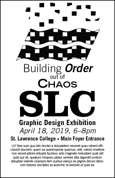
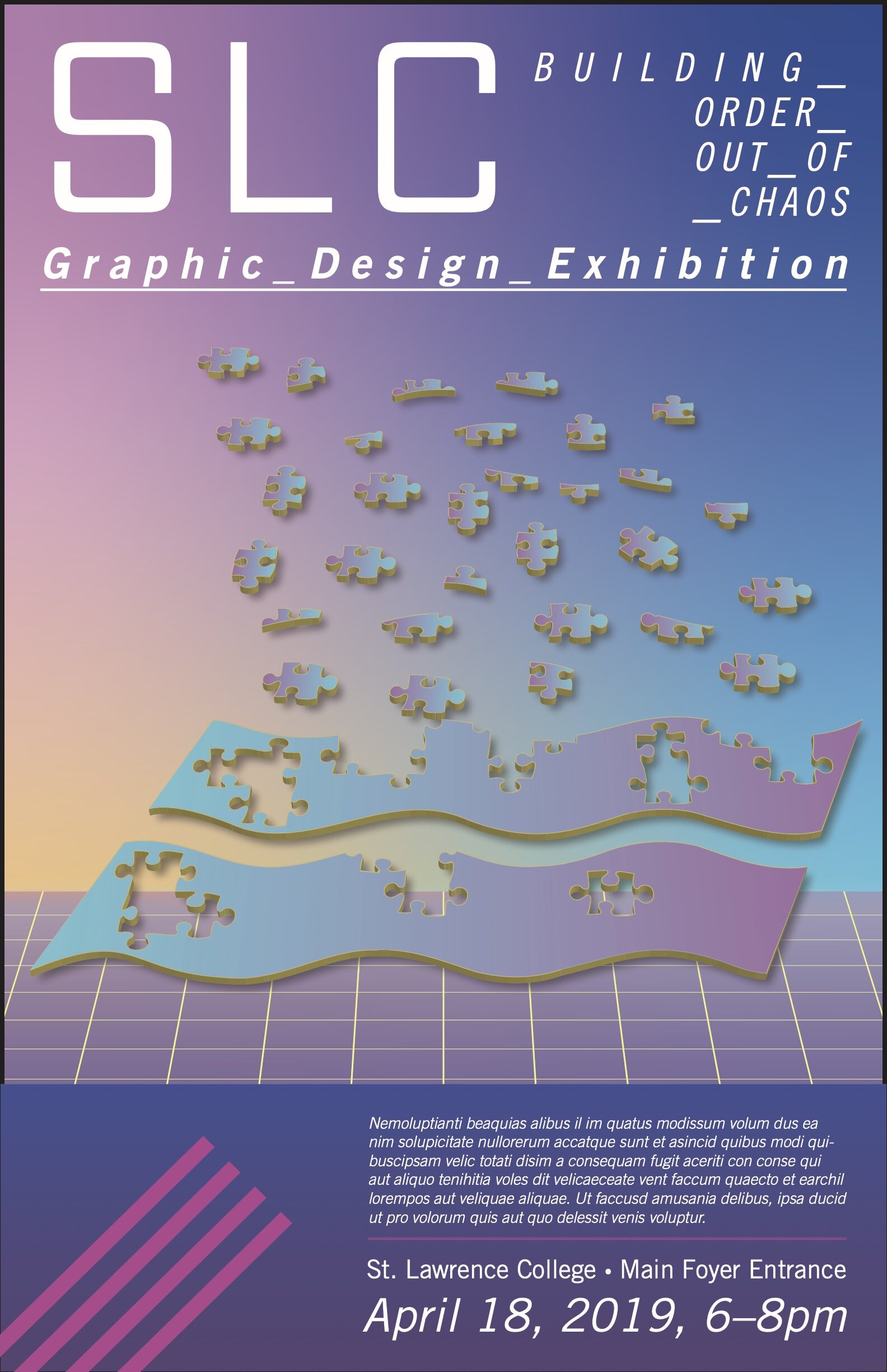
The key concept of the poster is to illustrate how Graphic Design is the organization and arrangement of disjointed parts to fulfill a visual communiqué to an audience. This process can be frustrating and seemingly impossible until parts start to fit together. Once enough parts are assembled, the full picture can come into view, and the rest of the chaotic pieces don’t seem quite as overwhelming. When complete, a project is cohesive and complete, and there is no question that this is how the parts should be arranged.
Application
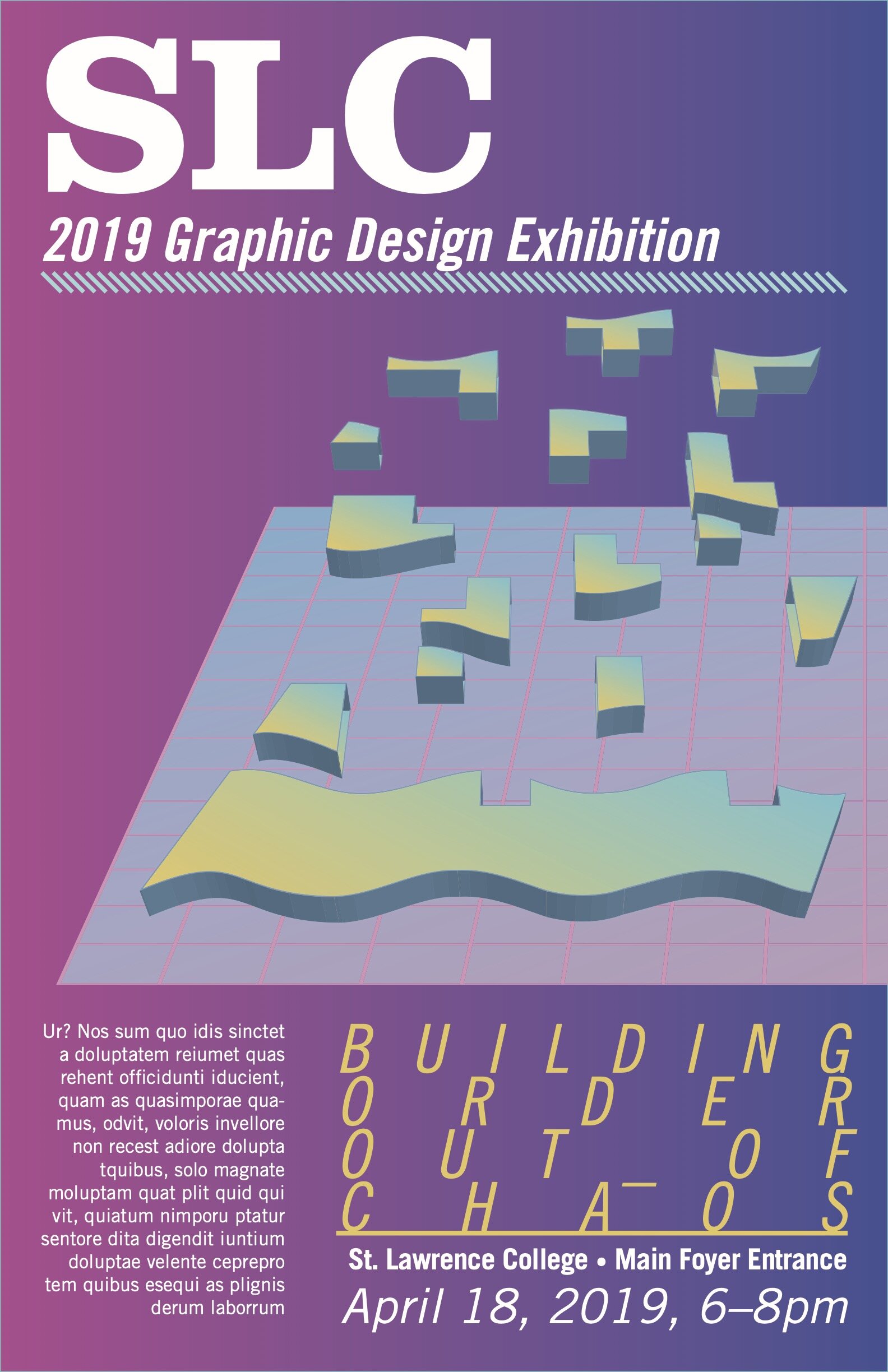
The visual metaphor that describes this concept is an image of a partly complete jigsaw puzzle. The remaining pieces are nearby, but their placement in the puzzle is not clear. The graphic design student is a puzzle solver, and they will be compelled to arrange the pieces.
The look of the design solution is inspired by the early digital graphics featured on many high-school textbook covers. The aesthetic features geometric shapes and gridded planes set against colourful gradient backgrounds. The design style was highly indulgent and irresponsible with their overuse of three-dimensional shapes and weightless space imagery.
Perhaps the designers were seeking to add excitement and wonder to a dry subject like physics or calculus. A teenage student in the ‘90s would feel a sense of annoyance and belittlement on their first encounter with a heavy textbook of long division. Later their displeasure would turn to familiarity as they scribble shapes and designs on their notebooks. After graduating, the trends in textbook design change, and the cover image is now a nostalgic touchstone.
The typefaces are all various sizes and weights of Univers, which is one of the official typefaces used by St. Lawrence College. The pastel colourscheme is evocative of springtime, when the event takes place.
Final Poster Design
Early Concept
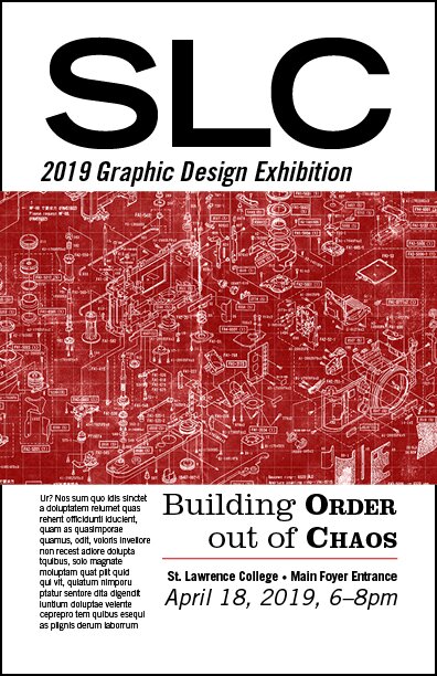
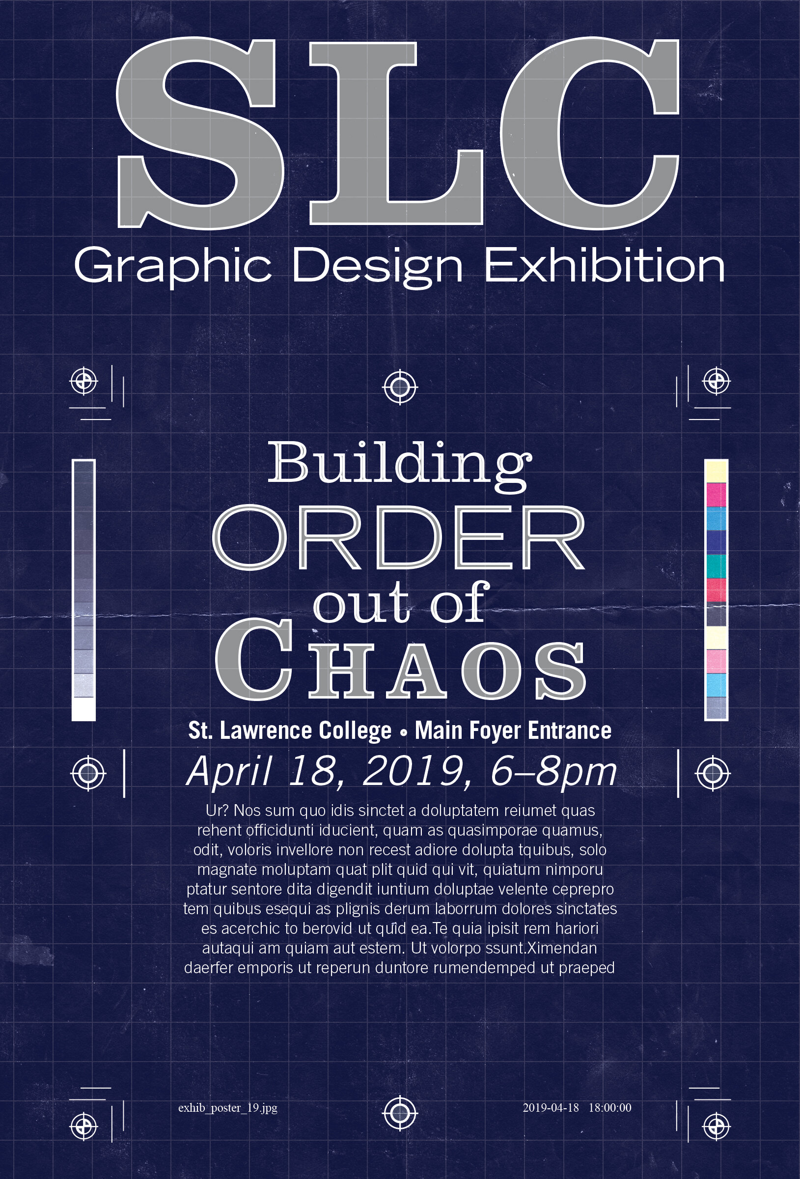
When I began this project, I had an entirely different approach. It is not unusual to spend multiple hours developing a concept which will be rejected. Sometimes projects change direction and I cannot become too attached to my existing work. This is all part of the process.
Strategy
This poster will feature a primary illustration depicting the notion of Order versus Chaos. This is an ancient theme demonstrated in a multitude of ways in the natural world. Humanity has taken pride in the ability to adjust a chaotic world to suit our needs. Rocks and trees become roads and houses, and society is improved.
The role of a designer is to take chaotic disjointed requirements and assemble them into an orderly visual communication. To achieve this, the chaotic elements are put together in such a cohesive way, the average viewer has no idea of the complexity underneath.
Taking these things into account, the visual metaphor for this poster will display a glimpse underneath the surface to expose the intricate inner workings of the typeface itself. Half of the poster will be rendered in a sketchy blueprint style with numerous notations and measurements indicated. The other half will show the clean assembled letters.
Relating it to Graphic Design
Design work is similar to building a car. Individual parts are whittled down to perfect size, then everything is assembled with exacting precision. While the visual metaphor of this poster could easily be an assembly diagram for an automobile, using a typeface is more directly related to the practice of graphic design. The letters are revealed to have just as much complexity as an elaborate mechanism or a perfectly built home.
Overall, the poster will resemble an assembly diagram, indicating how disconnected unique parts can come together to assemble a deceptively simple unified contraption.
