Music Label Promotional Campaign
_nothing records
Overview
Nothing Records – a “vanity” project created by Trent Reznor of Nine Inch Nails for the purpose of signing and promoting industrial, metal, and electronica acts which are curated by Reznor himself.
The goal of this project is to create promotional material for the label as a whole which will feature imagery that conveys the essence of the type of music for which Nothing Records is known. The bands on this label will all be performing at a large music festival in the summer. Currently, the run of promotional material centers around this event. The key message will be “buy tickets to this festival”.
The promotional material will take the form of a full-page magazine ad, as well as a series of banner ads for webpages. The ads will set themselves apart by their unique style which eschews conventional music act imagery. The end result will feel large and imposing, but also challenging and engaging. The stark simplicity will be familiar to old fans and inviting to new viewers.
Semiotics
Nothing Records has a sparse simplistic style which heavily incorporates semi-recognizable textures and imagery. Text elements are distorted and repeated in non-traditional manners, creating a sense of uneasiness and discomfort. Nothing Records relies heavily on text and does not typically show pictures of the band. The logotype identifier for Nothing is rendered as heavy bold sans serif letterforms with extremely low contrast, and often only represented in lower case.
The colour palette might be described as ‘urban filth’, using yellows, browns, and oranges to further connote discomfort. On other works, Nothing Records has leaned more towards a ‘digital dystopia’ colour palette, which uses more greys and blues. Even in this case, the textures and disordered lettering still conveys a sense of decay.
Production
There will be weekly progress updates every Tuesday until the project is completed.
Target Audience
Reserved, educated, open-minded, and thoughtful - the audience is not interested in shallow expression. The audience wants music which is dense and deceptively complex.
Perception
Powerful, Deep, Mysterious
Action
Ideally, viewers will encounter this material and become enticed to visit the website and engage with the bands signed by the label. They will also be compelled to buy tickets to the music festival, and consider travelling long distances to see a selection of their favourite acts.
Problem Statement
Current State
The problem is fundamentally a lack of awareness for the acts signed with Nothing Records. All the following issues revolve around the need for a targeted advertising campaign.
Who does it affect / who does it not affect?
Anyone with the means or the will to attend an outdoor music festival. Past and current music fans. People with money to spend on entertainment. Largely English-speaking people, but not limited to them. Anyone who reads arts and culture magazines or webpages. Aging Gen-Xers.
It does not affect non-music fans, or music fans with a distinct distaste for electronic industrial music. The faint of heart. Anyone physically unable to attend a show.
What does it effect / what does it not effect?
Music, arts, and culture-based webpages and magazines, etc. Anywhere the ads might appear needs to be ideologically aligned with the industrial aesthetic. Bus advertisement spots need to accept the advertisements.
It does not affect soft and light music and critics. It does not affect any outlets that would not print an advertisement for industrial music.
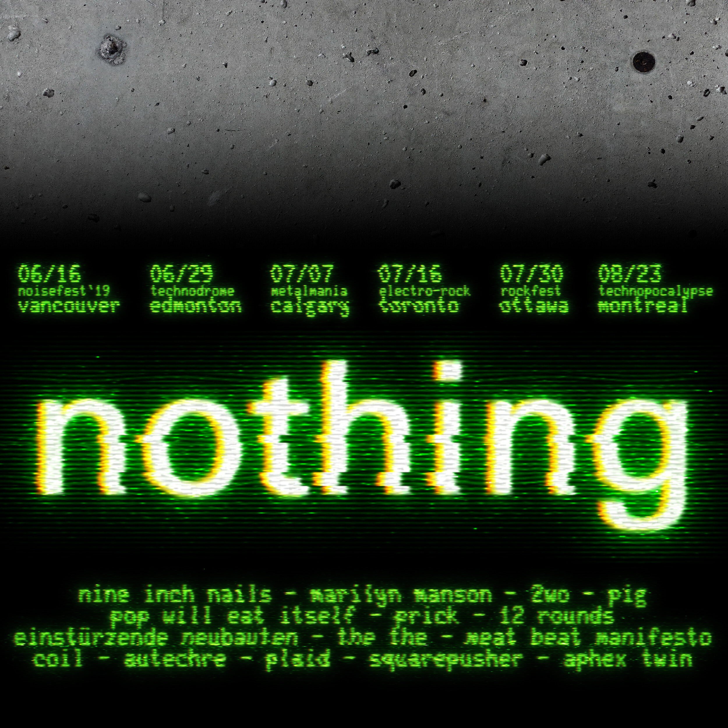
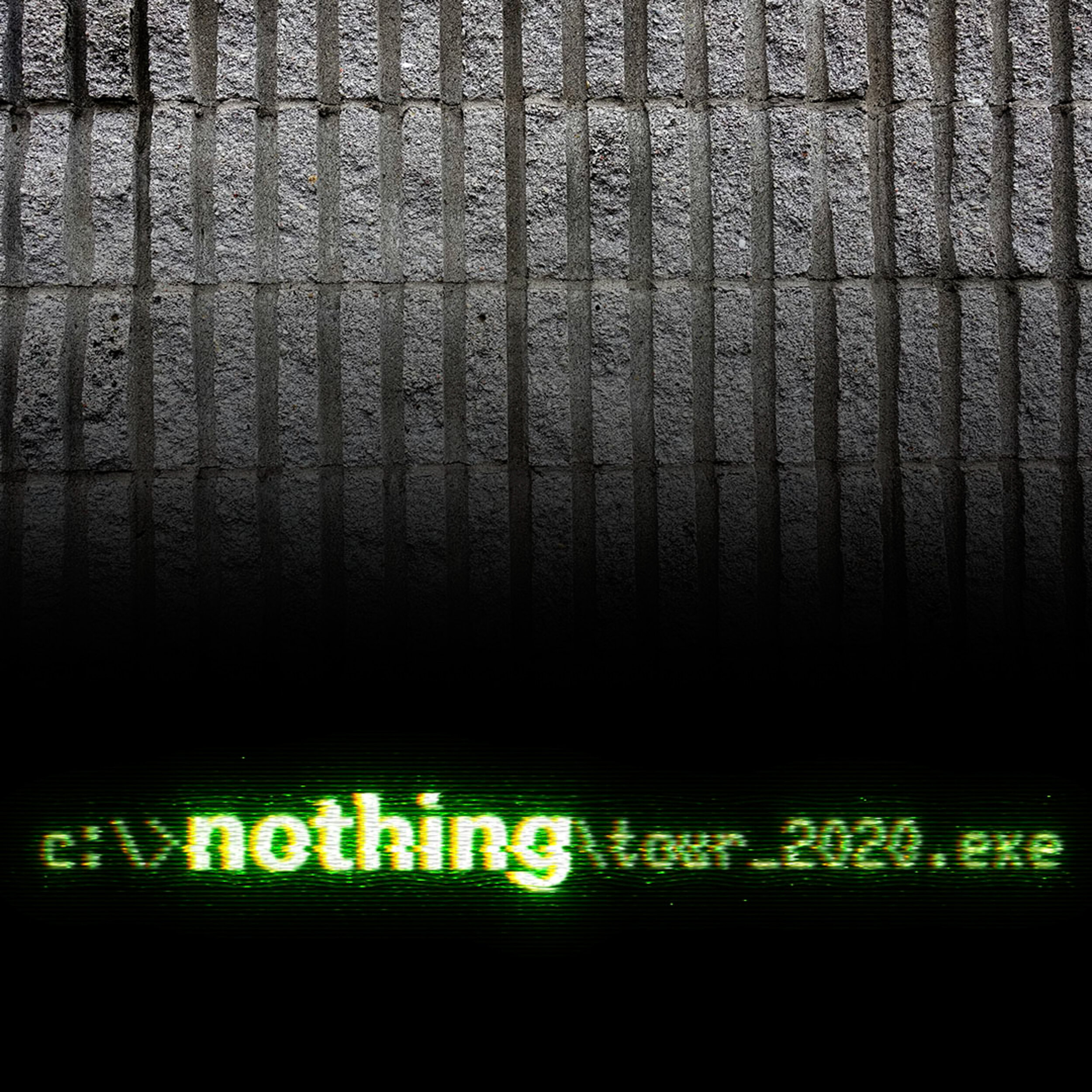
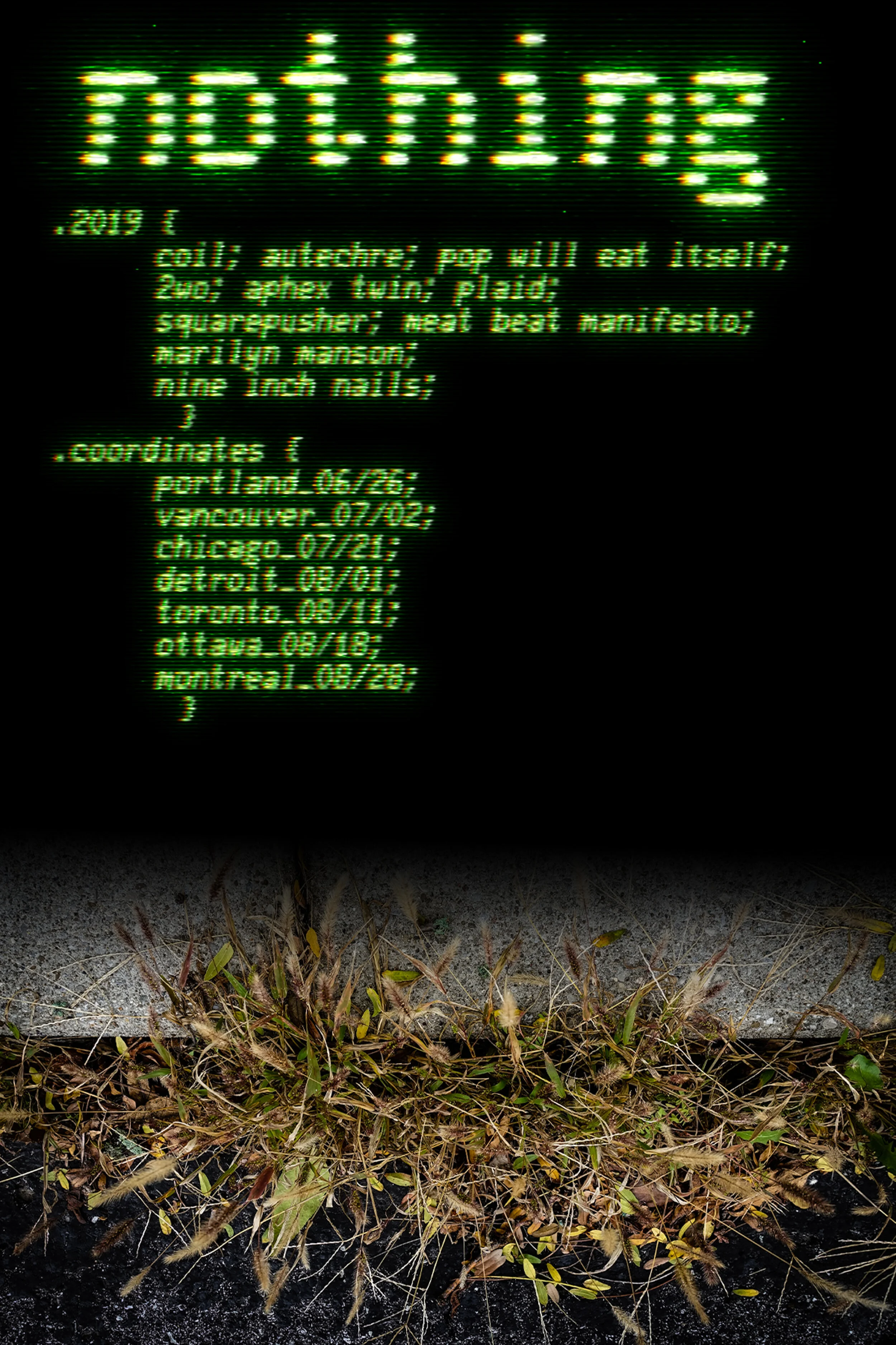
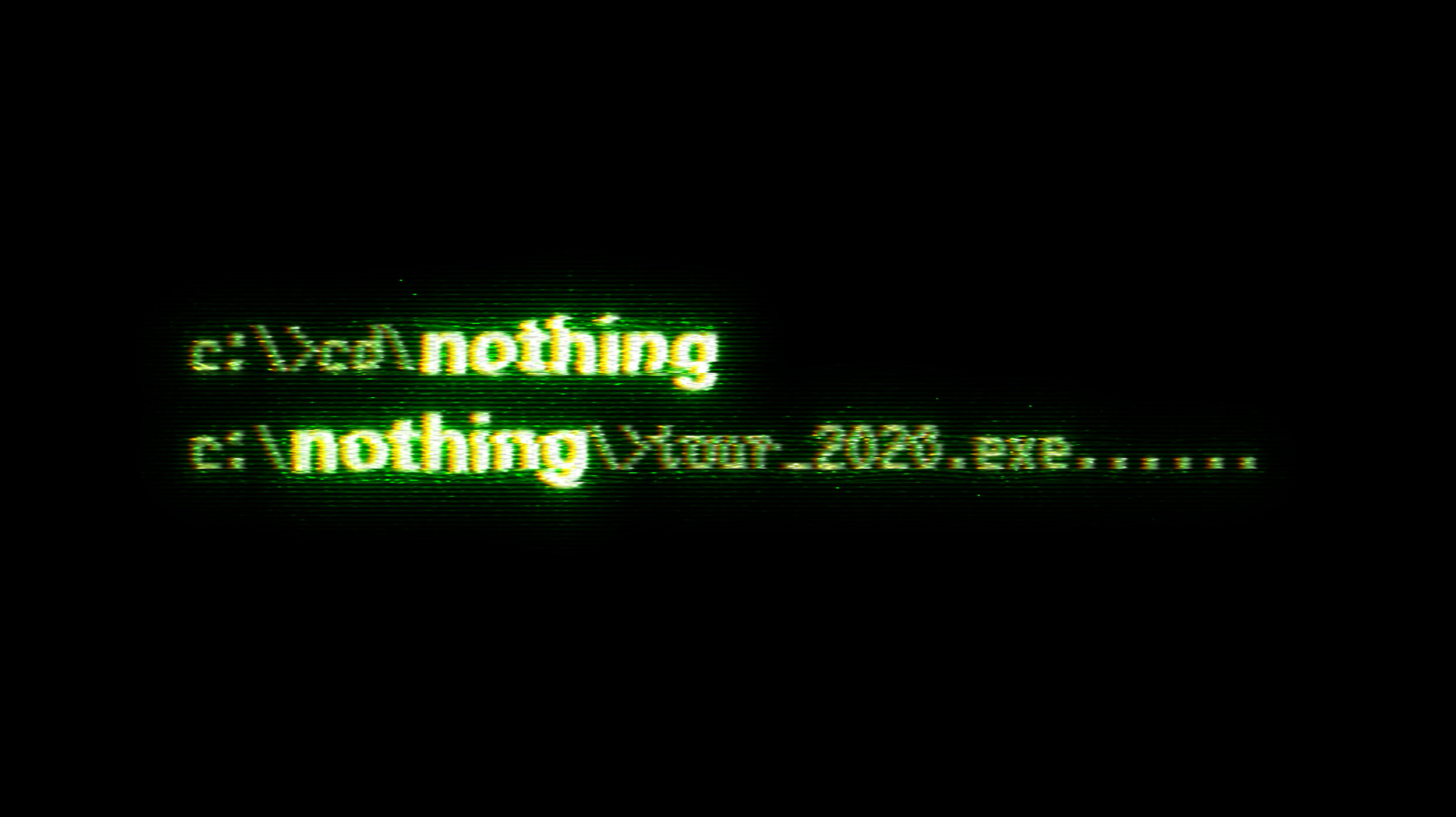
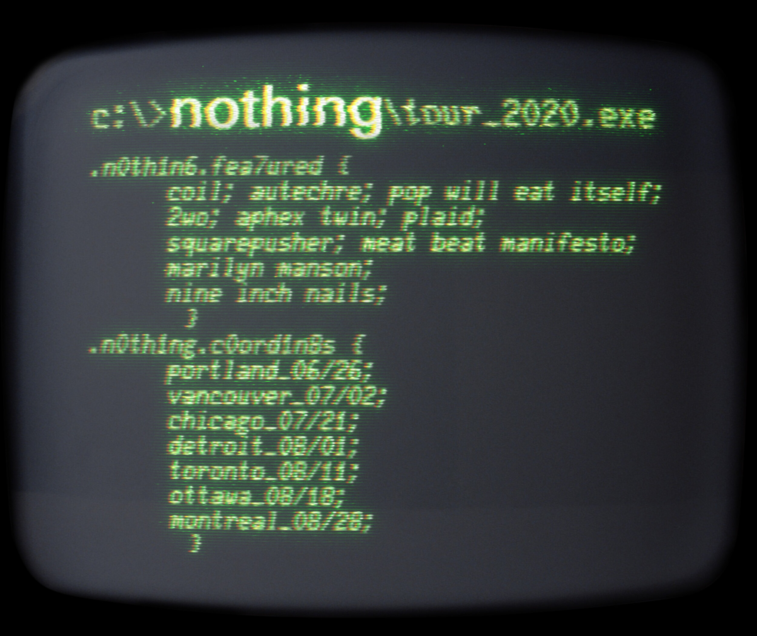
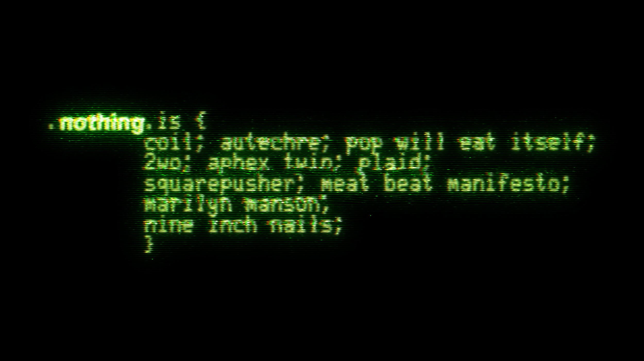
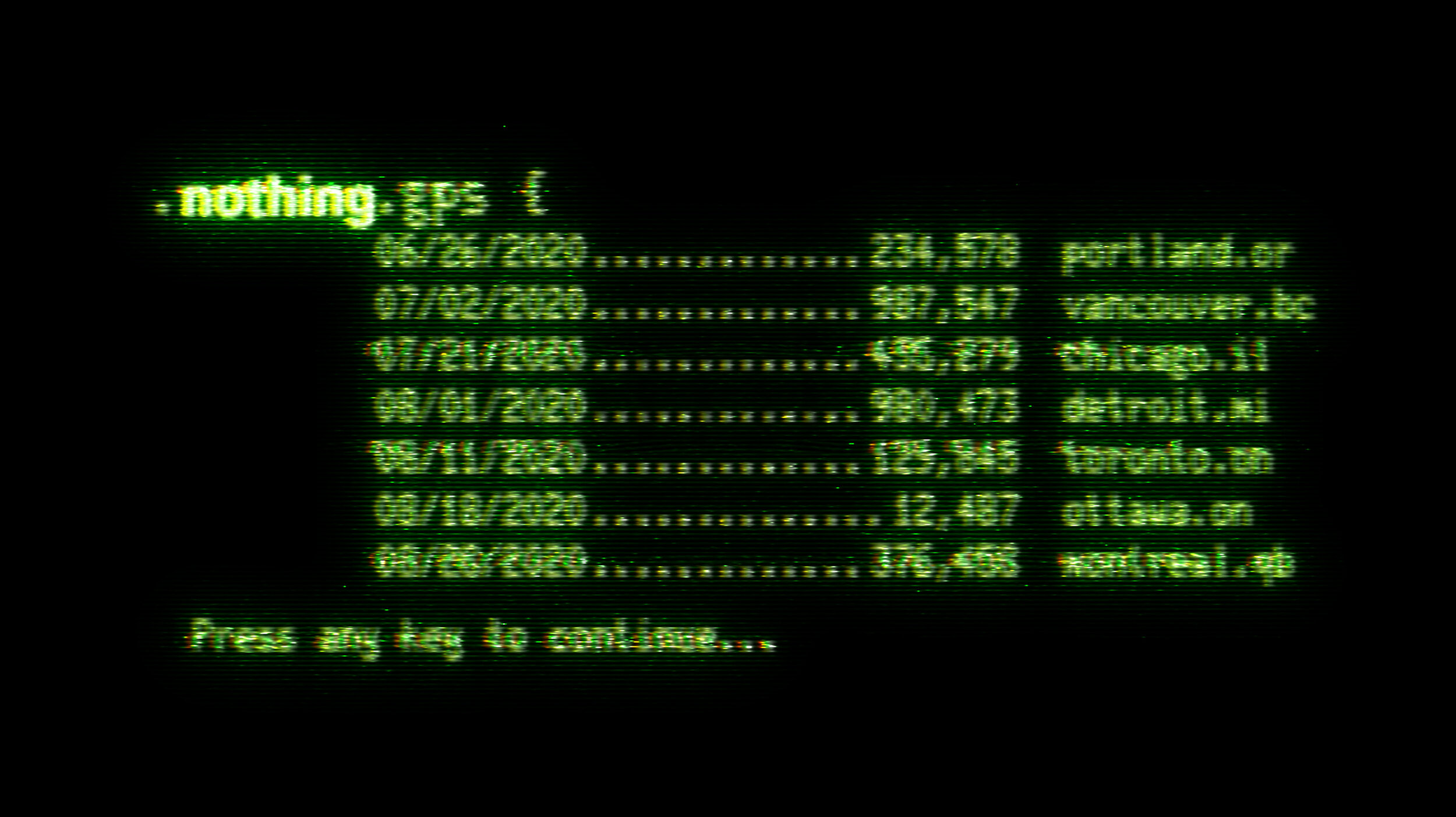
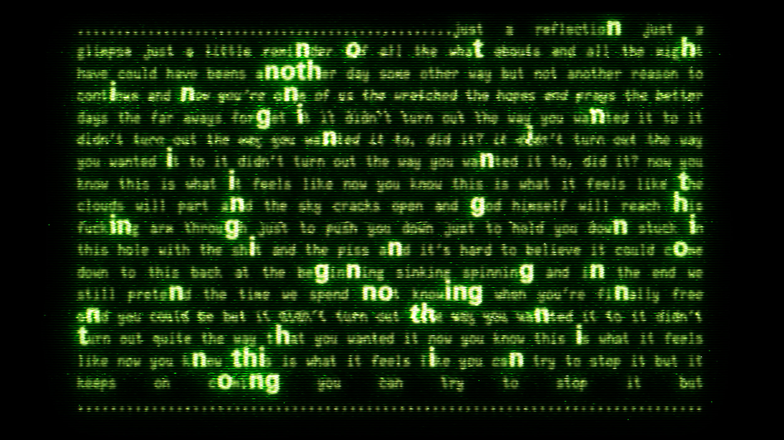
Developing versions of the design featured a green text colour with undesired The Matrix references
How does it effect / how does it not effect?
People are affected by not being informed about new music. The record label is affected by the lack of awareness which reduces their revenue.
When does it effect / when does it not effect?
There are dozens of music festivals and concerts that take place in the late summer. This festival is one of many that the audience must choose from. The problem occurs in the early summer when the tickets are on sale, and the event is competing for the attention of the audience.
Where does the problem occur / when is it not a problem?
The problem occurs especially in cities where the bands have played that have potential fans who are uninformed. The easiest target for this advertisement is anyone who happens to live within twenty miles of the venue for whom travel concerns are minimal.
Conversely, there are many potential concert-goers spread out beyond the 20-mile radius, although they are not nearly as densely collected as the city dwellers. The digital portion of this campaign should be heavily targeted towards people who live far from the venue.
Ideal State
Who does it affect / who does it not affect?
New and former industrial music enthusiasts will see the ads for the concert and will make plans to spend a weekend in the city where it is held. People who are not interested in electronic industrial music will see the ads and appreciate their avant-garde nature and provocative appearance even if they have no intention of attending the show.
The campaign will have no specific effect on non-music fans, traditionalist music elitists, or anyone who dislikes modern culture.
What does it effect / what does it not effect?
The design will affect the visual appeal of a website, magazine, or bus stop advertisement space. The design must attract attention, but also must be relatively attractive and inoffensive.
How does it effect / how does it not effect?
The imagery will be memorable and will remain as a souvenir reminder of the summer when this concert took place. The imagery will serve as a visual identifier that connects an individual to this concert series. Possessing this imagery will imply that the owner has some personal connection as a fan or crew member to the event.
When does it effect / when does it not effect?
The advertisement campaign will begin in the early summer before the concert festival tickets go on sale. Its primary action will take place in the four months leading up to the festival.
After the end of the show, the advertisements may be repurposed for future fan engagement, but the primary function will be limited to the festival season of this year.
Where does the problem occur / when is it not a problem?
The festival affects the tourist-centric businesses near the venue. The imagery will be displayed around the host city and must be attractive and cohesive with its surroundings. The imagery and the event could potentially increase the revenue gained over the weekend. Banner ads could increase the value of the websites on which they are displayed.
Problem Statement
The purpose of this design is to make music fans aware of the bands performing this summer in order to encourage them to buy tickets or listen to their albums on streaming services. The campaign will increase the popularity and value of the record label and their signed acts.
Rationale
For this design to satisfy the strategic brief it has been rendered primarily using photoshop effects. Text elements are displayed on screens which have been piled awaiting recycling. This represents the disposable culture typically seen in urban decay environs.
The colour scheme is heavily tilted towards the blue spectrum in an effort to downplay similarities to the film “The Matrix”. Nine Inch Nails, the band, have been favoring this blue tone in their more recent works, so it further reinforces the visual tone of the record label.
The design uses the gestalt theory of grouping in a few different ways. Primarily, the televisions are seen grouped together in a pile on the large format poster. Their screens are not specifically connected, but they display a contiguous image of text that carries a consistent message. Secondarily, the one text block contains an esoteric set of lyrics from the Nine Inch Nails catalog. These lyrics are rendered in a digital style blocky typeface, however the letters which spell the word “nothing” are rendered in the iconic Univers sans. This creates a visual connection and spells out the name of the record label despite not being directly connected together.


