Appliance Instructions Redesign
Project Overview
Asses the provided instruction pages from a current household appliance manual. Develop a more appropriate arrangement for the information and produce a prototype.
Background
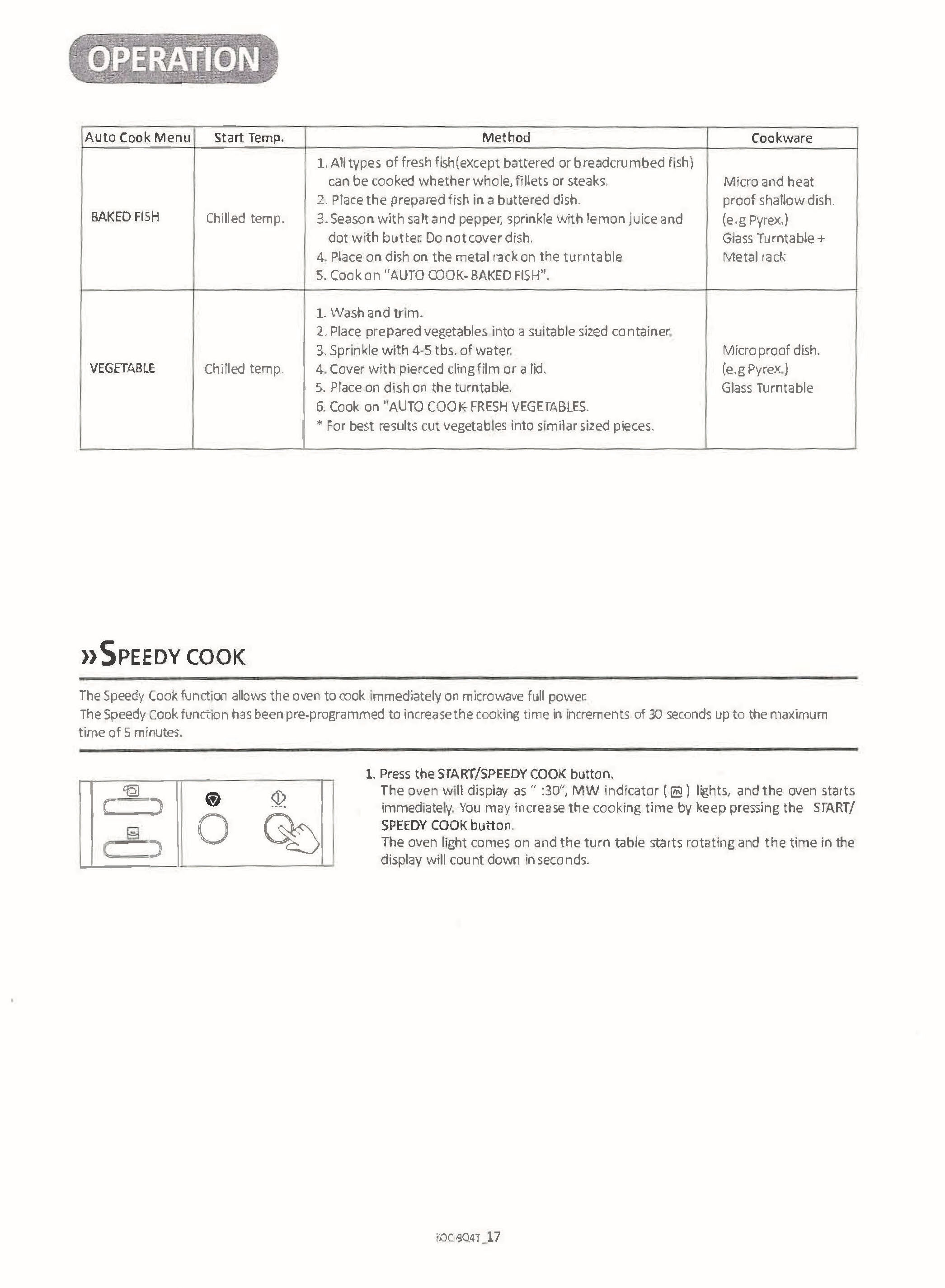
Daewoo is an electronic appliance company which manufactures several different devices for home use. The device in question is a combination convection and microwave oven designed for use on a kitchen counter top. The instructions are designed to be complete and legally accurate with minimal attention to user experience.This section of the instruction manual covers the “auto cook” function of the microwave. By choosing from five different cooking modes, the user can apply specialized heating to meals with improved results. The instructions are made to be stored in some useful location where the user can refer back to them whenever the need arises. Unfortunately, the more likely scenario is that the user will glance at the instructions once when the oven is new, and then never again.
Project Objectives
The goal is to make the instructions easier to follow. The information should be presented in a way that does not overwhelm the reader. In an ideal situation, the information will be made memorable, and reduce the need for the user to refer back to the manual. Realistically, the information should be easily recognized when a user flips through the manual.The original instructions are monochromatic. They feature a sequential list of steps and a few accompanying diagrams. The language used is understandable, but it is presented in an overly detailed and sterile way as if it were a legal document. The illustrations are strange as the hand icon is displayed at an unnatural scale. The overall design is useful only if the user has the attention span to read the entire page. It is challenging to find an answer to a basic question without reading the entire sequence.
Target Audience
The target audience is first-time homeowners and apartment dwellers. The oven can be used by many types of people, but the variety of functions and small form factor indicates that the oven is a space-saving appliance whose functionality could replace a traditional oven. The appliance is not overly expensive.Users will likely only use the instructions when they initially set up their oven. The design of the instructions is dense and typical of appliances such as a microwave. The density and illegibility might encourage the audience to discard the instructions entirely, and only use the most basic functions. This redesign could potentially alleviate this issue and increase the usability of the device. The manual will benefit from the use of mapping to help identify the more confusing functions and what all the buttons do.
Production Considerations
These two pages of information should remain as only two pages. While it is tempting to make the text and images bigger to increase legibility, the overall layout ought to remain at the same basic size. The layout needs to be usable by those with limited sight, i.e. using big type, and also any colour-blindness issues. Any colour coding needs to be accompanied by variations in stroke and contrast to ensure these elements are visible to all.
Rationale
This assignment is to redesign the Daewoo Combi-Oven Instructions Manual. The primary goal is to make the designs more legible by removing the oddly sized hand icons. Additionally, the illustrations were lacking identifiable details which would help the user understand what they were looking at. This instruction manual would benefit greatly from the use of mapping wherever possible.
This page in particular features a dominant illustration of the microwave instrument panel. The buttons are all shown in place and the steps are not separated out into frames like in the original manual design.In addition to the re-imagined illustrations, this set of instructions was lacking a clear typographical hierarchy. Eliminating needless sentences and adding more levels of type weights and sizes has improved the overall readability of the pages by allowing the user to scan for useful information. If the user merely needs to understand what one button or action does, they do not need to read the entire sequence of steps.
The main sequence has been reduced down to three steps from its original muli-step format. The same information is still present, although the lesser details are now incorporated into the overarching three steps.A simple addition of three colours reinforces the sequence in which the information is read. Red, blue, and green are presented as part of the three step process and reinforced in the left-to-right reading action on the chart. These colours increase understanding and also improve the overall aesthetic appeal of the design, which helps the user to avoid becoming overwhelmed by blocks of type.


