Nonprofit Arts Council Web Design
Background
The Kingston Arts Council seeks to enrich the community by encouraging the arts in all forms. Artistic education is largely experiential and constantly requires revision and newness. A community benefits in many ways from promoting the arts, but there is not often a monetary exchange between artist and audience. The creative arts are intangible.
Non-artistic citizens recognize the benefit of an art-filled life, but it is not at the forefront of their minds. The artist is not always the best person to negotiate payment. An intermediary with negotiation skills and a mind for finance can connect artists with resources and improve the community.
The Kingston Arts Champion is a campaign seeking to address some of the challenges facing the KAC. In 2015, the group outlined their mission statement and vision for the future for their stakeholders. This newly defined ethos helps summarize what the council needs o
Project Objectives
Improve Fundraising & Increase Awareness
This project presents an opportunity to apply cutting-edge approaches to fundraising. Modern communication enables nonprofits in new and exciting ways.
Promote Networking & Connect with Community
The Kingston Arts Council is a mediator between funding and the arts. Their work is hard to summarize in a brief statement.
Project Description
This promotional campaign could take several forms depending on the results of the ideation. A rebranding effort that creates a memorable new approach to the existing brand identity would be a good framework for a solution. This would help grow the audience and retain memorability in existing donors.
Another angle would be to improve aspects of the website. The work done by the KAC is not especially glamorous or easily understandable. The website has some biographic narratives about the arts they have supported. These reports seem to focus on the end result and the positive reactions. It could engage audiences better by telling a more complete story. There could be a photo gallery supported timeline showing the process of getting arts funding for a project. This might help audiences become engaged with the work.
Target Audience
Patrons
Individuals with a passing interest in the arts are the prime target. Existing art patrons are valuable, but gaining new donators is the ideal outcome.
Artists
Content creators who could benefit from arts grants need to be made aware of their availability. The campaign should target artists as well as art enthusiasts.
Production Considerations
Cost
The project will cost less than $500. A purely digital campaign would be extremely cost-effective. A crowd-sourced style social media campaign could promote awareness without consuming precious funding.
Potential Applications
Large-scale physical applications are probably unrealistic. Smaller tangible expressions could be reasonable, such as stickers or pins.
Creative Considerations
The current brand identity uses orange as its main colour. This new project is not specifically tied down to the colour, although new designs should avoid clashing with existing branding.
The current logo has potential to be adapted in a number of new ways without reinventing the whole brand.
The campaign is titled ‘Kingston Arts Champion’, which has a number of potential expressions. ‘Champion’ could take the form of an athlete.
Problem Statement
Professional, Welcoming, Supportive
The Kingston Arts Council wishes to expand their impact on the community by increasing awareness, improving funding, and remaining relevant.
Identifying Problem Areas
KAC Branding
The fundamental icon is solid. The colours are appropriate, memorable and unique. This is a clean and solid identity, although perhaps it is too clean and too professional for an arts council seeking audience engagement. The idea of “arts” is expressed in a visually dense way. Even when “arts” take an audio format, it remains visually appealing. This brand identity is severely lacking in visual expression.
The webpage should have a wealth of images put front and center. The site has pictures and a well-curated Instagram feed. There is not a lack of imagery, it is just not overt.
KAC Website
The sitemap of the website has several structural problems. There are eight main menu items, which is too many. Design experts have agreed after decades of intelligent scrutiny that the maximum should be seven. There should only be seven options when it is absolutely necessary. This menu could be rearranged down to five menu items.
When rearranging the main menu, several pages could be combined and decorated with more illustrative images.
The calendar page is not ideal. There is a large amount of information to parse here. It seems that there could be some colour coding or sub-dividing method that makes the information easier to follow.
Rationale
The outcome is a set of minor tweaks and adjustments to the website which will increase its visual appeal and utility. The current state of the website is mediocre and presentable. The redesign takes the existing content and presents it in a better way.
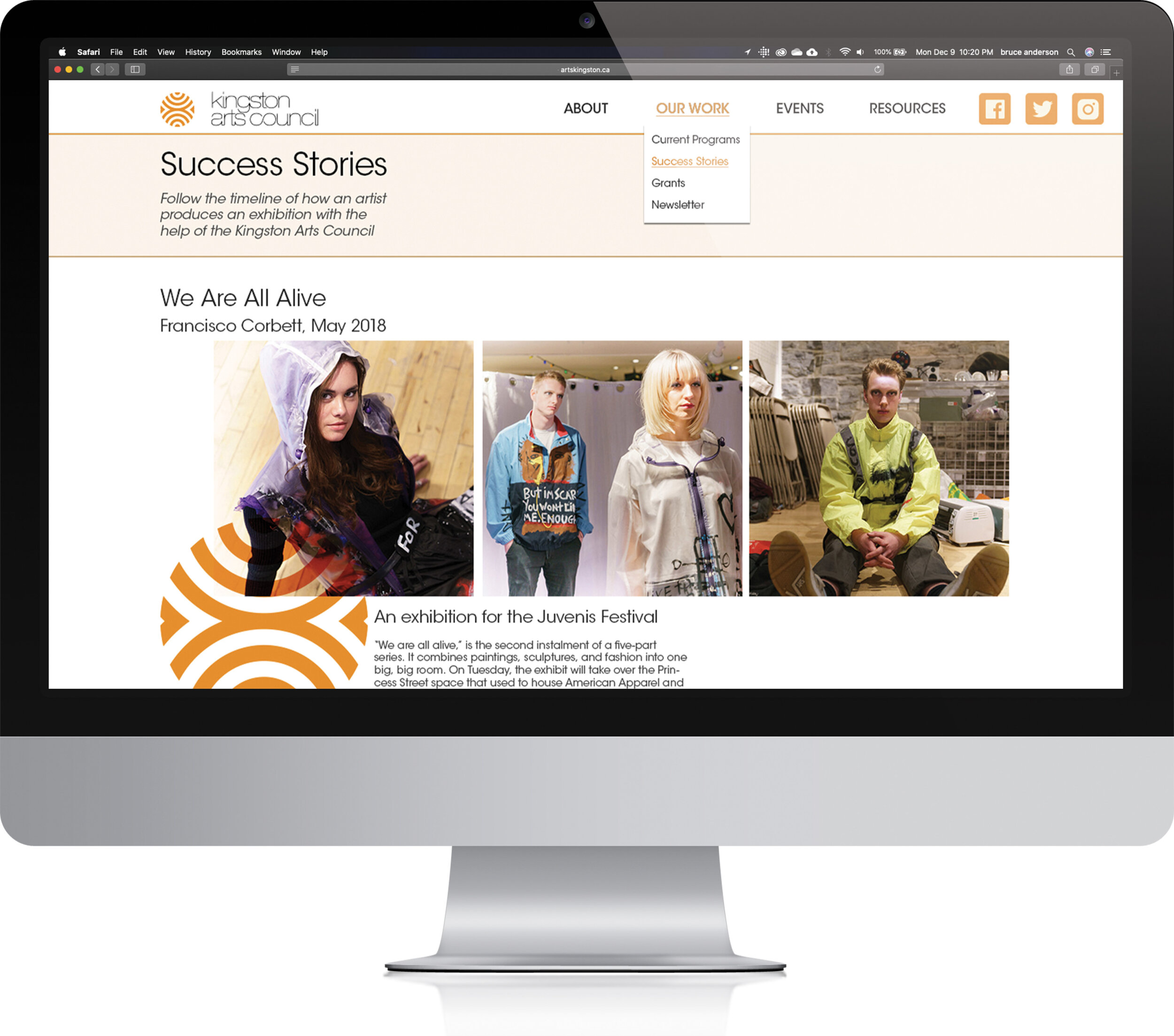
The primary change is to the sitemap. The main menu has too many elements, and some menu items have no sub items. Rearranging the items resulted in five main items rather than eight. The sub-menu items are made more communicative by rewording.
The secondary change is to add a “success stories” page. This is a human-interest style narrative of an individual artist. It features a timeline that illustrates how the KAC is able to facilitate artistic success by acting as a mediator between artist and grants.
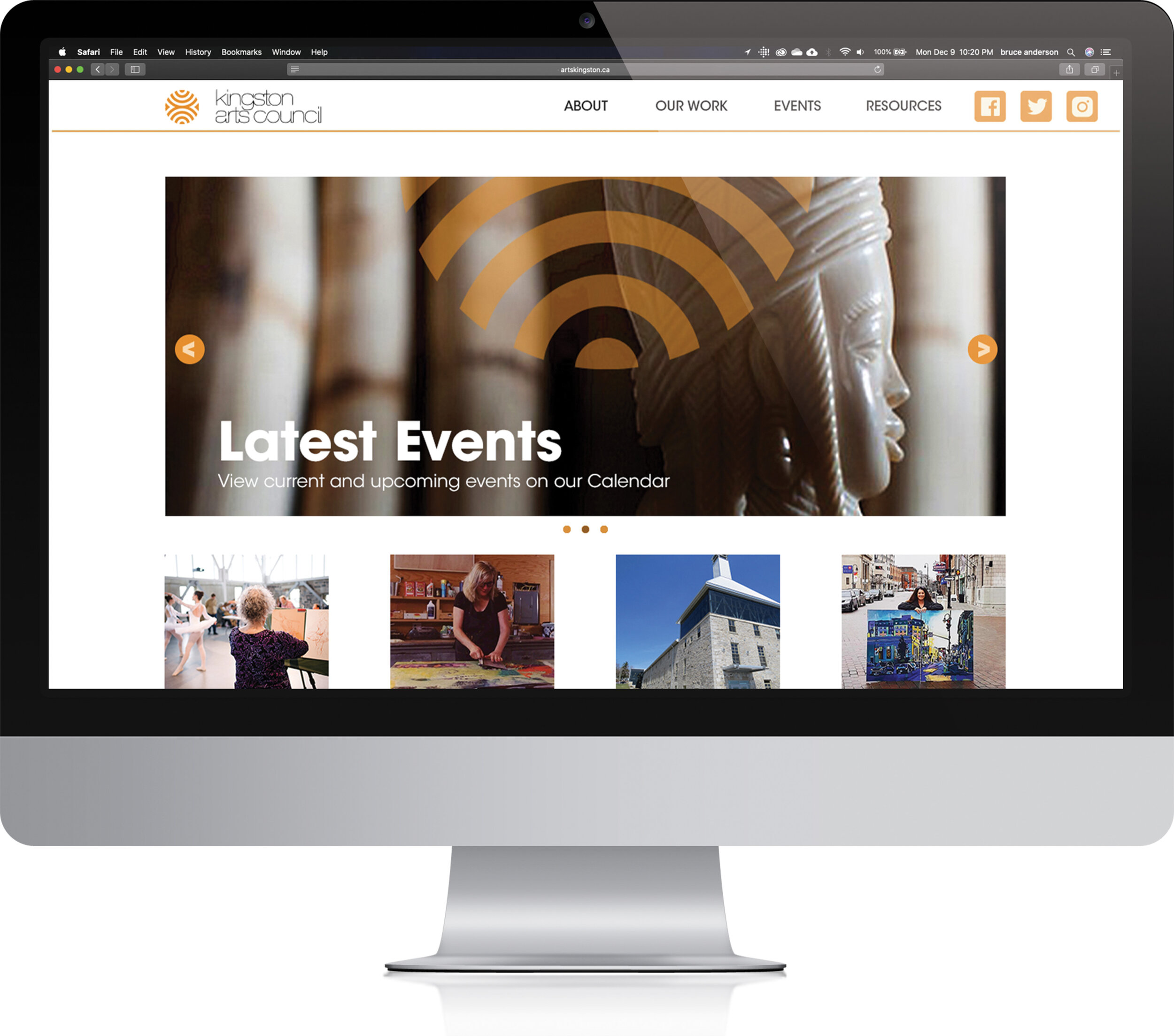
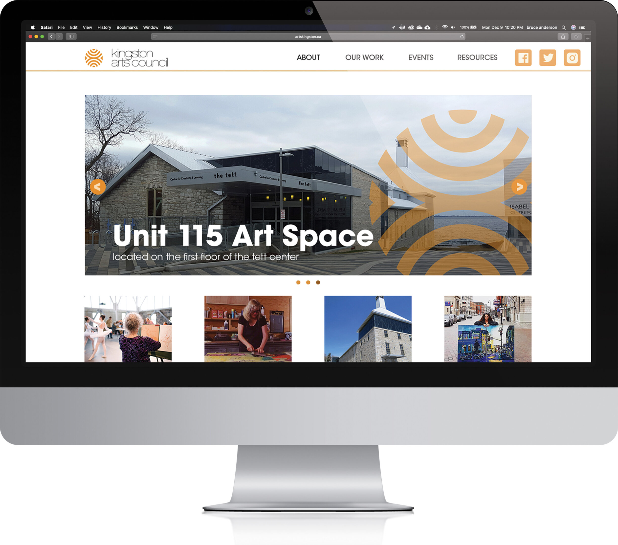
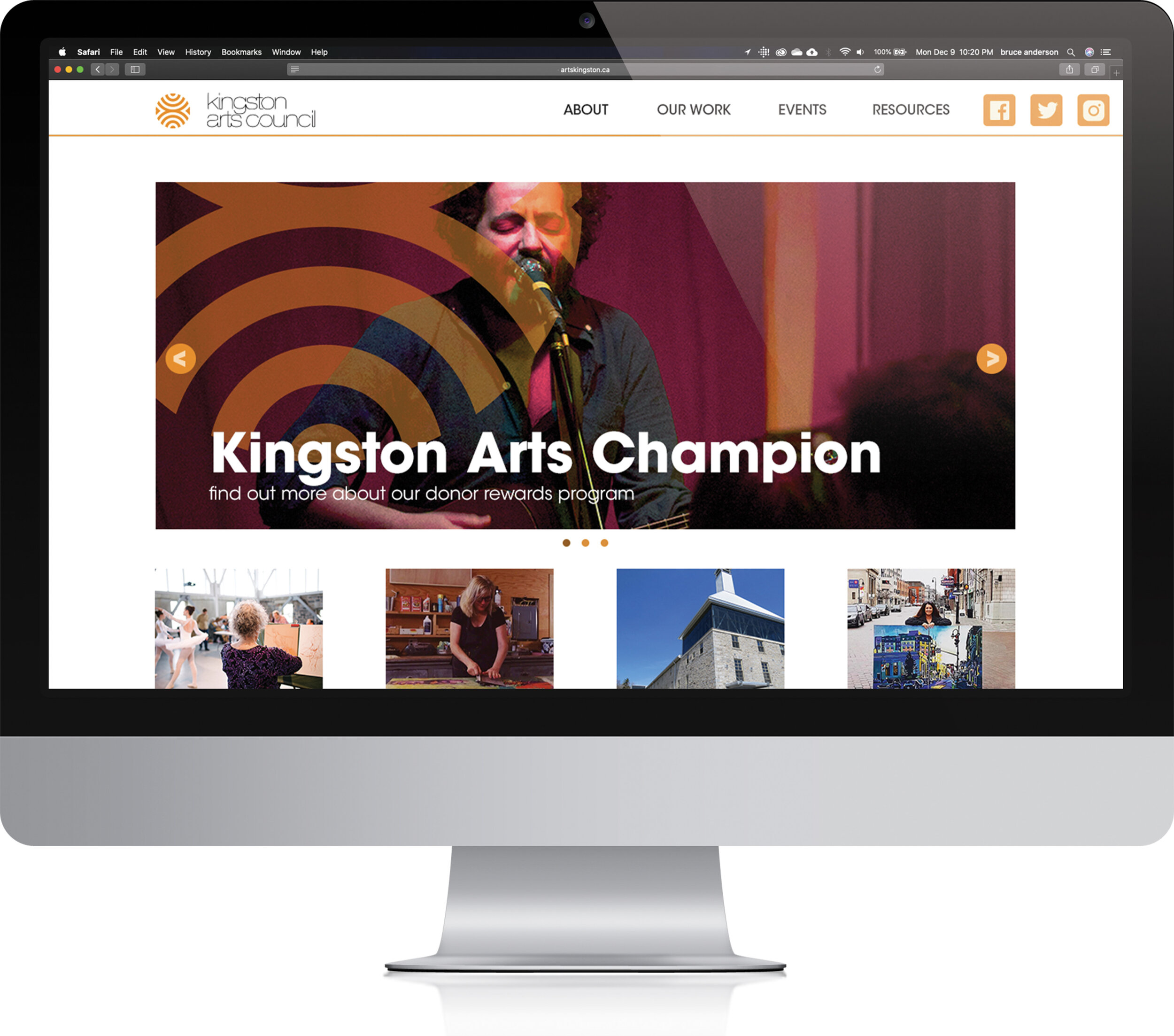
The home page makes use of the main banner, which is currently static. This banner is an ideal space to promote the current goals of the KAC. Adding additional text helps highlight the local arts and how it fits within the KAC’s goals.
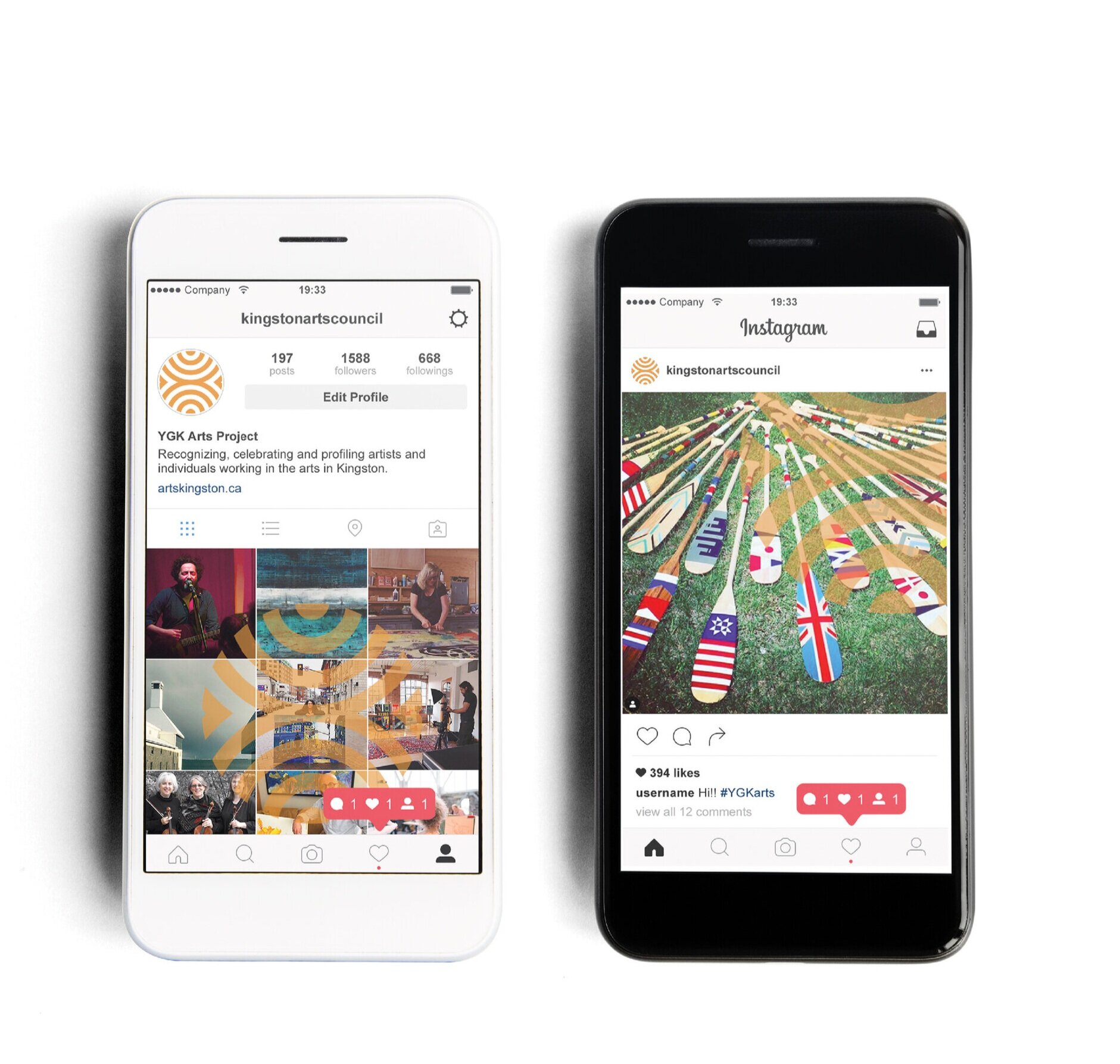
The KAC branding is strong and needs only a few adjustments. The brand can function in a variety of unused ways. The cover of the annual report features the logo functioning as a mask. This is a clever approach, but it obscures the image in an unflattering way. The KAC brand should be used as a 50% transparency over images. It will appear more like a watermark. This will subtly associate the image with the KAC while not overly detracting from the image itself.
The KAC should take this overlay approach and apply it to their Instagram feed as well. Dividing the brand into nine segments, images can be assembled to display the logo on the Instagram profile. This will connote sensations of belonging and teamwork. Every picture is one small part of a larger whole. The watermark style brand will function somewhat like a hashtag, but it will be much more memorable.

