Green Dwelling Seminar
Eco-Architecture Lecture Series
Brief
The Green Dwelling Conference on green building initiatives is the only conference in Eastern Ontario that offers a scientific perspective on the technology and challenges on eco-architecture in the 21st century.
The objective is to attract local and regional attendees to the conference who are interested or have a stake in the sustainable design for buildings. The conference organizers wish to register at least 250 people for this event.
The target audience are mostly well-educated with at least a college diploma, and many have advanced degrees. They live and work in the Eastern Ontario region, between Cobourg and Ottawa. They are motivated by a passion for sustainability, design, architecture, land-use, technology, construction principles, and economic profitability.
Rationale
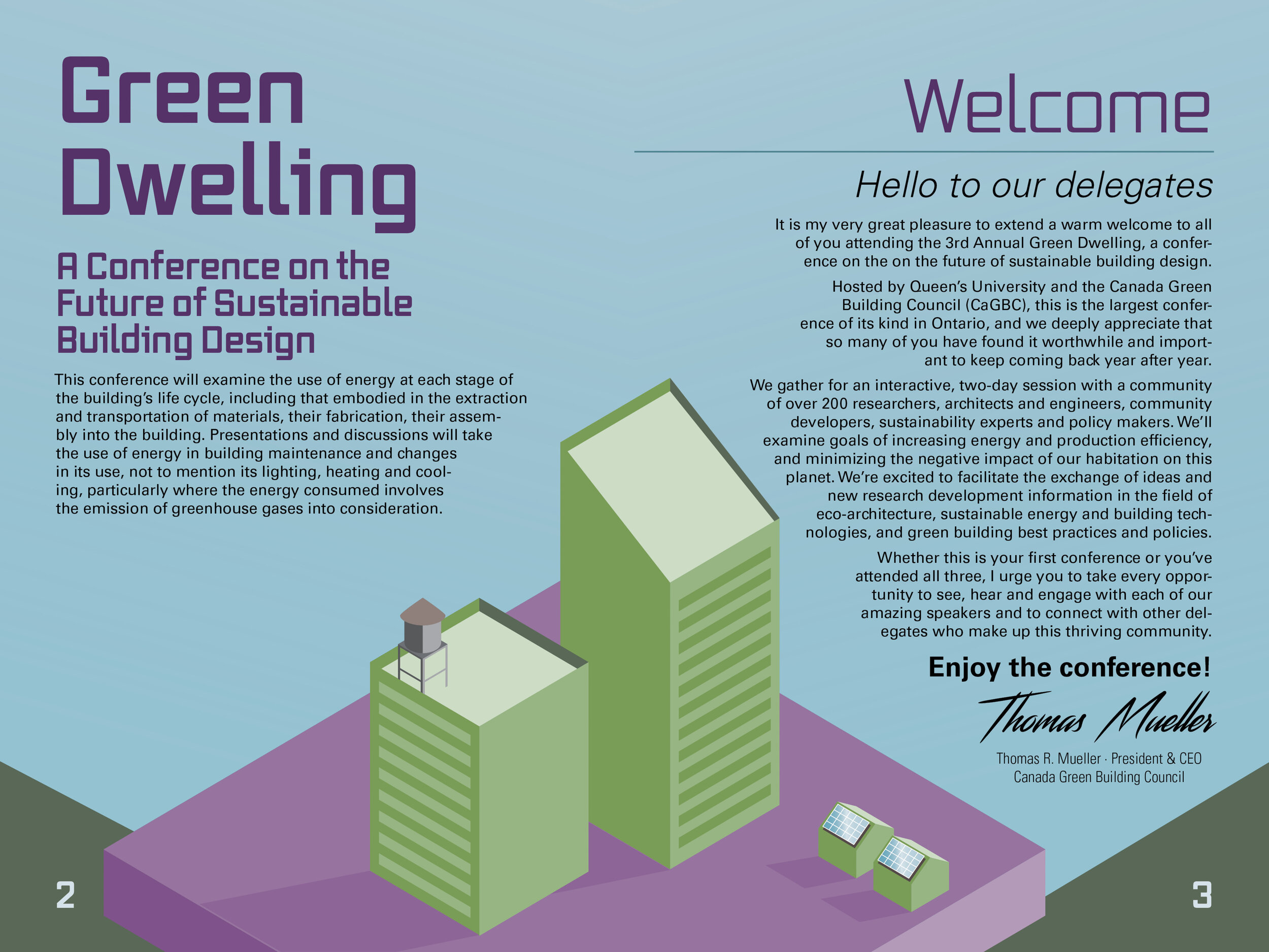
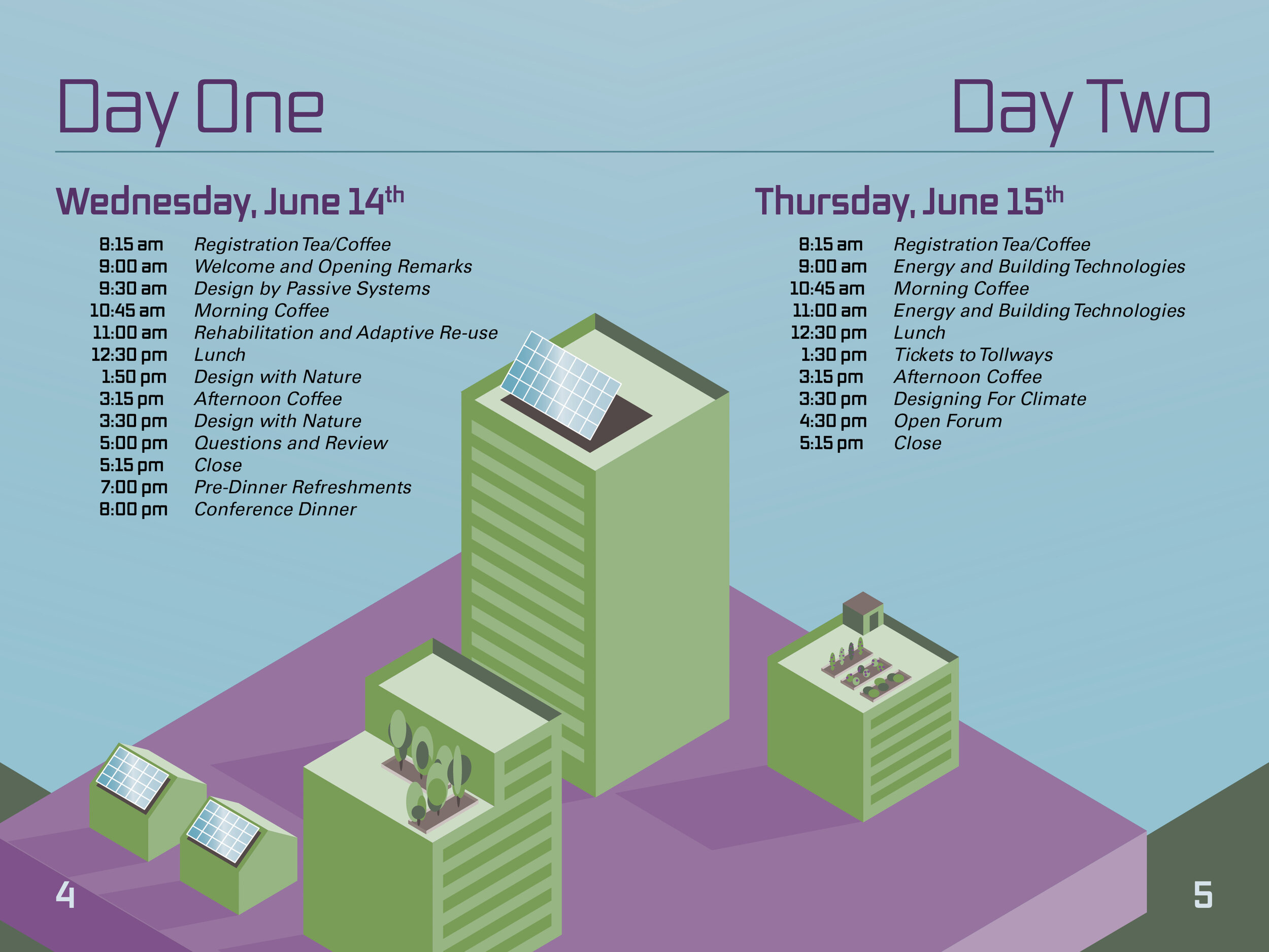
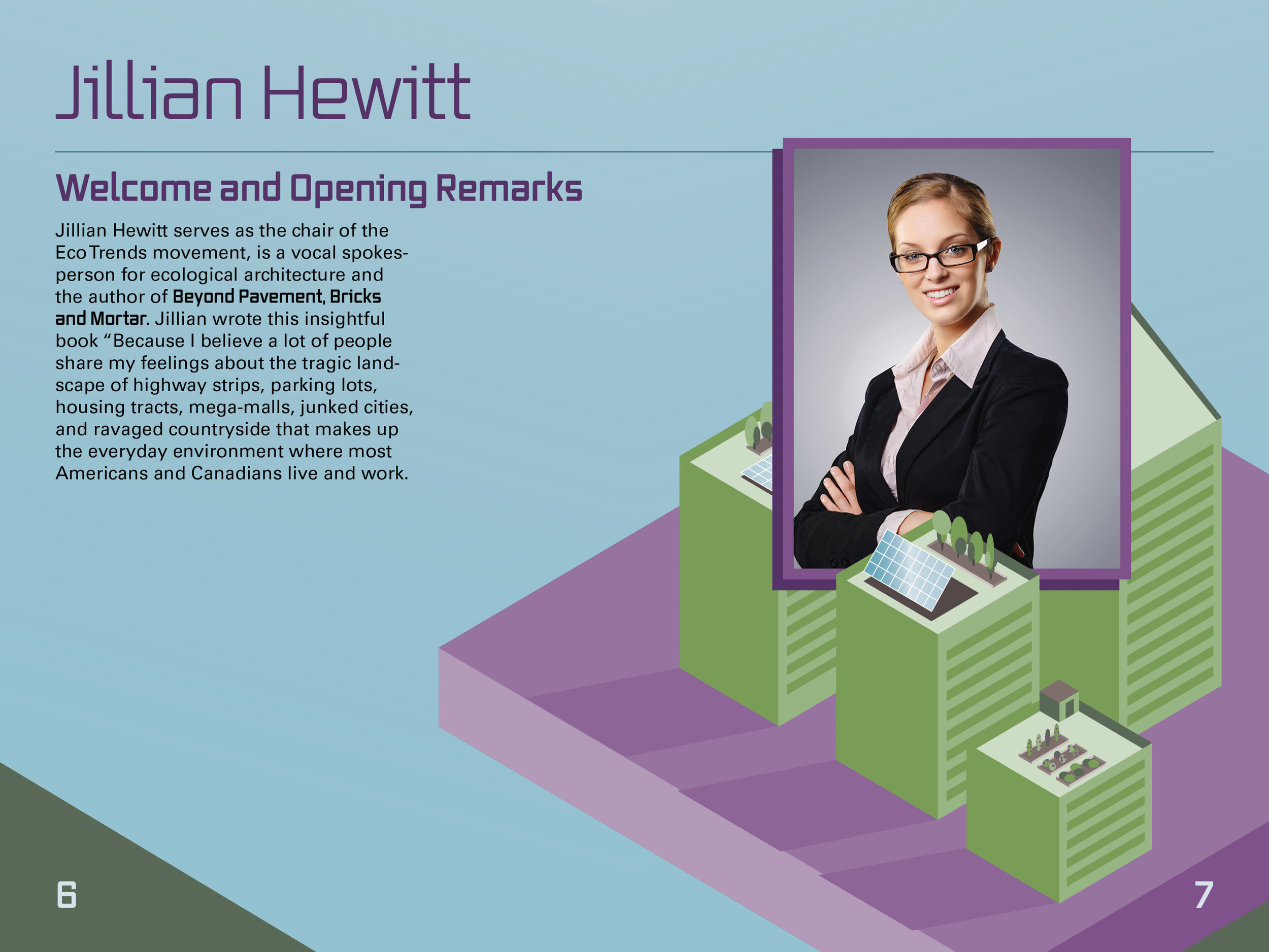
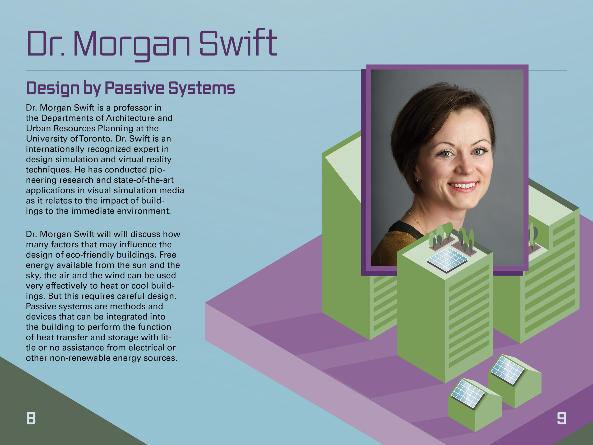
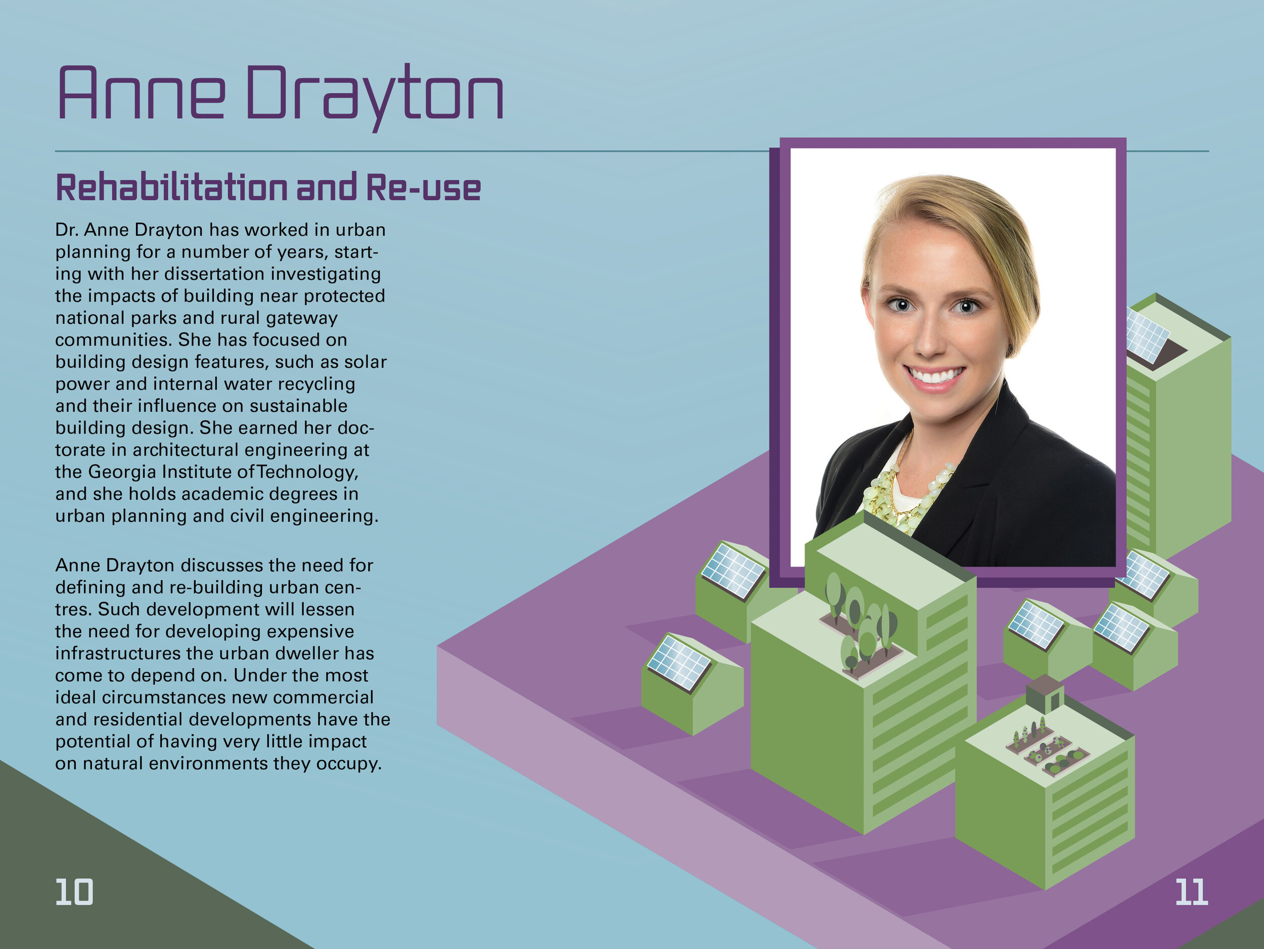
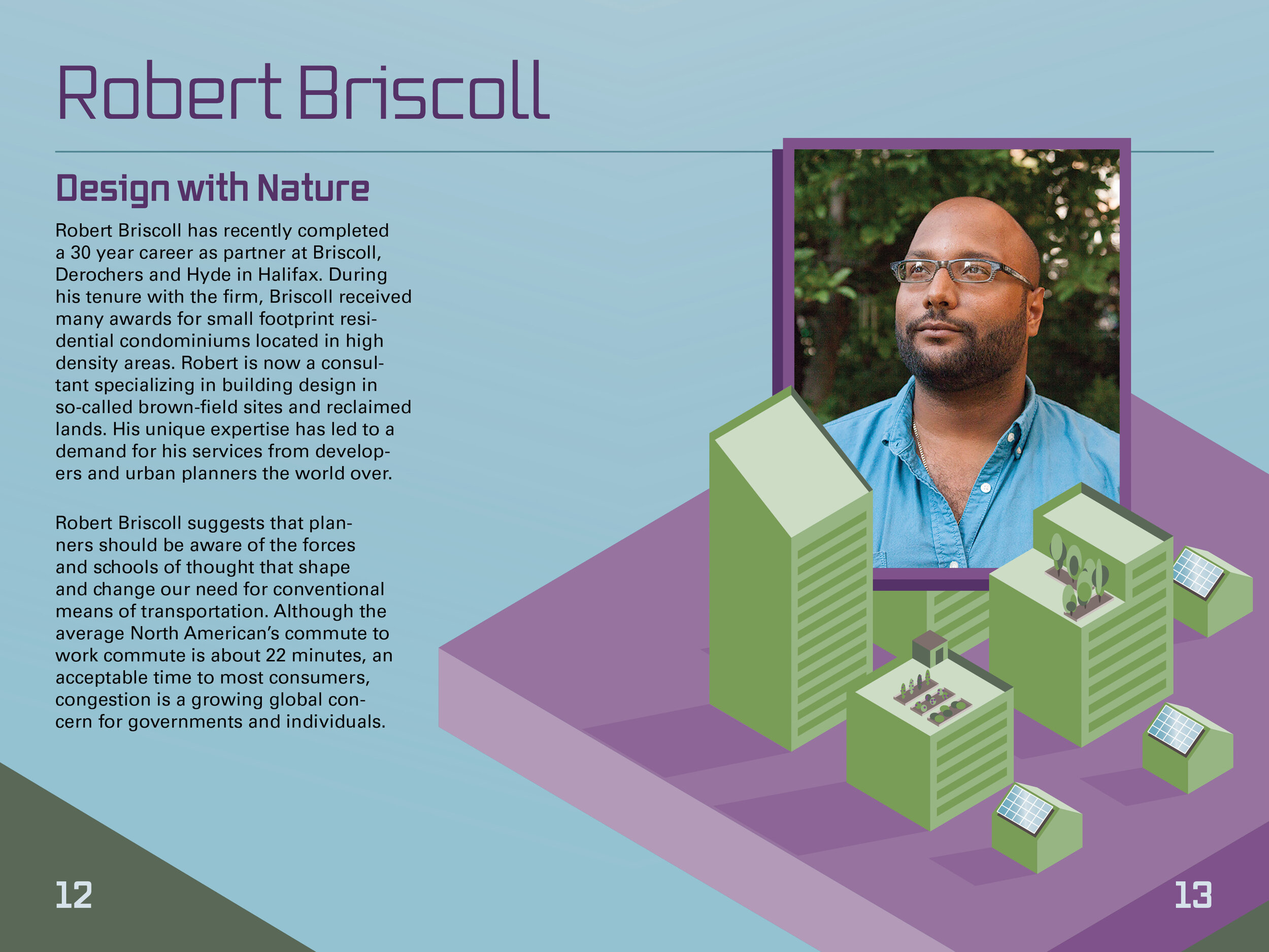
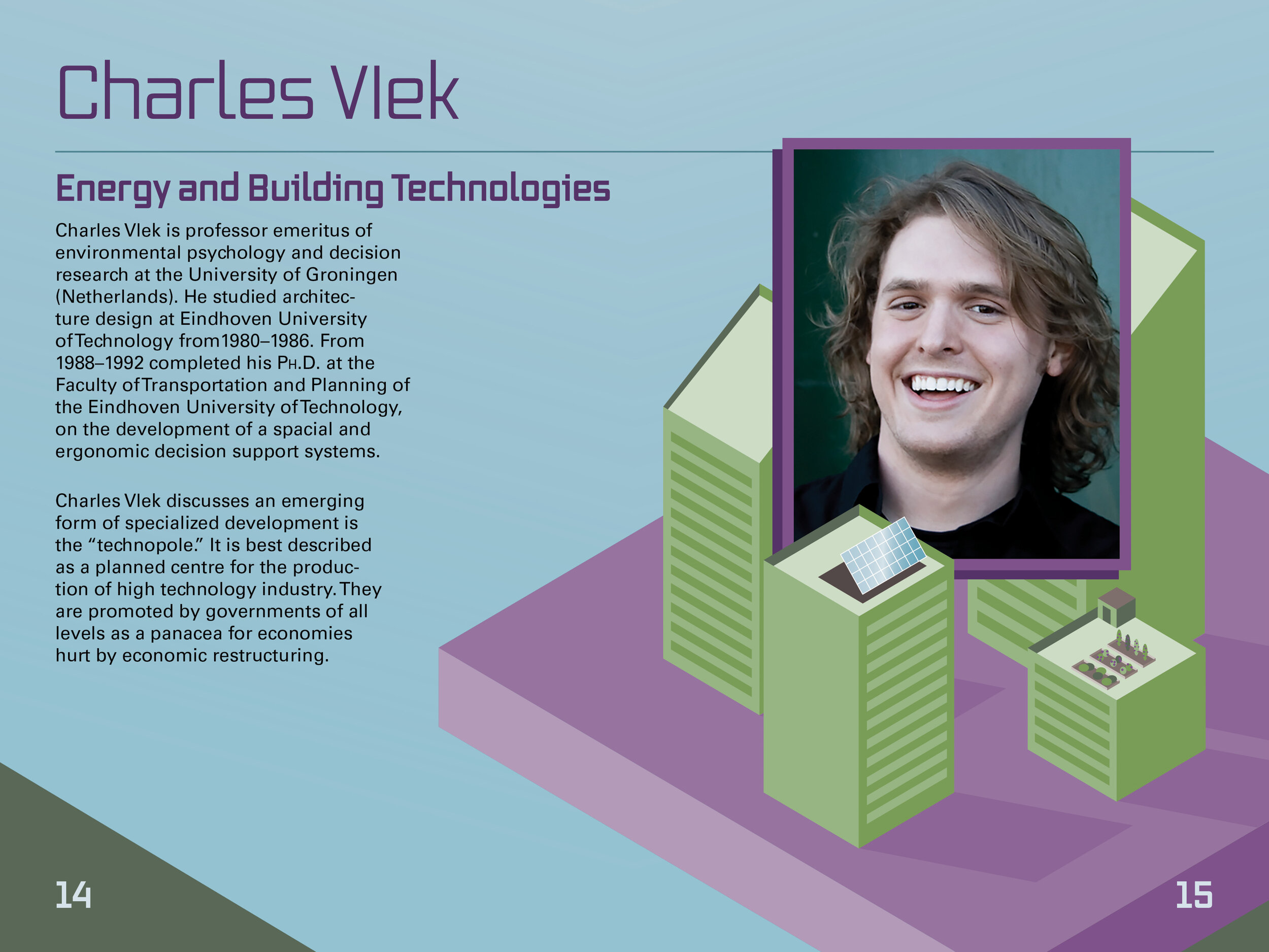
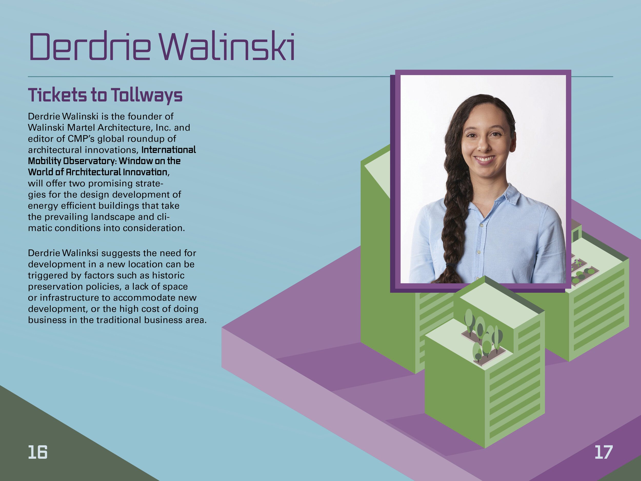
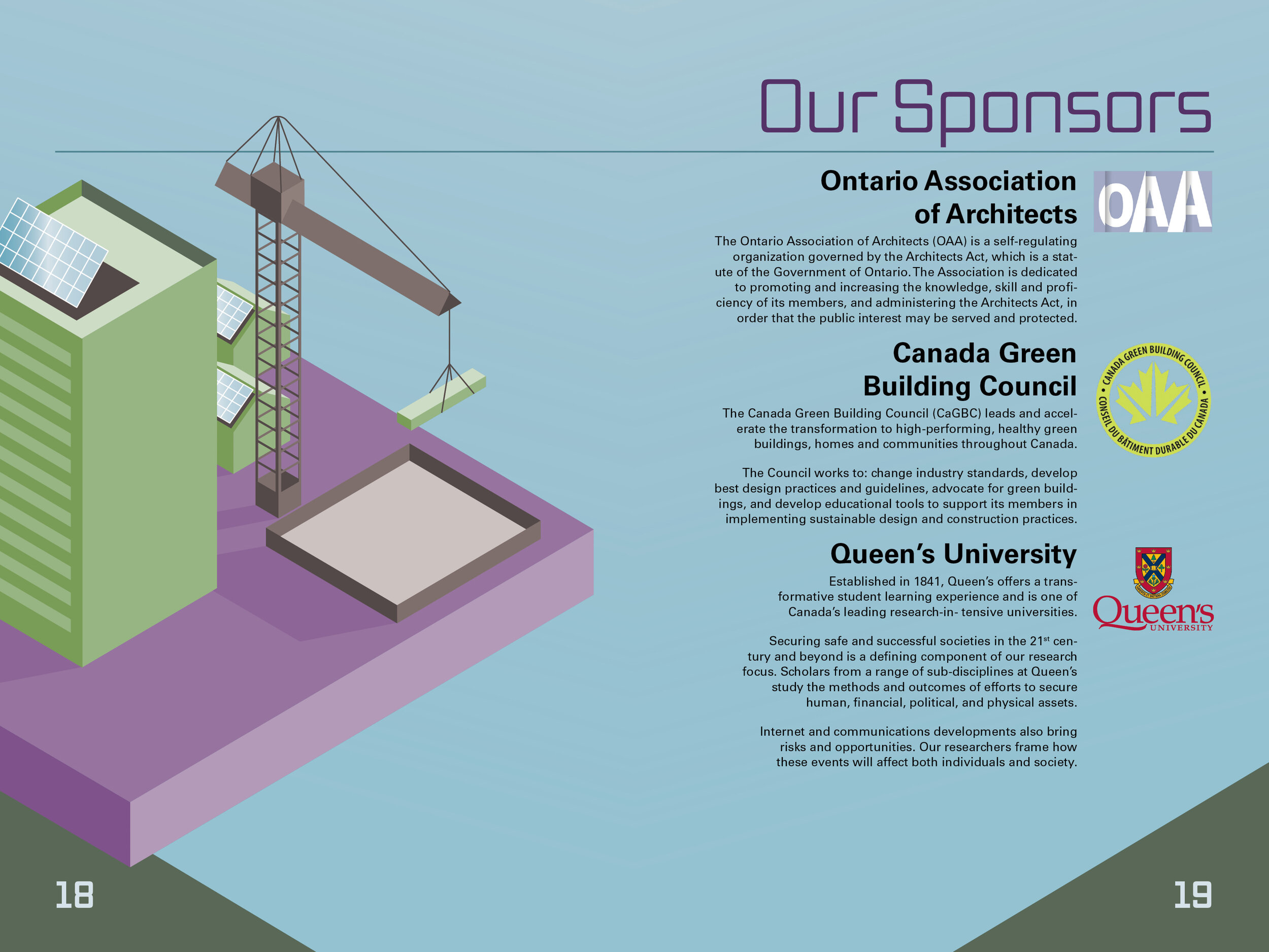
The resulting design is an isometric projection of a simplified city block. The colour palette is surreal and the buildings themselves are green. This serves as the primary visual communiqué. The conference is entitled “green dwelling”, and the poster features actual dwellings that are green in colour. While this may be a bit overt, the poster is intended to be understandable from a distance or at a glance. The design is eye-catching, and its overt display of green buildings is quickly understood and accepted.
The quality of the design is reminiscent of childhood building toys. The hope is to reinforce the entertaining aspect of the conference rather than overemphasizing the dry technical details. A playful overhead view makes big things like multistory apartments and ecological architecture seem small and manageable.
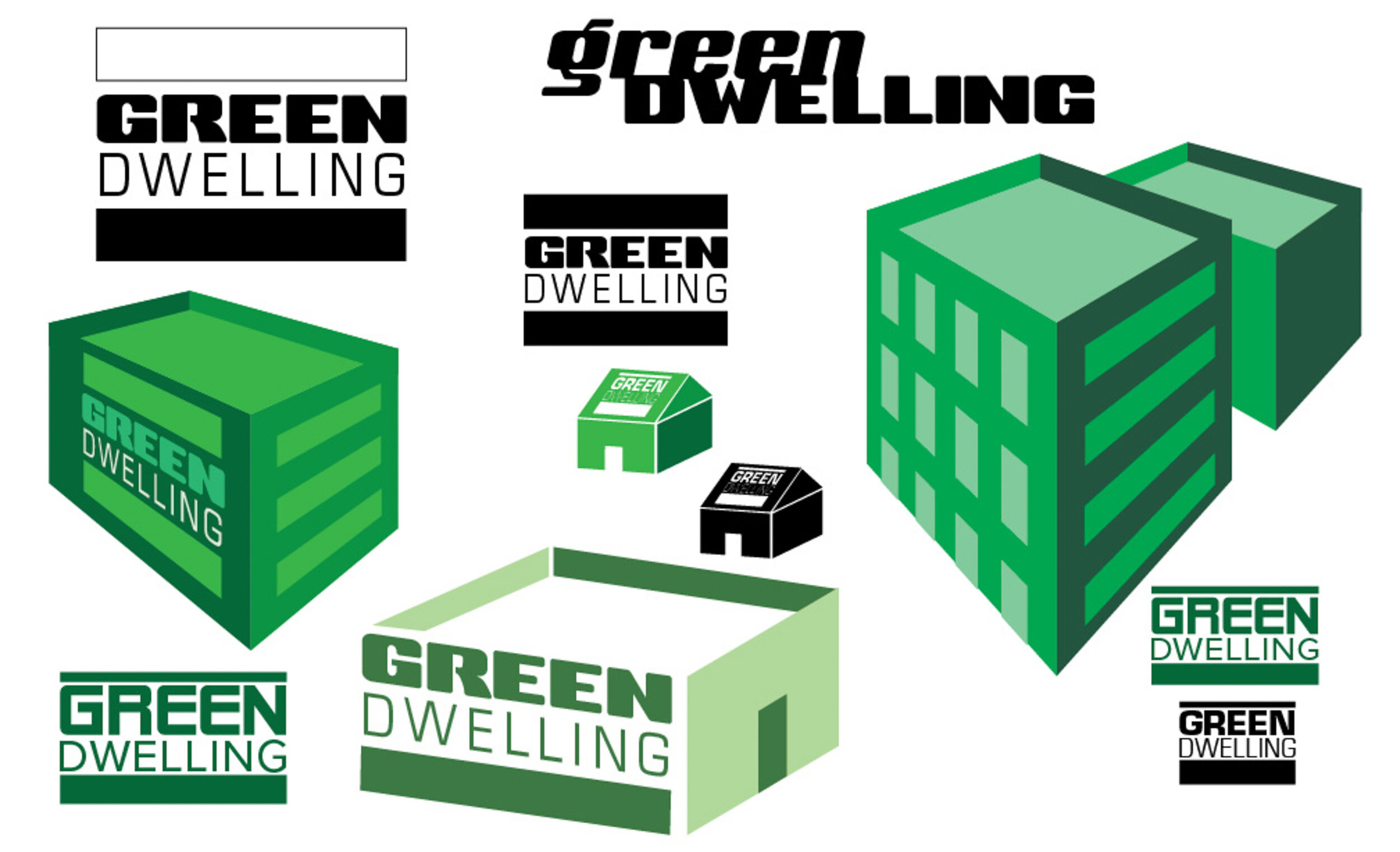
The final choices for typefaces were Vox and Univers. Headlines and big eye-magnets are displayed in Vox. This font has an angularity similar to the typical rectangular solid shape of an apartment building. It also has curved angles that make the blocky forms less aggressive. Univers was chosen for body copy because it shares some similarity with Vox, and it is highly legible. This brochure requires fairly small set type, so an uncomplicated sans like Univers is appropriate and equally modern.
The colour scheme begins with the green buildings, as discussed. The pairing colours were derived from the Teenage Mutant Ninja Turtles. This famous cartoon was at its height of popularity when the target audience for the Green Dwelling conference was in the prime age to watch. The pairing of green and brown colours with urban architecture elements in the early design stages led me to think about the Turtles, who are green urban dwellers. One of the four identifies with inventions and friendly science. This character wears purple as an identifying colour. I experimented with various versions of eggplant-esque purples until I arrived at a solid combination that said ‘Donatello’ to me. Critical reception was positive.
Booklet, Lanyard, and Folded Poster Mailer
A public advertisement
Booklet Front Cover


