Graphic Design
One could spend a lifetime learning the intricacies of adobe products with no hope of ever mastering it all. My personal experience is with Illustrator and Photoshop, but I have delved into Indesign as well. While beautiful and powerful, Adobe is also prohibitively expensive for the casual user. Most recently, I have been working with the open-source programs Inkscape and GIMP.
I certainly enjoy the tools of graphic design. One aspect of the pursuit frustrates me though. This is the idea that a project could be entirely limited to its digital origins. A graphic designer could be tasked with creating a new image to be used on a website, and never truly enter the 'real world'. Your artistic expression could just disappear with a hard drive failure.
With that idea in mind, I generally do not engage with graphic design programs unless the end result is a real-world object.
Stencil Art
Creating a good stencil begins with vector graphics. The layer option allows you to easily arrange all the colors, and eventually print them as individual templates.
I use acetate transparencies to trace and cut each layer. Once completed, the stencil can be applied to almost any surface.
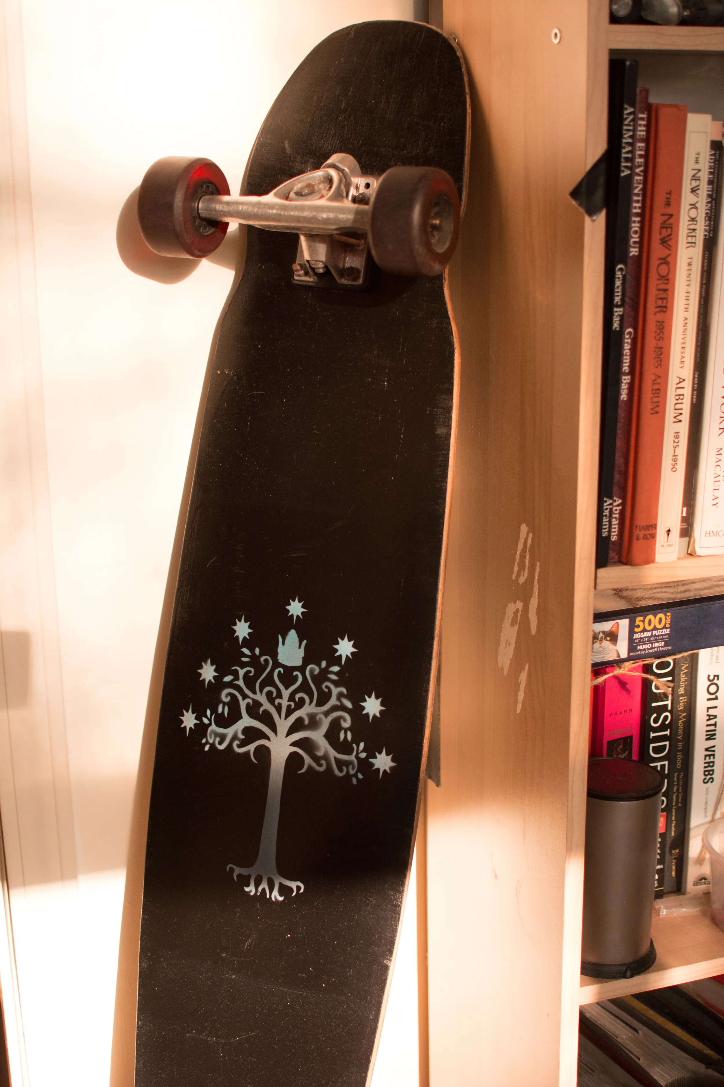
I use an airbrush for all my stencil application. It is a versatile tool, and I have barely scratched the surface of its potential. Fundamentally, the airbrush can easily create extremely vibrant colors, and the stencils allow for very sharp lines.
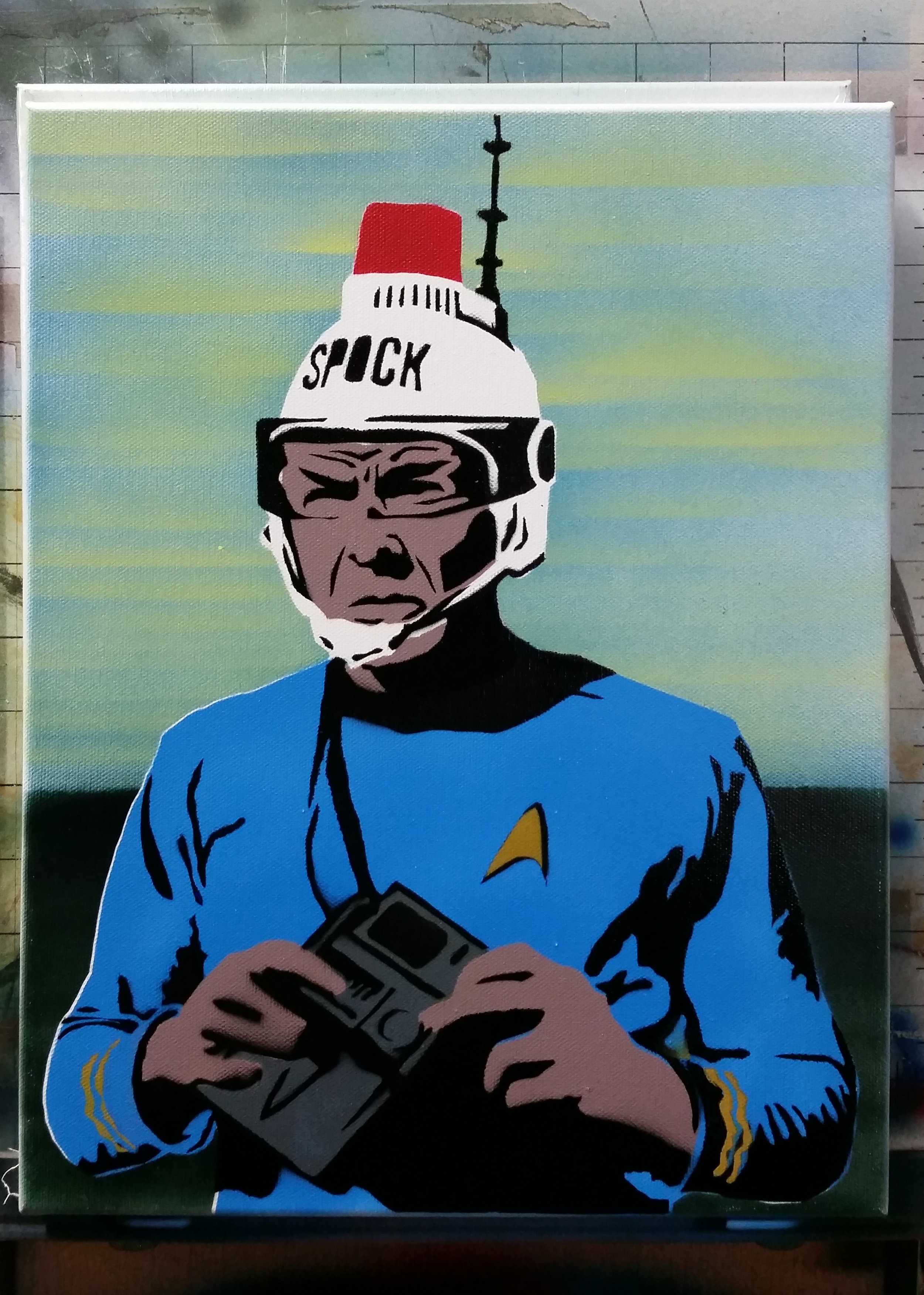
This particular image of Star Trek's Spock comes from a certain notorious picture. It seems one of the many shameless merchandising tie-ins from the 70s was a play helmet featuring a red light and antenna. Spock's name is written largely across the front. The utter absurdity of this toy combined with the seriousness of the character makes for one of the funniest images I have ever seen.
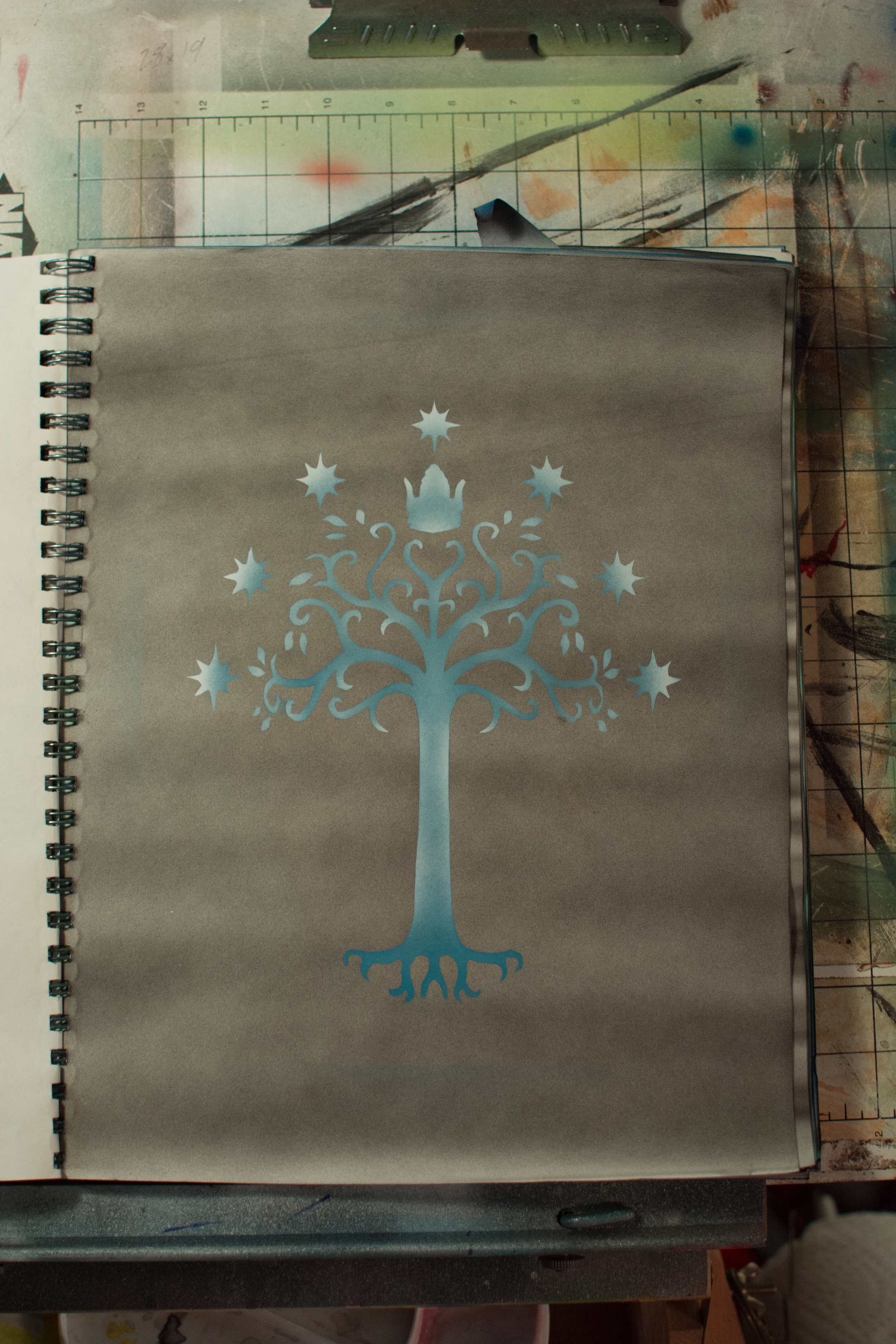
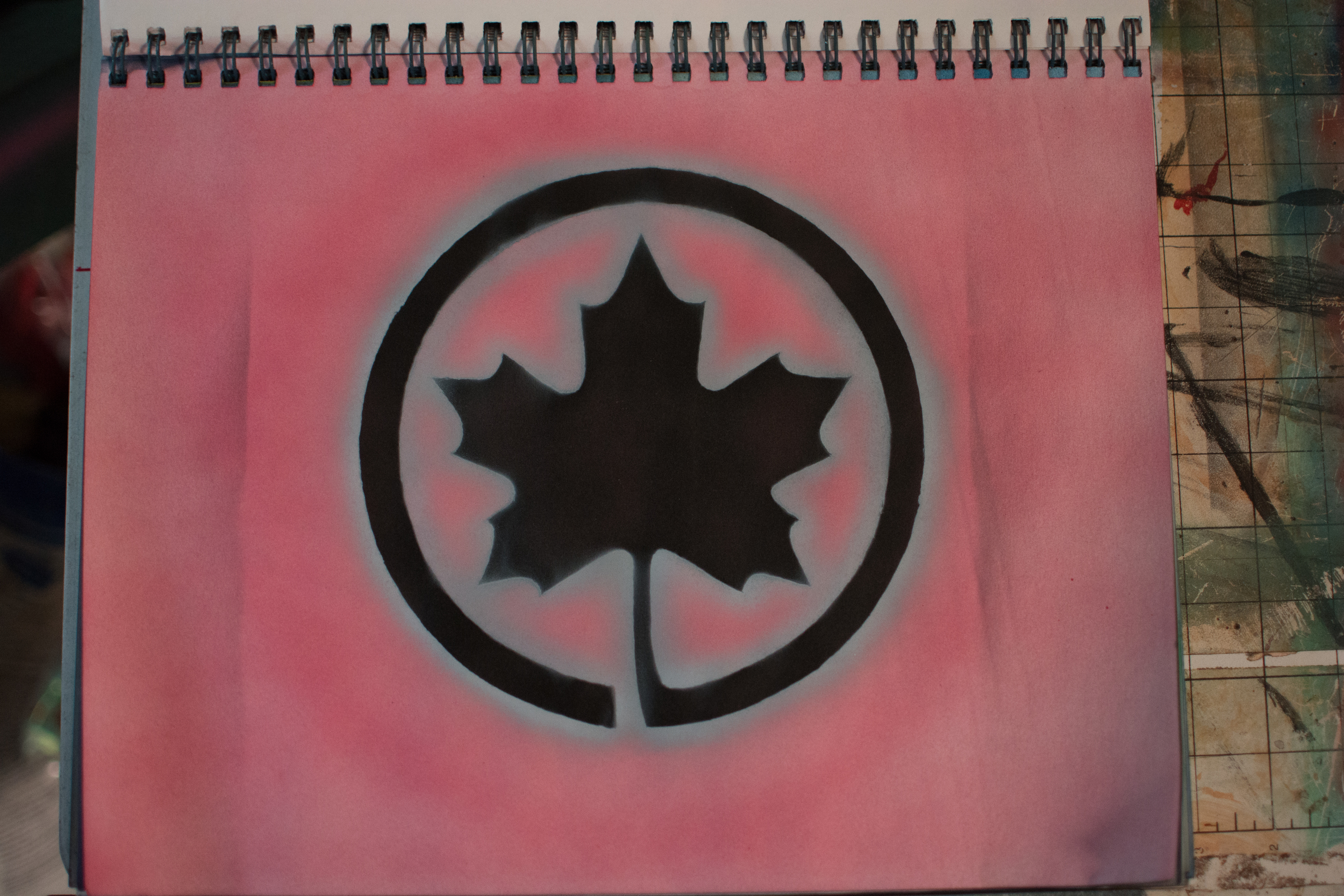
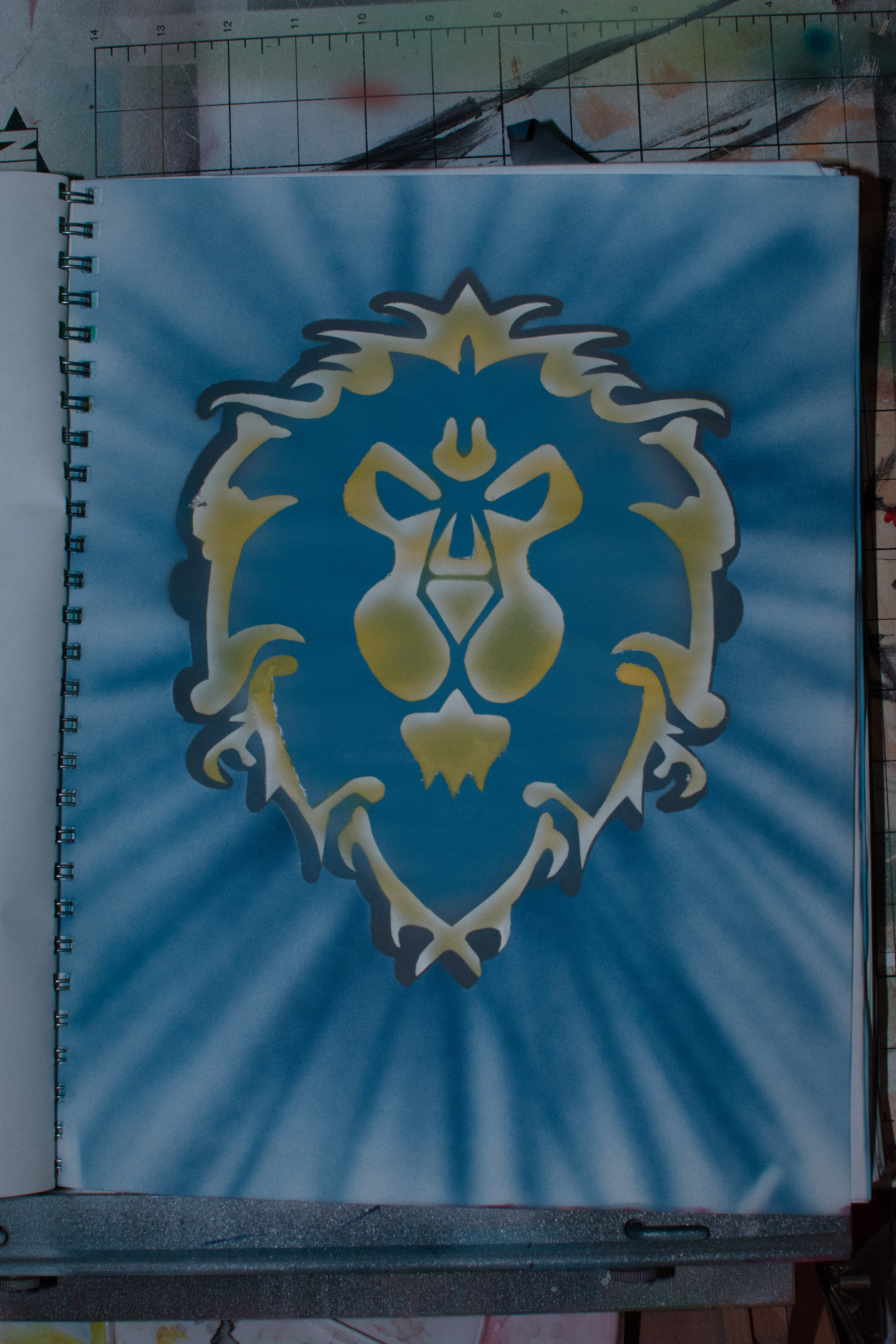
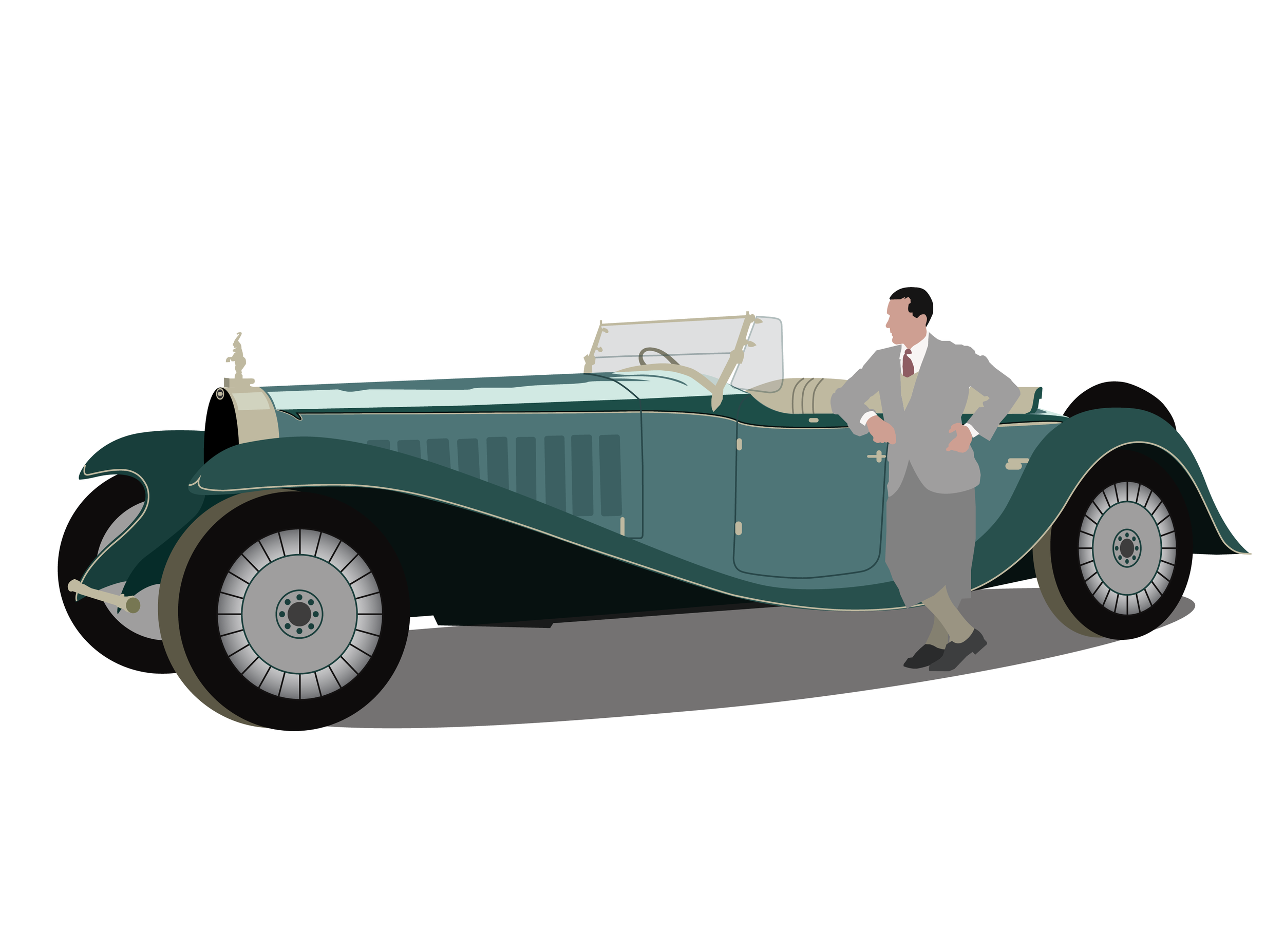
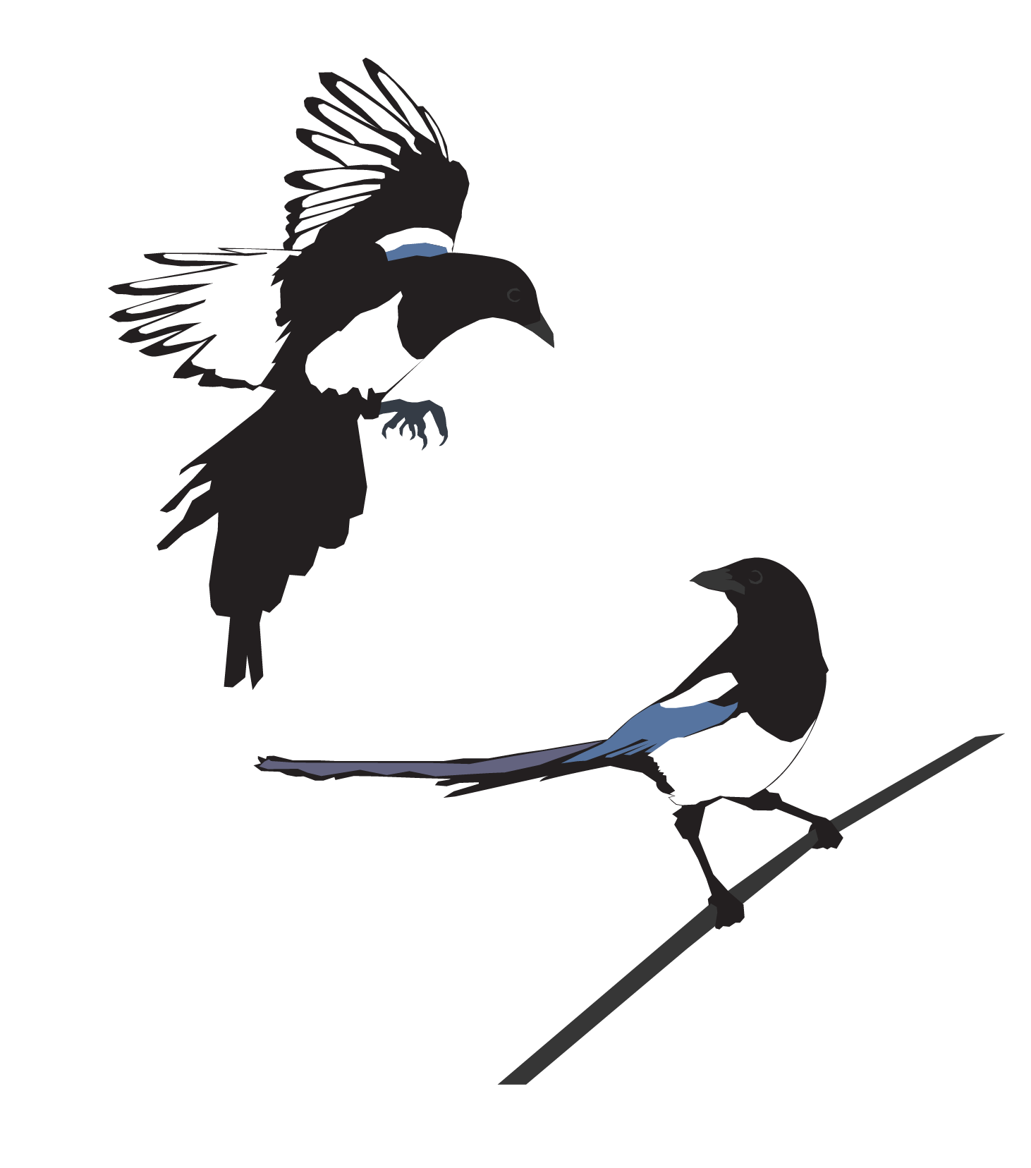
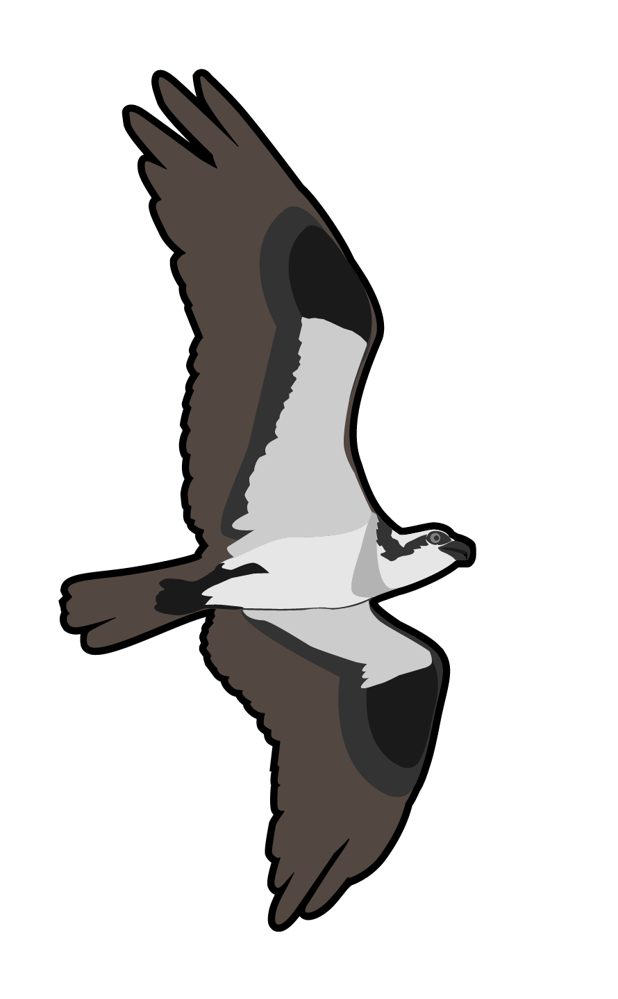
Some of the other various vector graphic designs I have come up with. Many are available for purchase as stickers and other formats at my Redbubble.com page.
Vector Graphics from photos
ICFC Subway Map
This has been a project that I have worked on here and there for years. In the fall of 2010, I suffered a hard drive failure, which resulted in the loss of several unfinished projects. At one point in 2009, I had a working version of this map, but it had some fundamental design flaws. In order to fix the problems, I would essentially be starting over, so I put it aside for awhile.
The current state of my map. I plan to align several elements, as well as tidy up some spacing between words. Including white circles at the 'stops' would add to the overall effect. I also need to decide how to represent the major 'stations'.
ICFC, as it was in 2000. A few cabins have been added, two of which fall outside the range of this map.
Now, years later, I decided to restart this project. I have learned much more about vector graphics in the meantime, so this took me far less time. I have found several methods of stretching and bending the lines without reinventing the wheel every time.
The Iron City Fishing Club features about fifty cabins connected by a boardwalk. There is also a number of boat docks, and bridges, as well as two larger communal buildings. This is one project where the fundamental structure is 99% of the effort. Subway maps manage to ignore physical distances in favor of simplified colored lines that reduce navigation to a simple sequence on a line.
ICFC has a certain resemblance to Chicago, in that the camp is situated on a shoreline, facing a much larger body of water; however, Chicago has a very smooth coastline, where Iron City's is erratic. Regardless, I took my major inspiration from the Chicago Transit Authority. The CTA manages to fit its entirety on a horizontal banner type map. This means that the map fits on the same template as the individual train line maps. Most cities require a large rectangular map to fit the mass transit on a single image.
I plan to add some more details. I need to study some more actual subway maps to know what I am missing. I could conceivably merge the circular blue line on the right with the purple and red lines to create a "loop" in the same manner as Chicago. It could also just add confusion. I also would like to find out all the cabin nicknames, though some do not have them. There are certainly some bits I have missed as well.
Overall, I am quite pleased with how this is going. I am not sure what the final format will be. The obvious choice would be a poster that is roughly 12"x42". You could hang it above a doorway to get the subway effect. There is a bit of anachronistic flair to this though. The camp attempts to maintain a certain degree of rustic-ness, and the notion of a subway system is a bit silly. Taking this into account, this image may make a better design for a coffee mug, t-shirt, or mousepad.
The Iron City Yearbook Project
A collaborative effort, this sixty page yearbook will feature twenty family trees, illustrating the legacy of each member. We aim to have this completed before December 2014, with a potential early release before this coming summer.
I have completed my own family tree, seen here. I am almost entirely satisfied with the design elements. The semi-transparent curved squares are clearly reminiscent of the Apple iOS interface. While I fear that this will appear dated in the near future, I remind myself that this project is a yearbook, which aims to capture a specific moment in time. Why not have it incorporate the most recent design trend?
Once I have one tree completed, the rest will be a simple matter of re-arrangement. All of the background photos are my own, and I hope to have enough satisfactory images in my catalog to cover all twenty families. Finding the perfect mix of flatness and light balance is tricky, and all images should come from the Club property, which is also limiting.
Tachometer Speed Overlay
Vector Graphics on Heavy Paper, Laminated.
My 30 year old automobile has an inaccurate speedometer. Original parts are not overly expensive, just rare. My solution was to create a graphic overlay for the accurate tachometer which would clearly indicate my vehicles' speed.
This method is only useful on a manual transmission. Most of these numbers are unnecessary, and I can only guess how fast my car could go in first gear at 7000rpms. All the speeds between 1000 and 5000 are accurate.
A potato-quality image of the overlay prototype.
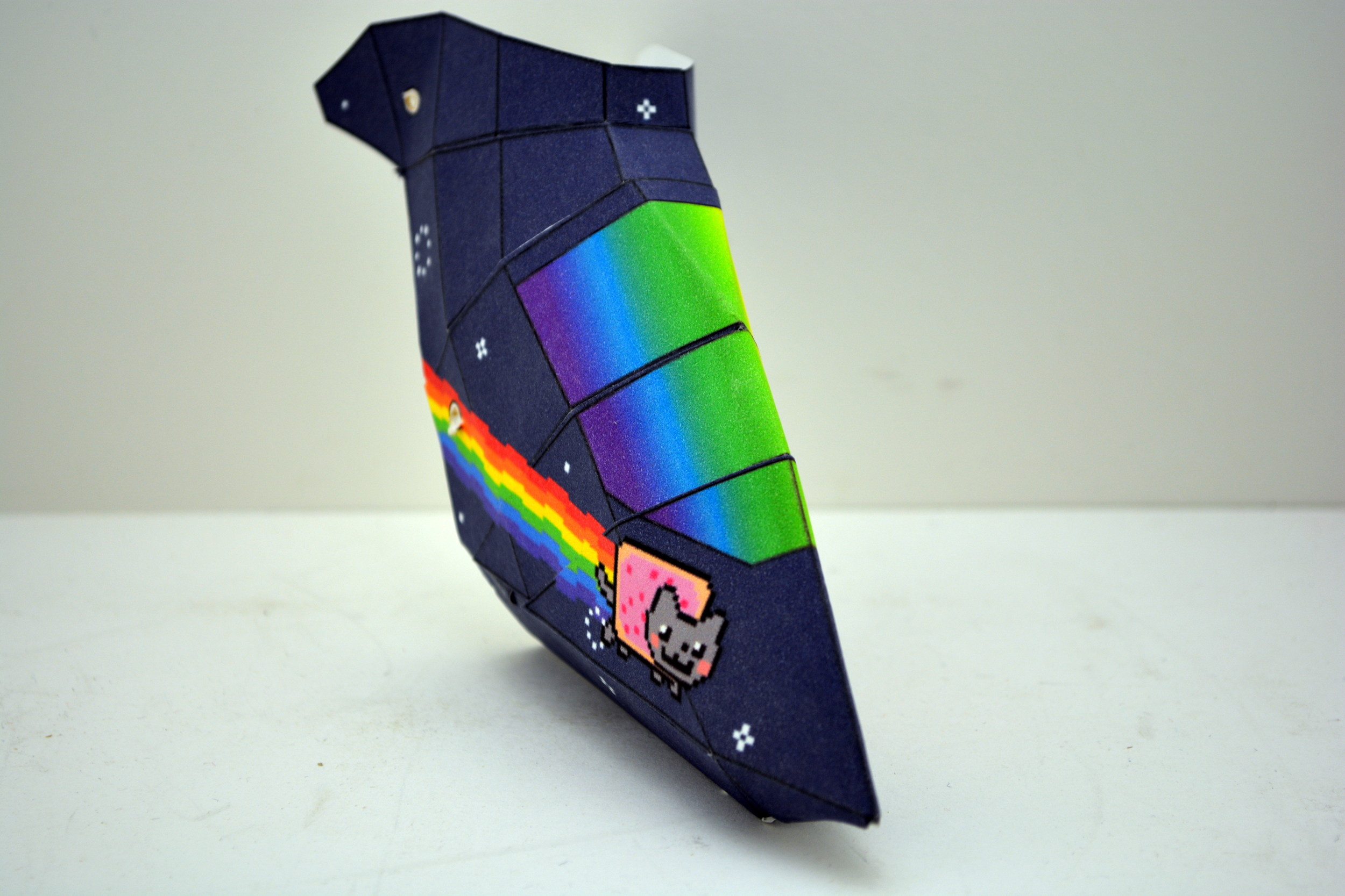
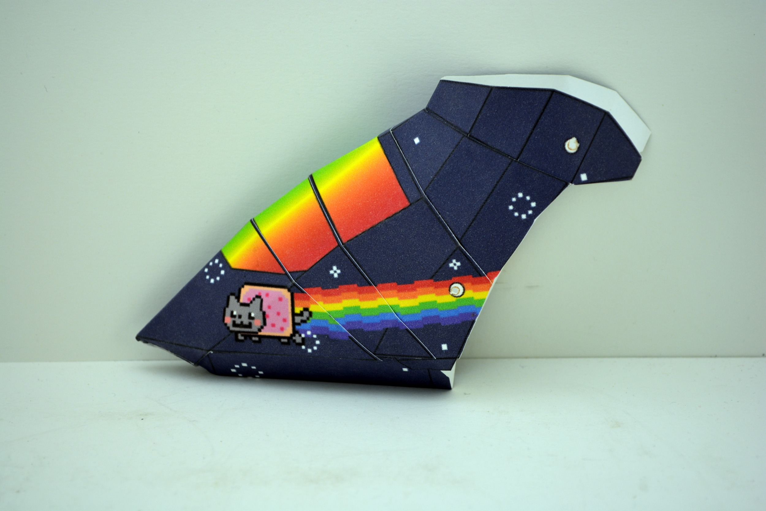
Model Helicopter Canopy
Vector Graphics on Heavy Weight Paper - 2013
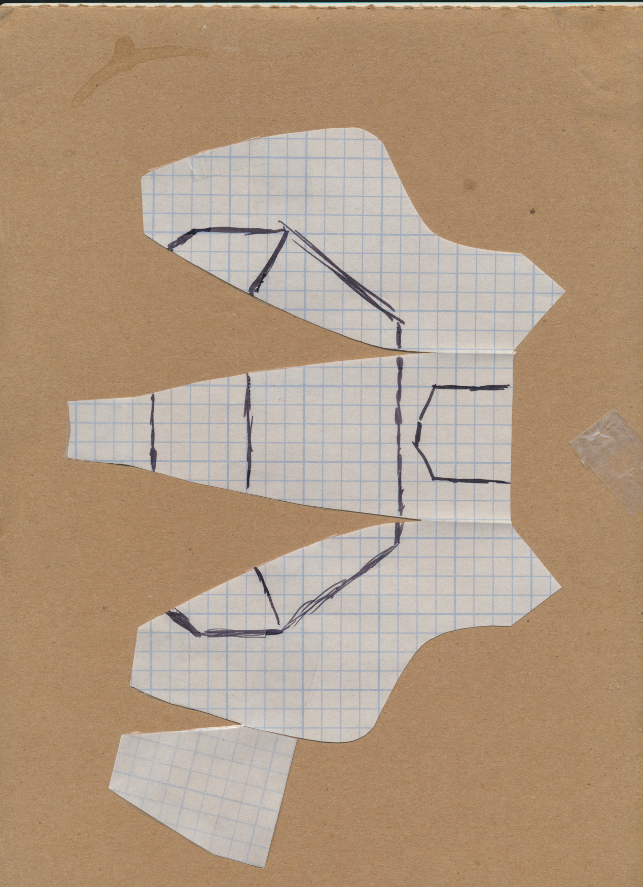
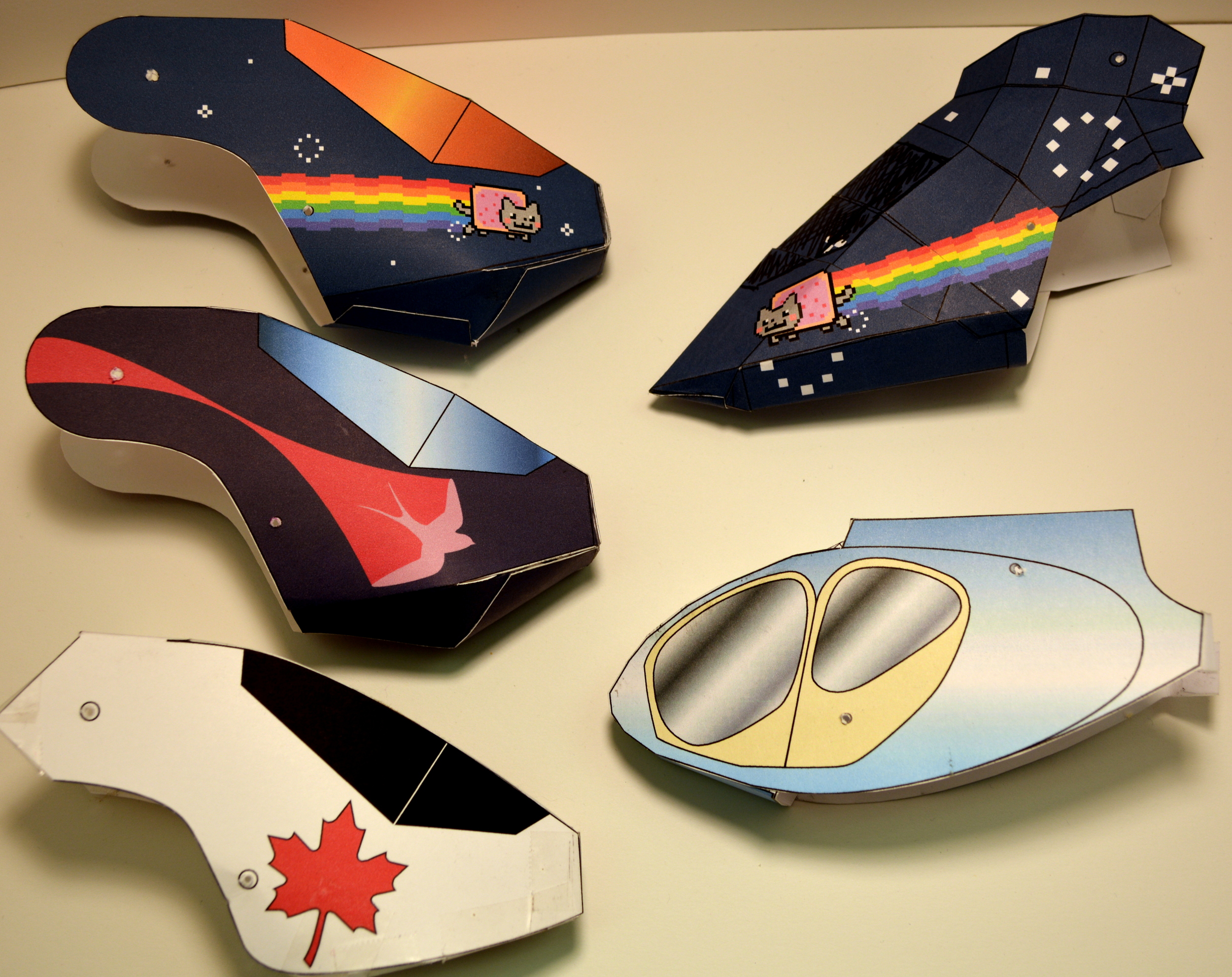
Customized livery for my Blade 120sr model helicopter. Multiple revisions resulted in a simple folding paper design which fits on a single letter-sized sheet of paper.
The design has taken three prototypes to perfect. My next goal will be to attempt a canopy for a much larger aircraft.





Back
Front
Iron City Staff T-Shirt
Vector Graphics - 2010
Two simple four-color designs for a summer camp t-shirt. I drew the stylized main hall for the back, and traced the bell logo, which was meant to appear decrepit.

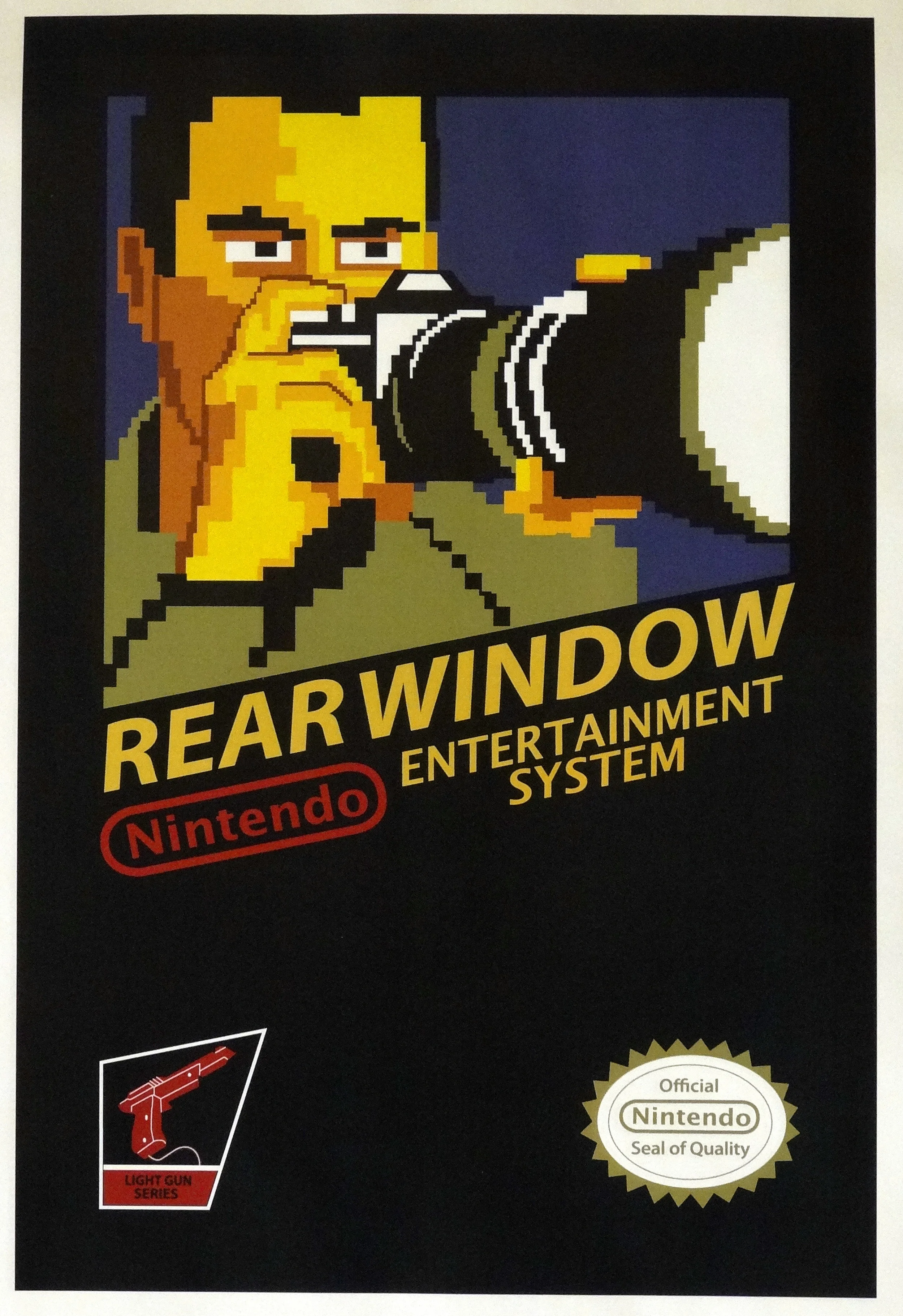


Four famous movies rendered as classic Nintendo games.
Vector Graphics - 2009
These were part of an assignment, which asked us to make a poster of a pop culture mash-up.
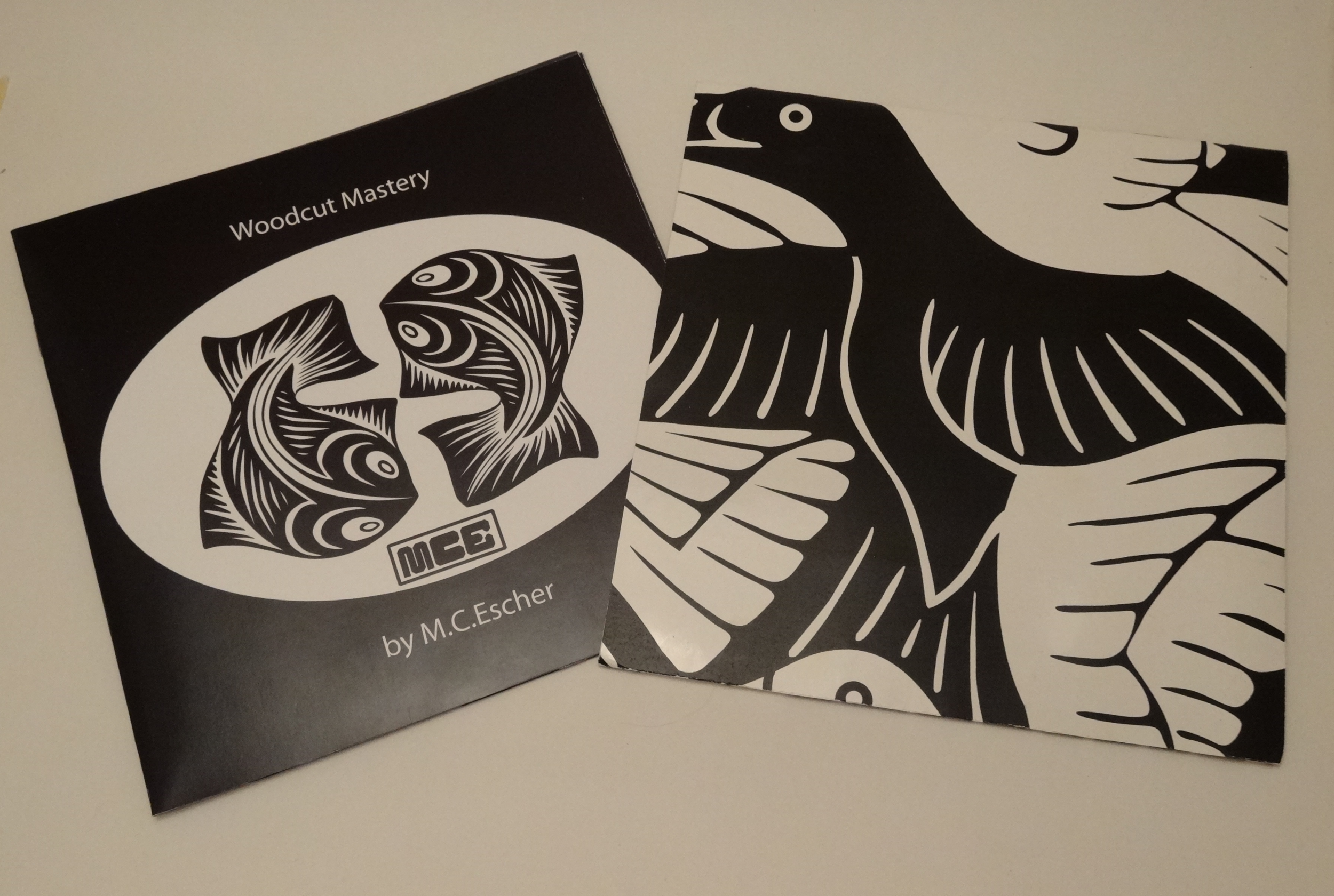
Gallery Pamphlet for M.C.Escher
Vector Graphics, 2009
A white card stock envelope with one open side which contains a booklet of twelve pages. Details on sixteen works as well as a brief artist's bio.



Homage to Gropius
Vector Graphics, 2005
Exercising the use of typography, I attempted to emulate the feeling of bauhaus design.
Iron City Fishing Club directory cover art
Pencil, pen, drawing paper - 2004
A surreal take on the wind blown pines native to the Georgian Bay region. Pen and pencil on drawing paper.
Cover
Inside with credit
