Great Lakes Ports Collective
Background
The Great Lakes Ports Collective is an organization which seeks to coordinate the tourism efforts of the port towns on the Great Lakes. These towns vary in size, but all share the need to draw in revenue from vacationers. A cohesive branding package is required to indicate the collaboration among the ports. Having a consistent identity will demonstrate the teamwork and shared goals of these port towns. A solid logo design speaks volumes to potential audiences, telling them to expect predictable professionalism from any port town bearing this icon.
The concept of vacation was birthed in the Great Lakes region of North America. Travelling for pleasure was prohibitively expensive for people without significant wealth and free time. The invention of the railroad and the steam engine changed everything. City dwellers in New York, Philadelphia, Chicago, Cleveland, etc. all suddenly had the ability to take a week off in the sweltering summer. Going due north to the freshwater beaches was extremely popular. The cruise ship industry took off, and the small towns of southern Ontario were happy to receive vacationers.
These early vacations featured a great deal of comfort. City-folk wanted to get out into nature, but they also wanted to have their needs met by dedicated service staff at every step. They would bring their finest vacation clothing and share drinks with new friends. They were not looking for anything strenuous or authentically rustic.
This branding project must fit in with these contrasting values. Vacationers want to see and experience the area, but they also want the comforts of home. They want to jump in the lake at noon and have dinner served to them at six.
Project Objectives
The design must function in all the expected applications. It must be easily understood from a great distance on either light or dark backgrounds. It must also function at a very large scale if necessary. The logo will be used by several different port towns, which means it must be adaptable for all the current and future member ports. The design must be delivered in a labelled organized file. It will consist of several options and file formats depending on the client’s needs. It will be usable in wide horizontal format as well as square or circular formats.
Target Audience
The target audience is potential cruise ship passengers, primarily. A secondary target is the actual owners of large yachts who can make use of a medium to large size docks. This audience is middle-aged and above, reaching their early 90s in some cases. They are likely very familiar with boating and will recognize the imagery associated with nautical adventures more than the average viewer. The audience likely appreciates history and tradition over modernity and cutting-edge tech.
Rationale
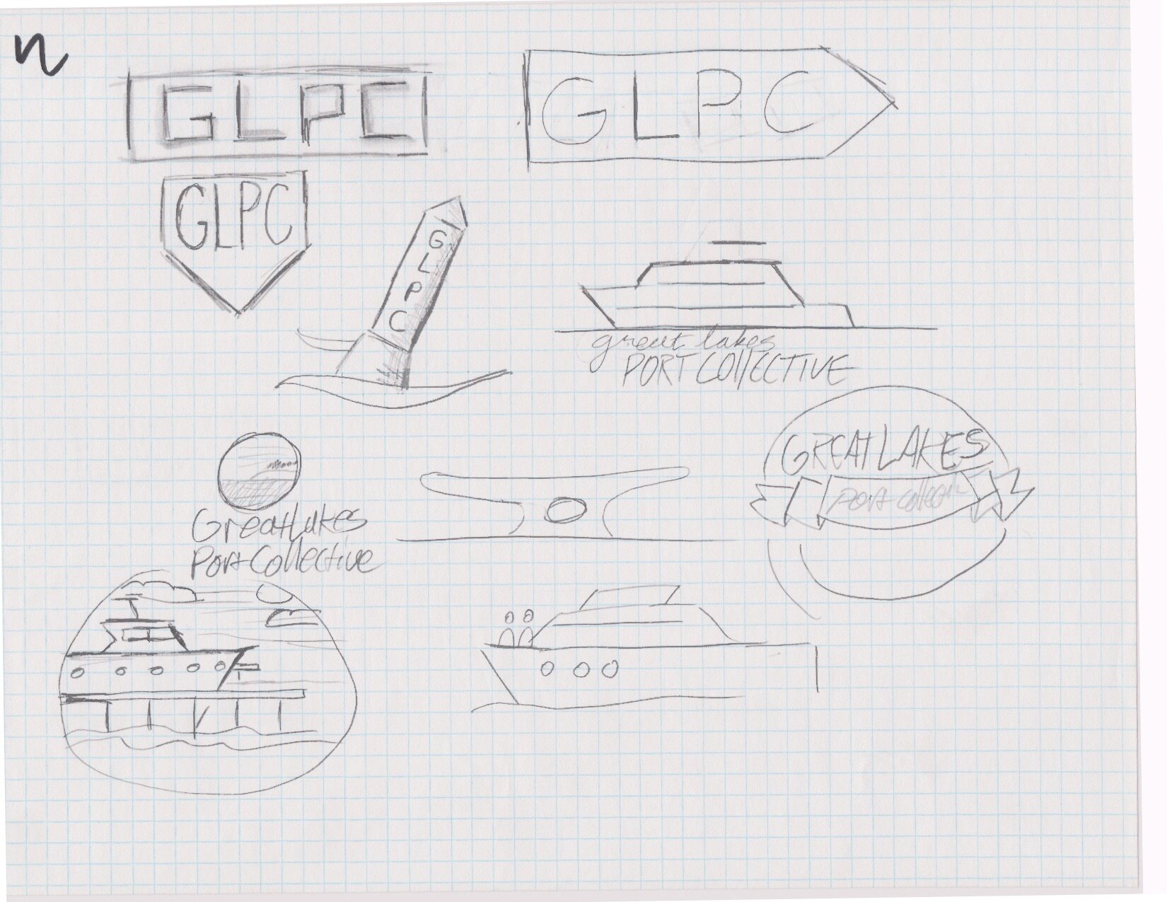
The design takes the form of a black uniform contrast line art image of a ship’s porthole. This shape of window has been used in ship designs for centuries. Modern vessels stray from the perfect circle design, often using rectangular or oval windows. The classic circle still remains popular and is used in new ships as well. Despite its old-fashioned form, the porthole window continues to be a recognizable image in boating.
Portholes are not found on small boats, sailboats, or fishing boats. The icon refers only to larger boats that feature sleeping cabins.
Portholes are also windows. A window begs a viewer to peer through and see what is on the other side. A window on a ship can present the viewer with any number of scenes. Maybe the viewer sees a familiar vacation spot. Perhaps they see open water. They could see the welcome of their hometown. The porthole stands for both adventure and comfort.
The icon of the porthole can be filled with anything. In this case, it is filled with a simple representation of two port towns on the great lakes. Using this art style, the circle can be adapted to represent any of the ports in the GLPC. Each is slightly different, but the style remains consistent, indicating the teamwork and cohesion of the collective.


