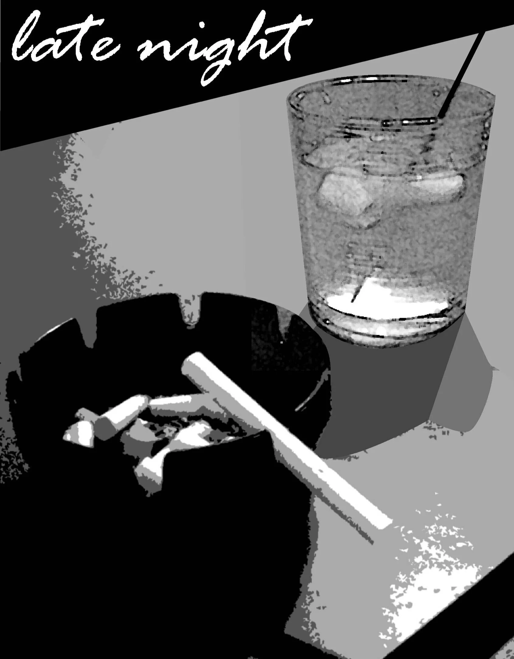
An old graphic I made for a school project in 2003
The current project for our Interactive Design course has me thinking a lot about soda. When asked to design an interface for a vending machine, my inner cynic keeps screaming out about how Coke is a blight on society and maybe the best vending machine is the one that tells people to stop using vending machines. Sodee-Pop is a socially accepted vice that is arguably worse than smoking. Of course everyone deserves a treat now and then, and I personally enjoy drinking a can or two of tonic water a day, though I dress mine up with a bit of ice and a squeeze of lime. Also gin.
Beverages seem to be falling into a few highly specialized categories. If you want some fast food or a break from work, then a Coca Cola over ice is traditional. If you are hitting the gym or recovering from a hangover, then you should choose a low sugar refresher like Gatorade. If you are cutting out caffeine or sugar, then maybe an ice-tea or one of those godawful kombucha concoctions is appropriate. If you are enjoying cocktails, then your options are tonic, soda water, or Collins mix, etc.
But why shouldn't you have tea with booze? And why should gin be the only thing infused with juniper and pine? The DieLine.com highlights a drink-maker seizing on a new trend of mixology, Rocktails. In an interview with the company's packaging designer, Shaun Bowen, the DieLine learns a bit about what went into making this clever hybrid.
Rocktails makes craft-distilled botanical drinks with zero alcohol, designed to drink as is, or as a mixer with the spirit of your choice. The brief was to target sophisticated foodies and take advantage of the growth in the non-alcoholic category.
The packaging is very sharp. It resembles a classy vodka bottle, but it is single serving sized. The beverage is upfront about its 0% alcohol content. It clearly identifies the complex array of ingredients with professional adult text and imagery. The simple color palette does not scream "health nut", nor does it yell out "PARTY TIME!!!111". The label walks a perfect line between up-scale classy cocktail and sober nightlife. You don't have to be a martini snob or a non-drinker to have a satisfying beverage.
Often I have found myself out a bar without a drink in hand. The question of "where's your drink" comes up and I have to either buy another round that I don't need or subtly ask the bartender to make a "fake gin and tonic" which is just soda water and a lime wedge. I would love to have a third option that is an interesting and complex non-alcoholic drink that isn't just a pint of sugar water.
The label takes its inspiration from the image of a mermaid. The designer says this creature reflects the dual usage of Rocktails. Is it a fish or a lady? It's whatever you need at the moment. I find it striking but subtle. All too often I see design work that is way too clever. Designers try to throw every idea and color they have into one application and it comes out aggressively messy. This packaging is upscale and smart like a wine bottle, but also sober and modern like an ice-tea. It is not trying to be a teenager, it is trying to be a 30 year old.
The rising popularity of craft brewers and smaller wine producers has created a new market for good graphic design. The world of soda is mostly dominated by mega-corporations such as Pepsi, but Rocktails shows that there is a niche for non-alcoholic intelligent bottle labels. I feel thirsty just thinking about it.

